
 wx.RichMessageDialog
Extension of wx.MessageDialog with additional functionality.
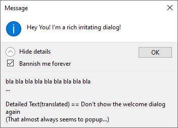
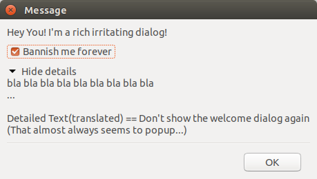
This class adds the possibility of using a checkbox (that is especially useful for implementing the “Don’t ask me again” kind of dialogs) and an extra explanatory text which is initially collapsed and not shown to the user but can be expanded to show more information.
Notice that currently the native dialog is used only under MSW. Elsewhere, a generic implementation which is less familiar to the users is used. Because of this it’s recommended to use this class only if you do need its extra functionality and use wx.MessageDialog which does have native implementation under all platforms otherwise. However if you do need to put e.g. a checkbox in a dialog, you should definitely consider using this class instead of using your own custom dialog because it will have much better appearance at least under recent Windows versions.
To use this class, you need to create the dialog object and call ShowCheckBox and/or ShowDetailedText to configure its contents. Other than that, it is used in exactly the same way as wx.MessageDialog and supports all the styles supported by it. In particular, ShowModal return value is the same as for wx.MessageDialog. The only difference is that you need to use IsCheckBoxChecked to examine the checkbox value if you had called ShowCheckBox.
Here is a simple example:
def ShowDialog(self):

    if dont_show:
        return

    dlg = wx.RichMessageDialog(self, "Welcome to my wonderful program!")
    dlg.ShowCheckBox("Don't show welcome dialog again")
    dlg.ShowModal() # return value ignored as we have "Ok" only anyhow

    if dlg.IsCheckBoxChecked():
        # ... make sure we won't show it again the next time ...
        dont_show = True
Added in version 2.9.2.
See also
 Class Hierarchy

 Control Appearance

 Methods Summary
Constructor specifying the rich message dialog properties. |
|
Retrieves the label for the checkbox. |
|
Retrieves the detailed text. |
|
Retrieves the footer icon. |
|
Retrieves the footer text. |
|
Retrieves the state of the checkbox. |
|
Specify the footer icon set together with the footer text. |
|
Shows or hides a footer text that is used at the bottom of the dialog together with an optional icon. |
|
Shows a checkbox with a given label or hides it. |
|
Shows or hides a detailed text and an expander that is used to show or hide the detailed text. |
|
Shows the dialog, returning one of |
 Properties Summary
See |
|
See |
|
See |
|
See |
 Class API
- class wx.RichMessageDialog(GenericMessageDialog)
Possible constructors:
RichMessageDialog(parent, message, caption=MessageBoxCaptionStr,
                  style=OK|CENTRE) -> None
Extension of MessageDialog with additional functionality.
Methods
- __init__(self, parent, message, caption=MessageBoxCaptionStr, style=OK | CENTRE)
Constructor specifying the rich message dialog properties.
Works just like the constructor for wx.MessageDialog.
- Parameters:
parent (wx.Window)
message (string)
caption (string)
style (long)
- Return type:
None
- GetCheckBoxText(self)
Retrieves the label for the checkbox.
- Return type:
str
- Returns:
The label for the checkbox, will be the empty string if no checkbox is used.
- static GetClassDefaultAttributes(variant=WINDOW_VARIANT_NORMAL)
- Parameters:
variant (WindowVariant)
- Return type:
- GetDetailedText(self)
Retrieves the detailed text.
- Return type:
str
- Returns:
The detailed text or empty if detailed text is not used.
Retrieves the footer icon.
- Return type:
int
- Returns:
The footer icon or 0 if footer icon is not used.
Added in version 4.1/wxWidgets-3.1.1.
See also
Retrieves the footer text.
- Return type:
str
- Returns:
The footer text or empty if footer text is not used.
Added in version 4.1/wxWidgets-3.1.1.
- IsCheckBoxChecked(self)
Retrieves the state of the checkbox.
If this method is called before showing the dialog, the initial value of the checkbox, as set by
ShowCheckBoxis used. If it is called after callingwx.Dialog.ShowModal, the value set by the user is returned.- Return type:
bool
- Returns:
Trueif the checkbox is checked orFalseif not.
Specify the footer icon set together with the footer text.
Valid values are
ICON_INFORMATION,ICON_WARNING,ICON_AUTH_NEEDEDandICON_ERROR(notice thatICON_QUESTIONis not allowed here).- Parameters:
icon (int)
- Return type:
None
Added in version 4.1/wxWidgets-3.1.1.
See also
Shows or hides a footer text that is used at the bottom of the dialog together with an optional icon.
- Parameters:
footerText (string) – The footer text if empty no footer text will be used.
- Return type:
None
Added in version 4.1/wxWidgets-3.1.1.
See also
- ShowCheckBox(self, checkBoxText, checked=False)
Shows a checkbox with a given label or hides it.
- Parameters:
checkBoxText (string) – If the parameter is non-empty a checkbox will be shown with that label, otherwise it will be hidden.
checked (bool) – The initial state of the checkbox.
- Return type:
None
- ShowDetailedText(self, detailedText)
Shows or hides a detailed text and an expander that is used to show or hide the detailed text.
- Parameters:
detailedText (string) – The detailed text that can be expanded when the dialog is shown, if empty no detailed text will be used.
- Return type:
None
- ShowModal(self)
Shows the dialog, returning one of
wx.ID_OK,wx.ID_CANCEL,wx.ID_YES,wx.ID_NO.IsCheckBoxCheckedcan be called afterwards to retrieve the value of the check box if one was used.- Return type:
int
Properties
- CheckBoxText
See
GetCheckBoxText
- DetailedText
See
GetDetailedText
See
GetFooterIconandSetFooterIcon
See
GetFooterTextandSetFooterText
