
 wx.TreeCtrl
A tree control presents information as a hierarchy, with items that may be expanded to show further items.
Items in a tree control are referenced by wx.TreeItemId handles, which may be tested for validity by calling wx.TreeItemId.IsOk .
A similar control with a fully native implementation for GTK+ and macOS as well is wx.dataview.DataViewTreeCtrl.
Images in TreeCtrl
wx.TreeCtrl inherits from wx.WithImages classes providing the functions for associating images with the control items. Each item refers to its image using an index, which can possibly by wx.WithImages.NO_IMAGE to indicate that the item doesn’t use any image at all, and the corresponding image is taken either from the vector passed to wx.WithImages.SetImages or from the image list passed to wx.WithImages.SetImageList or wx.WithImages.AssignImageList functions. In addition to normal images, handled with the methods mentioned above, wx.TreeCtrl also provides optional state images that may be used to indicate some additional state of the item, e.g. checked or unchecked status. These images can be set using SetStateImages (preferred, as they allow to specify high resolution versions of the state images too) or legacy SetStateImageList and AssignStateImageList functions that behave in the same way as the corresponding methods of wx.WithImages. Note that state images are currently not supported in the native Qt version. Finally, in the generic version of this control (wxGenericTreeCtrl), also provides SetButtonsImageList and AssignButtonsImageList, which can be used to change the images used for the control buttons, used to expand or collapse its branches. These methods are not available in the native wxMSW and Qt implementations.
Events
 Window Styles
To intercept events from a tree control, use the event table macros described in wx.TreeEvent. This class supports the following styles:
wx.TR_EDIT_LABELS: Use this style if you wish the user to be able to edit labels in the tree control.wx.TR_NO_BUTTONS: For convenience to document that no buttons are to be drawn.wx.TR_HAS_BUTTONS: Use this style to show + and - buttons to the left of parent items.wx.TR_TWIST_BUTTONS: Selects alternative style of +/-buttons and shows rotating (“twisting”) arrows instead. Currently this style is only implemented in wxMSW and is ignored under the other platforms as enabling it is equivalent to usingSystemThemedControl.EnableSystemTheme.wx.TR_NO_LINES: Use this style to hide vertical level connectors.wx.TR_FULL_ROW_HIGHLIGHT: Use this style to have the background colour and the selection highlight extend over the entire horizontal row of the tree control window. (This flag is ignored under Windows unless you specifyTR_NO_LINESas well.)wx.TR_LINES_AT_ROOT: Use this style to show lines leading to the root nodes (unless noTR_NO_LINESis also used, in which case no lines are shown). Note that in the MSW version, if this style is omitted, not only the lines, but also the button used for expanding the root item is not shown, which can be unexpected, so it is recommended to always use it.wx.TR_HIDE_ROOT: Use this style to suppress the display of the root node, effectively causing the first-level nodes to appear as a series of root nodes. Note that in wxMSW this style must be set when creating the control and can’t be changed later.wx.TR_ROW_LINES: Use this style to draw a contrasting border between displayed rows.wx.TR_HAS_VARIABLE_ROW_HEIGHT: Use this style to cause row heights to be just big enough to fit the content. If not set, all rows use the largest row height. The default is that this flag is unset. Generic only.wx.TR_SINGLE: For convenience to document that only one item may be selected at a time. Selecting another item causes the current selection, if any, to be deselected. This is the default.wx.TR_MULTIPLE: Use this style to allow a range of items to be selected. If a second range is selected, the current range, if any, is deselected.wx.TR_DEFAULT_STYLE: The set of flags that are closest to the defaults for the native control for a particular toolkit.
 Events Emitted by this Class
Handlers bound for the following event types will receive one of the wx.TreeEvent parameters.
EVT_TREE_BEGIN_DRAG: Begin dragging with the left mouse button. If you want to enable left-dragging you need to intercept this event and explicitly call
wx.TreeEvent.Allow, as it’s vetoed by default. Processes awxEVT_TREE_BEGIN_DRAGevent type.EVT_TREE_BEGIN_RDRAG: Begin dragging with the right mouse button. If you want to enable right-dragging you need to intercept this event and explicitly call
wx.TreeEvent.Allow, as it’s vetoed by default. Processes awxEVT_TREE_BEGIN_RDRAGevent type.EVT_TREE_END_DRAG: End dragging with the left or right mouse button. Processes a
wxEVT_TREE_END_DRAGevent type.EVT_TREE_BEGIN_LABEL_EDIT: Begin editing a label. This can be prevented by calling Veto(). Processes a
wxEVT_TREE_BEGIN_LABEL_EDITevent type.EVT_TREE_END_LABEL_EDIT: Finish editing a label. This can be prevented by calling Veto(). Processes a
wxEVT_TREE_END_LABEL_EDITevent type.EVT_TREE_DELETE_ITEM: An item was deleted. Processes a
wxEVT_TREE_DELETE_ITEMevent type.EVT_TREE_GET_INFO: Request information from the application. Processes a
wxEVT_TREE_GET_INFOevent type.EVT_TREE_SET_INFO: Information is being supplied. Processes a
wxEVT_TREE_SET_INFOevent type.EVT_TREE_ITEM_ACTIVATED: The item has been activated, i.e. chosen by double clicking it with mouse or from keyboard. Processes a
wxEVT_TREE_ITEM_ACTIVATEDevent type.EVT_TREE_ITEM_COLLAPSED: The item has been collapsed. Processes a
wxEVT_TREE_ITEM_COLLAPSEDevent type.EVT_TREE_ITEM_COLLAPSING: The item is being collapsed. This can be prevented by calling Veto(). Processes a
wxEVT_TREE_ITEM_COLLAPSINGevent type.EVT_TREE_ITEM_EXPANDED: The item has been expanded. Processes a
wxEVT_TREE_ITEM_EXPANDEDevent type.EVT_TREE_ITEM_EXPANDING: The item is being expanded. This can be prevented by calling Veto(). Processes a
wxEVT_TREE_ITEM_EXPANDINGevent type.EVT_TREE_ITEM_RIGHT_CLICK: The user has clicked the item with the right mouse button. Processes a
wxEVT_TREE_ITEM_RIGHT_CLICKevent type.EVT_TREE_ITEM_MIDDLE_CLICK: The user has clicked the item with the middle mouse button. This is only supported by the generic control. Processes a
wxEVT_TREE_ITEM_MIDDLE_CLICKevent type.EVT_TREE_SEL_CHANGED: Selection has changed. Processes a
wxEVT_TREE_SEL_CHANGEDevent type.EVT_TREE_SEL_CHANGING: Selection is changing. This can be prevented by calling Veto(). Processes a
wxEVT_TREE_SEL_CHANGINGevent type.EVT_TREE_KEY_DOWN: A key has been pressed. Processes a
wxEVT_TREE_KEY_DOWNevent type.EVT_TREE_ITEM_GETTOOLTIP: The opportunity to set the item tooltip is being given to the application (call
wx.TreeEvent.SetToolTip). Windows only. Processes awxEVT_TREE_ITEM_GETTOOLTIPevent type.EVT_TREE_ITEM_MENU: The context menu for the selected item has been requested, either by a right click or by using the menu key. Notice that these events always carry a valid tree item and so are not generated when (right) clicking outside of the items area. If you need to handle such events, consider using
wxEVT_CONTEXT_MENUinstead. Processes awxEVT_TREE_ITEM_MENUevent type.EVT_TREE_STATE_IMAGE_CLICK: The state image has been clicked. Processes a
wxEVT_TREE_STATE_IMAGE_CLICKevent type.
See also
See also
wx.dataview.DataViewTreeCtrl, wx.TreeEvent, TreeItemData , TreeCtrl Overview, wx.ListBox, wx.ListCtrl, wx.WithImages
 Class Hierarchy

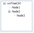
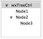
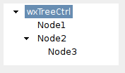
 Control Appearance
 Methods Summary
Default Constructor. |
|
Adds the root node to the tree, returning the new item. |
|
Appends an item to the end of the branch identified by parent, return a new item id. |
|
Sets the state image list. |
|
Clears the currently focused item. |
|
Collapses the given item. |
|
Collapses the root item. |
|
Collapses this item and all of its children, recursively. |
|
Collapses the given item and removes all children. |
|
Creates the tree control. |
|
Deletes the specified item. |
|
Deletes all items in the control. |
|
Deletes all children of the given item (but not the item itself). |
|
Starts editing the label of the given item. |
|
Enable or disable a beep if there is no match for the currently entered text when searching for the item from keyboard. |
|
Can be used to disable the system theme of controls using it by default. |
|
Ends label editing. |
|
Scrolls and/or expands items to ensure that the given item is visible. |
|
Expands the given item. |
|
Expands all items in the tree. |
|
Expands the given item and all its children recursively. |
|
Returns the rectangle bounding the item. If textOnly is |
|
Returns the number of items in the branch. |
|
Returns the number of items in the control. |
|
Returns the edit control being currently used to edit a label. |
|
Returns the first child; call |
|
Returns the first visible item. |
|
Returns the item last clicked or otherwise selected. |
|
Returns the current tree control indentation in |
|
Returns the background colour of the item. |
|
Returns the tree item data associated with the item. |
|
Returns the font of the item label. |
|
Gets the specified item image. |
|
Returns the item’s parent. |
|
Gets the specified item state. |
|
Returns the item label. |
|
Returns the colour of the item label. |
|
Returns the last child of the item (or an invalid tree item if this item has no children). |
|
Returns the next child; call |
|
Returns the next sibling of the specified item; call |
|
Returns the next visible item or an invalid item if this item is the last visible one. |
|
Returns the previous sibling of the specified item; call |
|
Returns the previous visible item or an invalid item if this item is the first visible one. |
|
Returns |
|
Returns the root item for the tree control. |
|
Returns the selection, or an invalid item if there is no selection. |
|
Returns a list of currently selected items in the tree. This function can be called only if the control has the wx.``wx.TR_MULTIPLE`` style. |
|
Returns the current tree control spacing. |
|
Returns the number of state images used by the control. |
|
Returns the state image list (from which application-defined state images are taken). |
|
Returns |
|
Calculates which (if any) item is under the given point, returning the tree item id at this point plus extra information flags. |
|
Inserts an item after a given one (previous). |
|
Returns |
|
Returns |
|
Returns |
|
Returns |
|
Returns |
|
Returns |
|
Override this function in the derived class to change the sort order of the items in the tree control. |
|
Appends an item as the first child of parent, return a new item id. |
|
Scrolls the specified item into view. |
|
Select all the immediate children of the given parent. |
|
Selects the given item. |
|
Sets the currently focused item. |
|
Sets the indentation for the tree control, in |
|
Sets the colour of the item’s background. |
|
Makes item appear in bold font if bold parameter is |
|
Sets the item client data. |
|
Gives the item the visual feedback for Drag’n’Drop actions, which is useful if something is dragged from the outside onto the tree control (as opposed to a DnD operation within the tree control, which already is implemented internally). |
|
Sets the item’s font. |
|
Force appearance of the button next to the item. |
|
Sets the specified item’s image. |
|
Sets the specified item state. |
|
Sets the item label. |
|
Sets the colour of the item’s text. |
|
If |
|
Sets the spacing for the tree control. |
|
Sets the state image list (from which application-defined state images are taken). |
|
Sets the images to use for the application-defined item states. |
|
Sets the mode flags associated with the display of the tree control. |
|
Sorts the children of the given item using |
|
Toggles the given item between collapsed and expanded states. |
|
Toggles the given item between selected and unselected states. |
|
Removes the selection from the currently selected item (if any). |
|
This function either behaves the same as |
|
Unselects the given item. |
 Properties Summary
See |
|
See |
|
See |
|
See |
|
See |
|
See |
|
See |
|
See |
|
See |
|
See |
 Class API
- class wx.TreeCtrl(Control, WithImages)
Possible constructors:
TreeCtrl() -> None

TreeCtrl(parent, id=ID_ANY, pos=DefaultPosition, size=DefaultSize,
         style=TR_DEFAULT_STYLE, validator=DefaultValidator,
         name=TreeCtrlNameStr) -> None
A tree control presents information as a hierarchy, with items that may be expanded to show further items.
Methods
- __init__(self, *args, **kw)
 Overloaded Implementations:
__init__ (self)
Default Constructor.
- Return type:
None
__init__ (self, parent, id=ID_ANY, pos=DefaultPosition, size=DefaultSize, style=TR_DEFAULT_STYLE, validator=DefaultValidator, name=TreeCtrlNameStr)
Constructor, creating and showing a tree control.
- Parameters:
parent (wx.Window) – Parent window. Must not be nullptr.
id (wx.WindowID) – Window identifier. The value
ID_ANYindicates a default value.pos (wx.Point) – Window position. If
wx.DefaultPositionis specified then a default position is chosen.size (wx.Size) – Window size. If
wx.DefaultSizeis specified then the window is sized appropriately.style (long) – Window style. See wx.TreeCtrl.
validator (wx.Validator) – Window validator.
name (string) – Window name.
- Return type:
None
See also
- AddRoot(self, text, image=-1, selImage=-1, data=nullptr)
Adds the root node to the tree, returning the new item.
The image and selImage parameters are an index within the normal image list specifying the image to use for unselected and selected items, respectively. If image > -1 and selImage is -1, the same image is used for both selected and unselected items.
- Parameters:
text (string)
image (int)
selImage (int)
data (TreeItemData)
- Return type:
- AppendItem(self, parent, text, image=-1, selImage=-1, data=nullptr)
Appends an item to the end of the branch identified by parent, return a new item id.
The image and selImage parameters are an index within the normal image list specifying the image to use for unselected and selected items, respectively. If image > -1 and selImage is -1, the same image is used for both selected and unselected items.
- Parameters:
parent (wx.TreeItemId)
text (string)
image (int)
selImage (int)
data (TreeItemData)
- Return type:
- AssignStateImageList(self, imageList)
Sets the state image list.
Image list assigned with this method will be automatically deleted by wx.TreeCtrl as appropriate (i.e. it takes ownership of the list).
- Parameters:
imageList (wx.ImageList)
- Return type:
None
Note
Prefer using
SetStateImagesin the new code.See also
- ClearFocusedItem(self)
Clears the currently focused item.
- Return type:
None
Added in version 2.9.1.
- Collapse(self, item)
Collapses the given item.
- Parameters:
item (wx.TreeItemId)
- Return type:
None
- CollapseAllChildren(self, item)
Collapses this item and all of its children, recursively.
- Parameters:
item (wx.TreeItemId)
- Return type:
None
See also
- CollapseAndReset(self, item)
Collapses the given item and removes all children.
- Parameters:
item (wx.TreeItemId)
- Return type:
None
- Create(self, parent, id=ID_ANY, pos=DefaultPosition, size=DefaultSize, style=TR_DEFAULT_STYLE, validator=DefaultValidator, name=TreeCtrlNameStr)
Creates the tree control.
See
TreeCtrl.__init__for further details.- Parameters:
parent (wx.Window)
id (wx.WindowID)
pos (wx.Point)
size (wx.Size)
style (long)
validator (wx.Validator)
name (string)
- Return type:
bool
- Delete(self, item)
Deletes the specified item.
A
EVT_TREE_DELETE_ITEMevent will be generated.This function may cause a subsequent call to
GetNextChildto fail.- Parameters:
item (wx.TreeItemId)
- Return type:
None
- DeleteAllItems(self)
Deletes all items in the control.
This function generates
wxEVT_TREE_DELETE_ITEMevents for each item being deleted, including the root one if it is shown, i.e. unlesswx.TR_HIDE_ROOTstyle is used.- Return type:
None
- DeleteChildren(self, item)
Deletes all children of the given item (but not the item itself).
A
wxEVT_TREE_DELETE_ITEMevent will be generated for every item being deleted.If you have called
SetItemHasChildren, you may need to call it again sinceDeleteChildrendoes not automatically clear the setting.- Parameters:
item (wx.TreeItemId)
- Return type:
None
- EditLabel(self, item)
Starts editing the label of the given item.
This function generates a
EVT_TREE_BEGIN_LABEL_EDITevent which can be vetoed to prevent the editing from starting.If it does start, a text control, which can be retrieved using
GetEditControl, allowing the user to edit the label interactively is shown. In wxMSW, this text control is created using textCtrlClass, however this parameter is currently ignored in the other ports where a plain wx.TextCtrl is always used.When the editing ends,
EVT_TREE_END_LABEL_EDITevent is sent and this event can be vetoed as well to prevent the label from changing. Note that this event is sent both when the user accepts (e.g. by pressing Enter) or cancels (e.g. by pressing Escape) and its handler can usewx.TreeEvent.IsEditCancelledto distinguish between these situations.- Parameters:
item (wx.TreeItemId)
- Return type:
See also
- EnableBellOnNoMatch(self, on=True)
Enable or disable a beep if there is no match for the currently entered text when searching for the item from keyboard.
The default is to not beep in this case except in wxMSW where the beep is always generated by the native control and cannot be disabled, i.e. calls to this function do nothing there.
- Parameters:
on (bool)
- Return type:
None
Added in version 2.9.5.
- EnableSystemTheme(self, enable=True)
Can be used to disable the system theme of controls using it by default.
On Windows there an alternative theme available for the list and list-like controls since Windows Vista. This theme is used by Windows Explorer list and tree view and so is arguably more familiar to the users than the standard appearance of these controls. This class automatically uses the new theme, but if that is not desired then this method can be used to turn it off.
Please note that this method should be called before the widget is actually created, using the 2-phase create pattern. Something like this:
# This creates the object, but not the window
widget = wx.TreeCtrl()

# Disable the system theme
widget.EnableSystemTheme(False)

# Now create the window
widget.Create(parent, wx.``wx.ID_ANY``)
This method has no effect on other platorms
- Parameters:
enable (bool)
- Return type:
None
- EndEditLabel(self, item, discardChanges=False)
Ends label editing.
If cancelEdit is
True, the edit will be cancelled.- Parameters:
item (wx.TreeItemId)
discardChanges (bool)
- Return type:
None
Note
This function is currently supported under Windows only.
See also
- EnsureVisible(self, item)
Scrolls and/or expands items to ensure that the given item is visible.
This method can be used, and will work, even while the window is frozen (see
wx.Window.Freeze).- Parameters:
item (wx.TreeItemId)
- Return type:
None
- Expand(self, item)
Expands the given item.
- Parameters:
item (wx.TreeItemId)
- Return type:
None
- ExpandAll(self)
Expands all items in the tree.
- Return type:
None
- ExpandAllChildren(self, item)
Expands the given item and all its children recursively.
- Parameters:
item (wx.TreeItemId)
- Return type:
None
- GetBoundingRect(self, item, textOnly=False)
Returns the rectangle bounding the item. If textOnly is
True, only the rectangle around the item’s label will be returned, otherwise the item’s image is also taken into account. The return value may be None if the rectangle was not successfully retrieved, such as if the item is currently not visible.- Return type:
Any
- GetChildrenCount(self, item, recursively=True)
Returns the number of items in the branch.
If recursively is
True, returns the total number of descendants, otherwise only one level of children is counted.- Parameters:
item (wx.TreeItemId)
recursively (bool)
- Return type:
int
- static GetClassDefaultAttributes(variant=WINDOW_VARIANT_NORMAL)
- Parameters:
variant (WindowVariant)
- Return type:
- GetCount(self)
Returns the number of items in the control.
- Return type:
int
- GetEditControl(self)
Returns the edit control being currently used to edit a label.
Returns nullptr if no label is being edited.
- Return type:
Note
This is currently only implemented for wxMSW.
- GetFirstChild(self, item)
Returns the first child; call
GetNextChildfor the next child.For this enumeration function you must pass in a ‘cookie’ parameter which is opaque for the application but is necessary for the library to make these functions reentrant (i.e. allow more than one enumeration on one and the same object simultaneously). The cookie passed to
GetFirstChildandGetNextChildshould be the same variable.Returns an invalid tree item (i.e.
wx.TreeItemId.IsOkreturnsFalse) if there are no further children.
- GetFirstVisibleItem(self)
Returns the first visible item.
- Return type:
- GetFocusedItem(self)
Returns the item last clicked or otherwise selected.
Unlike
GetSelection, it can be used whether or not the control has theTR_MULTIPLEstyle.- Return type:
Added in version 2.9.1.
- GetIndent(self)
Returns the current tree control indentation in
DPIindependent pixels.- Return type:
int
- GetItemBackgroundColour(self, item)
Returns the background colour of the item.
- Parameters:
item (wx.TreeItemId)
- Return type:
- GetItemData(self, item)
Returns the tree item data associated with the item.
- GetItemFont(self, item)
Returns the font of the item label.
If the font hadn’t been explicitly set for the specified item with
SetItemFont, returns an invalidwx.NullFontfont.GetFontcan be used to retrieve the global tree control font used for the items without any specific font.- Parameters:
item (wx.TreeItemId)
- Return type:
- GetItemImage(self, item, which=TreeItemIcon_Normal)
Gets the specified item image.
The value of which may be:
wx.TreeItemIcon_Normal: to get the normal item image.wx.TreeItemIcon_Selected: to get the selected item image (i.e. the image which is shown when the item is currently selected).wx.TreeItemIcon_Expanded: to get the expanded image (this only makes sense for items which have children - then this image is shown when the item is expanded and the normal image is shown when it is collapsed).wx.TreeItemIcon_SelectedExpanded: to get the selected expanded image (which is shown when an expanded item is currently selected).
- Parameters:
item (wx.TreeItemId)
which (TreeItemIcon)
- Return type:
int
- GetItemParent(self, item)
Returns the item’s parent.
- Parameters:
item (wx.TreeItemId)
- Return type:
- GetItemState(self, item)
Gets the specified item state.
- Parameters:
item (wx.TreeItemId)
- Return type:
int
- GetItemText(self, item)
Returns the item label.
- Parameters:
item (wx.TreeItemId)
- Return type:
str
- GetItemTextColour(self, item)
Returns the colour of the item label.
- Parameters:
item (wx.TreeItemId)
- Return type:
- GetLastChild(self, item)
Returns the last child of the item (or an invalid tree item if this item has no children).
- Parameters:
item (wx.TreeItemId)
- Return type:
See also
- GetNextChild(self, item, cookie)
Returns the next child; call
GetFirstChildfor the first child.For this enumeration function you must pass in a ‘cookie’ parameter which is opaque for the application but is necessary for the library to make these functions reentrant (i.e. allow more than one enumeration on one and the same object simultaneously). The cookie passed to
GetFirstChildandGetNextChildshould be the same.Returns an invalid tree item if there are no further children.
- GetNextSibling(self, item)
Returns the next sibling of the specified item; call
GetPrevSiblingfor the previous sibling.Returns an invalid tree item if there are no further siblings.
- Parameters:
item (wx.TreeItemId)
- Return type:
See also
- GetNextVisible(self, item)
Returns the next visible item or an invalid item if this item is the last visible one.
- Parameters:
item (wx.TreeItemId)
- Return type:
Note
The item itself must be visible.
- GetPrevSibling(self, item)
Returns the previous sibling of the specified item; call
GetNextSiblingfor the next sibling.Returns an invalid tree item if there are no further children.
- Parameters:
item (wx.TreeItemId)
- Return type:
See also
- GetPrevVisible(self, item)
Returns the previous visible item or an invalid item if this item is the first visible one.
- Parameters:
item (wx.TreeItemId)
- Return type:
Note
The item itself must be visible.
- GetQuickBestSize(self)
Returns
Trueif the control will use a quick calculation for the best size, looking only at the first and last items.The default is
False.- Return type:
bool
See also
- GetRootItem(self)
Returns the root item for the tree control.
- Return type:
- GetSelection(self)
Returns the selection, or an invalid item if there is no selection.
This function only works with the controls without
TR_MULTIPLEstyle, useGetSelectionsfor the controls which do have this style or, if a single item is wanted, useGetFocusedItem.- Return type:
- GetSelections(self)
Returns a list of currently selected items in the tree. This function can be called only if the control has the wx.``wx.TR_MULTIPLE`` style.
- Return type:
Any
- GetSpacing(self)
Returns the current tree control spacing.
This is the number of horizontal DIPs (
DPIindependent pixels) between the buttons and the state images.- Return type:
int
- GetStateImageCount(self)
Returns the number of state images used by the control.
Returns the number of images passed to the last call to
SetStateImagesor 0 if it had been never called.- Return type:
int
Added in version 4.3/wxWidgets-3.3.0.
See also
- GetStateImageList(self)
Returns the state image list (from which application-defined state images are taken).
- Return type:
See also
- HasStateImages(self)
Returns
Trueif the control uses any state images.This is equivalent to comparing
GetStateImageCountreturn value with 0 but more clear.- Return type:
bool
Added in version 4.3/wxWidgets-3.3.0.
See also
- HitTest(self, point, flags)
Calculates which (if any) item is under the given point, returning the tree item id at this point plus extra information flags.
flags is a bitlist of the following:
TREE_HITTEST_ABOVE:Above the client area.TREE_HITTEST_BELOW:Below the client area.TREE_HITTEST_NOWHERE:In the client area but below the last item.TREE_HITTEST_ONITEMBUTTON:On the button associated with an item.TREE_HITTEST_ONITEMICON:On the bitmap associated with an item.TREE_HITTEST_ONITEMINDENT:In the indentation associated with an item.TREE_HITTEST_ONITEMLABEL:On the label (string) associated with an item.TREE_HITTEST_ONITEMRIGHT:In the area to the right of an item.TREE_HITTEST_ONITEMSTATEICON:On the state icon for a tree view item that is in a user-defined state.TREE_HITTEST_TOLEFT:To the right of the client area.TREE_HITTEST_TORIGHT:To the left of the client area.
- InsertItem(self, *args, **kw)
- Overloaded Implementations:
InsertItem (self, parent, previous, text, image=-1, selImage=-1, data=nullptr)
Inserts an item after a given one (previous).
The image and selImage parameters are an index within the normal image list specifying the image to use for unselected and selected items, respectively. If image > -1 and selImage is -1, the same image is used for both selected and unselected items.
- Parameters:
parent (wx.TreeItemId)
previous (wx.TreeItemId)
text (string)
image (int)
selImage (int)
data (TreeItemData)
- Return type:
InsertItem (self, parent, pos, text, image=-1, selImage=-1, data=nullptr)
Inserts an item before one identified by its position (pos).
pos must be less than or equal to the number of children.
The image and selImage parameters are an index within the normal image list specifying the image to use for unselected and selected items, respectively. If image > -1 and selImage is -1, the same image is used for both selected and unselected items.
- Parameters:
parent (wx.TreeItemId)
pos (int)
text (string)
image (int)
selImage (int)
data (TreeItemData)
- Return type:
- IsBold(self, item)
Returns
Trueif the given item is in bold state.- Parameters:
item (wx.TreeItemId)
- Return type:
bool
See also
- IsEmpty(self)
Returns
Trueif the control is empty (i.e. has no items, even no root one).- Return type:
bool
- IsExpanded(self, item)
Returns
Trueif the item is expanded (only makes sense if it has children).- Parameters:
item (wx.TreeItemId)
- Return type:
bool
- IsSelected(self, item)
Returns
Trueif the item is selected.- Parameters:
item (wx.TreeItemId)
- Return type:
bool
- IsVisible(self, item)
Returns
Trueif the item is visible on the screen.- Parameters:
item (wx.TreeItemId)
- Return type:
bool
- ItemHasChildren(self, item)
Returns
Trueif the item has children.- Parameters:
item (wx.TreeItemId)
- Return type:
bool
- OnCompareItems(self, item1, item2)
Override this function in the derived class to change the sort order of the items in the tree control.
The function should return a negative, zero or positive value if the first item is less than, equal to or greater than the second one.
Please note that you must use
RTTImacrosDECLARE_DYNAMIC_CLASSandIMPLEMENT_DYNAMIC_CLASSif you override this function because otherwise the base class considers that it is not overridden and uses the default comparison, i.e. sorts the items alphabetically, which allows it optimize away the calls to the virtual function completely.- Parameters:
item1 (wx.TreeItemId)
item2 (wx.TreeItemId)
- Return type:
int
See also
- PrependItem(self, parent, text, image=-1, selImage=-1, data=nullptr)
Appends an item as the first child of parent, return a new item id.
The image and selImage parameters are an index within the normal image list specifying the image to use for unselected and selected items, respectively. If image > -1 and selImage is -1, the same image is used for both selected and unselected items.
- Parameters:
parent (wx.TreeItemId)
text (string)
image (int)
selImage (int)
data (TreeItemData)
- Return type:
- ScrollTo(self, item)
Scrolls the specified item into view.
Note that this method doesn’t work while the window is frozen (See
wx.Window.Freeze), at least under MSW.- Parameters:
item (wx.TreeItemId)
- Return type:
None
See also
- SelectChildren(self, parent)
Select all the immediate children of the given parent.
This function can be used with multiselection controls only.
- Parameters:
parent (wx.TreeItemId)
- Return type:
None
Added in version 2.9.1.
- SelectItem(self, item, select=True)
Selects the given item.
In multiple selection controls, can be also used to deselect a currently selected item if the value of
selectisFalse.Notice that calling this method will generate
wxEVT_TREE_SEL_CHANGINGandwxEVT_TREE_SEL_CHANGEDevents and that the change could be vetoed by the former event handler.- Parameters:
item (wx.TreeItemId)
select (bool)
- Return type:
None
- SetFocusedItem(self, item)
Sets the currently focused item.
- Parameters:
item (wx.TreeItemId) – The item to make the current one. It must be valid.
- Return type:
None
Added in version 2.9.1.
- SetIndent(self, indent)
Sets the indentation for the tree control, in
DIP(DPIindependent pixels).- Parameters:
indent (int)
- Return type:
None
- SetItemBackgroundColour(self, item, col)
Sets the colour of the item’s background.
- Parameters:
item (wx.TreeItemId)
col (wx.Colour)
- Return type:
None
- SetItemBold(self, item, bold=True)
Makes item appear in bold font if bold parameter is
Trueor resets it to the normal state.- Parameters:
item (wx.TreeItemId)
bold (bool)
- Return type:
None
See also
- SetItemData(self, item, data)
Sets the item client data.
Notice that the client data previously associated with the item (if any) is not freed by this function and so calling this function multiple times for the same item will result in memory leaks unless you delete the old item data pointer yourself.
- SetItemDropHighlight(self, item, highlight=True)
Gives the item the visual feedback for Drag’n’Drop actions, which is useful if something is dragged from the outside onto the tree control (as opposed to a DnD operation within the tree control, which already is implemented internally).
- Parameters:
item (wx.TreeItemId)
highlight (bool)
- Return type:
None
- SetItemFont(self, item, font)
Sets the item’s font.
All items in the tree should have the same height to avoid text clipping, so the fonts height should be the same for all of them, although font attributes may vary.
- Parameters:
item (wx.TreeItemId)
font (wx.Font)
- Return type:
None
See also
- SetItemHasChildren(self, item, hasChildren=True)
Force appearance of the button next to the item.
This is useful to allow the user to expand the items which don’t have any children now, but instead adding them only when needed, thus minimizing memory usage and loading time.
- Parameters:
item (wx.TreeItemId)
hasChildren (bool)
- Return type:
None
- SetItemImage(self, item, image, which=TreeItemIcon_Normal)
Sets the specified item’s image.
See
GetItemImagefor the description of the which parameter.- Parameters:
item (wx.TreeItemId)
image (int)
which (TreeItemIcon)
- Return type:
None
- SetItemState(self, item, state)
Sets the specified item state.
The value of state may be an index into the state image list, or one of the special values:
TREE_ITEMSTATE_NONE:to disable the item state (the state image will be not displayed).TREE_ITEMSTATE_NEXT:to set the next item state.TREE_ITEMSTATE_PREV:to set the previous item state.
- Parameters:
item (wx.TreeItemId)
state (int)
- Return type:
None
- SetItemText(self, item, text)
Sets the item label.
- Parameters:
item (wx.TreeItemId)
text (string)
- Return type:
None
- SetItemTextColour(self, item, col)
Sets the colour of the item’s text.
- Parameters:
item (wx.TreeItemId)
col (wx.Colour)
- Return type:
None
- SetQuickBestSize(self, quickBestSize)
If
Trueis passed, specifies that the control will use a quick calculation for the best size, looking only at the first and last items.Otherwise, it will look at all items. The default is
False.- Parameters:
quickBestSize (bool)
- Return type:
None
See also
- SetSpacing(self, spacing)
Sets the spacing for the tree control.
Spacing is the number of horizontal DIPs (
DPIindependent pixels) between the buttons and the state images. This has no effect under wxMSW.- Parameters:
spacing (int)
- Return type:
None
- SetStateImageList(self, imageList)
Sets the state image list (from which application-defined state images are taken).
Image list assigned with this method will not be deleted by wx.TreeCtrl’s destructor, you must delete it yourself.
- Parameters:
imageList (wx.ImageList)
- Return type:
None
Note
Prefer using
SetStateImagesin the new code.See also
- SetStateImages(self, images)
Sets the images to use for the application-defined item states.
This function takes a vector of wx.BitmapBundle objects which can specify multiple versions of the same icon for different display resolutions for each state. If the vector is empty, no state images are shown.
- Parameters:
images (Vector)
- Return type:
None
Added in version 4.3/wxWidgets-3.3.0.
See also
- SetWindowStyle(self, styles)
Sets the mode flags associated with the display of the tree control.
The new mode takes effect immediately.
- Parameters:
styles (long)
- Return type:
None
Note
Generic only; MSW ignores changes.
- SortChildren(self, item)
Sorts the children of the given item using
OnCompareItems.You should override that method to change the sort order (the default is ascending case-sensitive alphabetical order).
- Parameters:
item (wx.TreeItemId)
- Return type:
None
See also
TreeItemData ,
OnCompareItems
- Toggle(self, item)
Toggles the given item between collapsed and expanded states.
- Parameters:
item (wx.TreeItemId)
- Return type:
None
- ToggleItemSelection(self, item)
Toggles the given item between selected and unselected states.
For multiselection controls only.
- Parameters:
item (wx.TreeItemId)
- Return type:
None
- Unselect(self)
Removes the selection from the currently selected item (if any).
- Return type:
None
- UnselectAll(self)
This function either behaves the same as
Unselectif the control doesn’t haveTR_MULTIPLEstyle, or removes the selection from all items if it does have this style.- Return type:
None
- UnselectItem(self, item)
Unselects the given item.
This works in multiselection controls only.
- Parameters:
item (wx.TreeItemId)
- Return type:
None
Properties
- BoundingRect
See
GetBoundingRect
- EditControl
See
GetEditControl
- FirstVisibleItem
- FocusedItem
See
GetFocusedItemandSetFocusedItem
- QuickBestSize
See
GetQuickBestSizeandSetQuickBestSize
- RootItem
See
GetRootItem
- Selection
See
GetSelection
- Selections
See
GetSelections
- Spacing
See
GetSpacingandSetSpacing
- StateImageCount
- StateImageList
See
GetStateImageListandSetStateImageList
