
 wx.adv.BitmapComboBox
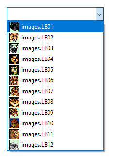
A combobox that displays bitmap in front of the list items.
It currently only allows using bitmaps of one size, and resizes itself so that a bitmap can be shown next to the text field.
 Window Styles
This class supports the following styles:
wx.CB_READONLY: Creates a combobox without a text editor. On some platforms the control may appear very different when this style is used.wx.CB_SORT: Sorts the entries in the list alphabetically.wx.TE_PROCESS_ENTER: The control will generate the event wxEVT_TEXT_ENTER (otherwise pressing Enter key is either processed internally by the control or used for navigation between dialog controls). Windows only.
 Events Emitted by this Class
Handlers bound for the following event types will receive a wx.CommandEvent parameter.
EVT_COMBOBOX: Process a
wxEVT_COMBOBOXevent, when an item on the list is selected.EVT_TEXT: Process a
wxEVT_TEXTevent, when the combobox text changes.EVT_TEXT_ENTER: Process a
wxEVT_TEXT_ENTERevent, whenRETURNis pressed in the combobox.
Note
While wx.adv.BitmapComboBox contains the wx.ComboBox API, but it might not actually be derived from that class. In fact, if the platform does not have a native implementation, wx.adv.BitmapComboBox will inherit from wx.adv.OwnerDrawnComboBox. You can determine if the implementation is generic by checking whether GENERIC_BITMAPCOMBOBOX is defined. Currently wx.adv.BitmapComboBox is implemented natively for MSW and GTK+.
See also
wx.ComboBox, wx.Choice, wx.adv.OwnerDrawnComboBox, wx.CommandEvent
Todo
create CB_PROCESS_ENTER rather than reusing wx.TE_PROCESS_ENTER!
 Class Hierarchy

 Control Appearance
 Methods Summary
Default constructor. |
|
Adds the item to the end of the combo box. |
|
Creates the combobox for two-step construction. |
|
Hides the list box portion of the combo box. |
|
Finds an item whose label matches the given string. |
|
Returns the size of the bitmaps used in the combo box. |
|
Returns the number of items in the control. |
|
Same as |
|
Returns the bitmap of the item with the given index. |
|
Returns the index of the selected item or |
|
Gets the current selection span. |
|
Returns the label of the item with the given index. |
|
Inserts the item into the list before pos. |
|
Returns |
|
Returns |
|
Shows the list box portion of the combo box. |
|
Sets the bitmap for the given item. |
|
Same as |
|
Changes the text of the specified combobox item. |
|
Same as |
|
Sets the text for the combobox text field. |
 Properties Summary
See |
|
See |
|
See |
 Class API
- class wx.adv.BitmapComboBox(Control, TextEntry, ItemContainer)
Possible constructors:
BitmapComboBox() -> None

BitmapComboBox(parent, id=ID_ANY, value='', pos=DefaultPosition,
               size=DefaultSize, choices=[], style=0, validator=DefaultValidator,
               name=BitmapComboBoxNameStr) -> None
A combobox that displays bitmap in front of the list items.
Methods
- __init__(self, *args, **kw)
 Overloaded Implementations:
__init__ (self)
Default constructor.
- Return type:
None
__init__ (self, parent, id=ID_ANY, value=’’, pos=DefaultPosition, size=DefaultSize, choices=[], style=0, validator=DefaultValidator, name=BitmapComboBoxNameStr)
Constructor, creating and showing a combobox.
- Parameters:
parent (wx.Window) – Parent window. Must not be nullptr.
id (wx.WindowID) – Window identifier. The value
wx.ID_ANYindicates a default value.value (string) – Initial selection string. An empty string indicates no selection.
pos (wx.Point) – Initial position.
size (wx.Size) – Initial size.
choices (list of strings) – A list of strings with which to initialise the control.
style (long) – The window style, see
CB_flags.validator (wx.Validator) – Validator which can be used for additional data checks.
name (string) – Control name.
- Return type:
None
See also
- Append(self, *args, **kw)
- Overloaded Implementations:
Append (self, item, bitmap=BitmapBundle())
Adds the item to the end of the combo box.
- Parameters:
item (string)
bitmap (wx.BitmapBundle)
- Return type:
int
Append (self, item, bitmap, clientData)
Adds the item to the end of the combo box, associating the given typed client data pointer clientData with the item.
- Parameters:
item (string)
bitmap (wx.BitmapBundle)
clientData (ClientData)
- Return type:
int
- Create(self, parent, id=ID_ANY, value='', pos=DefaultPosition, size=DefaultSize, choices=[], style=0, validator=DefaultValidator, name=BitmapComboBoxNameStr)
Creates the combobox for two-step construction.
- Parameters:
parent (wx.Window)
id (wx.WindowID)
value (string)
pos (wx.Point)
size (wx.Size)
choices (list of strings)
style (long)
validator (wx.Validator)
name (string)
- Return type:
bool
- Dismiss(self)
Hides the list box portion of the combo box.
Currently this method is implemented in wxMSW, wxGTK and OSX/Cocoa.
Notice that calling this function will generate a
wxEVT_COMBOBOX_CLOSEUPevent except under wxOSX where generation of this event is not supported at all.- Return type:
None
Added in version 2.9.1.
- FindString(self, string, caseSensitive=False)
Finds an item whose label matches the given string.
- Parameters:
string (string) – String to find.
caseSensitive (bool) – Whether search is case sensitive (default is not).
- Return type:
int
- Returns:
The zero-based position of the item, or
wx.NOT_FOUNDif the string was not found.
- GetBitmapSize(self)
Returns the size of the bitmaps used in the combo box.
If the combo box is empty, then
wx.DefaultSizeis returned.- Return type:
Size
- static GetClassDefaultAttributes(variant=WINDOW_VARIANT_NORMAL)
- Parameters:
variant (WindowVariant)
- Return type:
VisualAttributes
- GetInsertionPoint(self)
Same as
wx.TextEntry.GetInsertionPoint.- Return type:
int
Note
Under wxMSW, this function always returns 0 if the combobox doesn’t have the focus.
- GetItemBitmap(self, n)
Returns the bitmap of the item with the given index.
- Parameters:
n (int)
- Return type:
Bitmap
- GetSelection(self)
Returns the index of the selected item or
NOT_FOUNDif no item is selected.- Return type:
int
- Returns:
The position of the current selection.
See also
- GetTextSelection(self)
Gets the current selection span.
If the returned values are equal, there was no selection. Please note that the indices returned may be used with the other wx.TextCtrl methods but don’t necessarily represent the correct indices into the string returned by
GetValuefor multiline controls under Windows (at least,) you should useGetStringSelectionto get the selected text.- Return type:
Tuple[int, int]
- GetString(self, n)
Returns the label of the item with the given index.
The index must be valid, i.e. less than the value returned by
GetCount, otherwise an assert is triggered. Notably, this function can’t be called if the control is empty.- Parameters:
n (int) – The zero-based index.
- Return type:
str
- Returns:
The label of the item.
- Insert(self, *args, **kw)
- Overloaded Implementations:
Insert (self, item, bitmap, pos)
Inserts the item into the list before pos.
Not valid for
CB_SORTstyle, useAppendinstead.- Parameters:
item (string)
bitmap (wx.BitmapBundle)
pos (int)
- Return type:
int
Insert (self, item, bitmap, pos, clientData)
Inserts the item into the list before pos, associating the given typed client data pointer with the item.
Not valid for
CB_SORTstyle, useAppendinstead.- Parameters:
item (string)
bitmap (wx.BitmapBundle)
pos (int)
clientData (ClientData)
- Return type:
int
- IsListEmpty(self)
Returns
Trueif the list of combobox choices is empty.Use this method instead of (not available in this class)
IsEmptyto test if the list of items is empty.- Return type:
bool
Added in version 2.9.3.
- IsTextEmpty(self)
Returns
Trueif the text of the combobox is empty.Use this method instead of (not available in this class)
IsEmptyto test if the text currently entered into the combobox is empty.- Return type:
bool
Added in version 2.9.3.
- Popup(self)
Shows the list box portion of the combo box.
Currently this method is implemented in wxMSW, wxGTK and OSX/Cocoa.
Notice that calling this function will generate a
wxEVT_COMBOBOX_DROPDOWNevent except under wxOSX where generation of this event is not supported at all.- Return type:
None
Added in version 2.9.1.
- SetItemBitmap(self, n, bitmap)
Sets the bitmap for the given item.
- Parameters:
n (int)
bitmap (wx.BitmapBundle)
- Return type:
None
- SetSelection(self, *args, **kw)
- Overloaded Implementations:
SetSelection (self, from_, to_)
Same as
wx.TextEntry.SetSelection.- Parameters:
from_ (long)
to_ (long)
- Return type:
None
SetSelection (self, n)
Sets the selection to the given item n or removes the selection entirely if n ==
NOT_FOUND.Note that this does not cause any command events to be emitted nor does it deselect any other items in the controls which support multiple selections.
- Parameters:
n (int) – The string position to select, starting from zero.
- Return type:
None
See also
SetString,SetStringSelection
- SetString(self, n, text)
Changes the text of the specified combobox item.
Notice that if the item is the currently selected one, i.e. if its text is displayed in the text part of the combobox, then the text is also replaced with the new text.
- Parameters:
n (int)
text (string)
- Return type:
None
- SetTextSelection(self, from_, to_)
Same as
wx.TextEntry.SetSelection.- Parameters:
from_ (long)
to_ (long)
- Return type:
None
- SetValue(self, text)
Sets the text for the combobox text field.
For normal, editable comboboxes with a text entry field calling this method will generate a
wxEVT_TEXTevent, consistently withwx.TextEntry.SetValuebehaviour, usewx.TextEntry.ChangeValueif this is undesirable.For controls with
CB_READONLYstyle the method behaves somewhat differently: the string must be in the combobox choices list (the check for this is case-insensitive) andwxEVT_TEXTis not generated in this case.- Parameters:
text (string) – The text to set.
- Return type:
None
Properties
- BitmapSize
See
GetBitmapSize
- InsertionPoint
- Selection
See
GetSelectionandSetSelection
