
 wx.dataview.DataViewCtrl
wx.dataview.DataViewCtrl is a control to display data either in a tree like fashion or in a tabular form or both.
If you only need to display a simple tree structure with an API more like the older wx.TreeCtrl class, then the specialized wx.dataview.DataViewTreeCtrl can be used. Likewise, if you only want to display simple table structure you can use the specialized wx.dataview.DataViewListCtrl class. Both wx.dataview.DataViewTreeCtrl and wx.dataview.DataViewListCtrl can be used without defining your own wx.dataview.DataViewModel.
A wx.dataview.DataViewItem is used to represent a (visible) item in the control.
Unlike wx.ListCtrl, wx.dataview.DataViewCtrl doesn’t get its data from the user through virtual functions or by setting it directly. Instead you need to write your own wx.dataview.DataViewModel and associate it with this control. Then you need to add a number of wx.dataview.DataViewColumn to this control to define what each column shall display. Each wx.dataview.DataViewColumn in turn owns 1 instance of a wx.dataview.DataViewRenderer to render its cells.
A number of standard renderers for rendering text, dates, images, toggle, a progress bar etc. are provided. Additionally, the user can write custom renderers deriving from wx.dataview.DataViewCustomRenderer for displaying anything.
All data transfer from the control to the model and the user code is done through Variant which can be extended to support more data formats as necessary. Accordingly, all type information uses the strings returned from Variant.GetType .
This control supports single column sorting. On platforms using the generic implementation, sorting multiple columns at once is also available. (This currently excludes wxGTK and wxOSX, which use native implementations.) Multi-column sorting must be explicitly enabled using AllowMultiColumnSort. Calling this will also indicate whether this feature is supported, as it changes the default behaviour of right clicking the column header to add or remove it to the set of columns used for sorting. If this behaviour is not appropriate, you may handle wxEVT_DATAVIEW_COLUMN_HEADER_RIGHT_CLICK event yourself to prevent it from happening. In this case you would presumably call ToggleSortByColumn from some other event handler to still allow the user to configure sort order somehow.
 Window Styles
This class supports the following styles:
wx.dataview.DV_SINGLE: Single selection mode. This is the default.wx.dataview.DV_MULTIPLE: Multiple selection mode.wx.dataview.DV_ROW_LINES: Use alternating colours for odd and even rows.wx.dataview.DV_HORIZ_RULES: Display the separator lines between rows.wx.dataview.DV_VERT_RULES: Display the separator lines between columns.wx.dataview.DV_VARIABLE_LINE_HEIGHT: Allow variable line heights. This can be inefficient when displaying large number of items.wx.dataview.DV_NO_HEADER: Do not show column headers (which are shown by default).
 Events Emitted by this Class
Handlers bound for the following event types will receive a wx.dataview.DataViewEvent parameter.
EVT_DATAVIEW_SELECTION_CHANGED: Process a
wxEVT_DATAVIEW_SELECTION_CHANGEDevent.EVT_DATAVIEW_ITEM_ACTIVATED: Process a
wxEVT_DATAVIEW_ITEM_ACTIVATEDevent. This event is triggered by double clicking an item or pressing some special key (usually “Enter”) when it is focused.EVT_DATAVIEW_ITEM_START_EDITING: Process a
wxEVT_DATAVIEW_ITEM_START_EDITINGevent. This event can be vetoed in order to prevent editing on an item by item basis.EVT_DATAVIEW_ITEM_EDITING_STARTED: Process a
wxEVT_DATAVIEW_ITEM_EDITING_STARTEDevent.EVT_DATAVIEW_ITEM_EDITING_DONE: Process a
wxEVT_DATAVIEW_ITEM_EDITING_DONEevent.EVT_DATAVIEW_ITEM_COLLAPSING: Process a
wxEVT_DATAVIEW_ITEM_COLLAPSINGevent.EVT_DATAVIEW_ITEM_COLLAPSED: Process a
wxEVT_DATAVIEW_ITEM_COLLAPSEDevent.EVT_DATAVIEW_ITEM_EXPANDING: Process a
wxEVT_DATAVIEW_ITEM_EXPANDINGevent.EVT_DATAVIEW_ITEM_EXPANDED: Process a
wxEVT_DATAVIEW_ITEM_EXPANDEDevent.EVT_DATAVIEW_ITEM_VALUE_CHANGED: Process a
wxEVT_DATAVIEW_ITEM_VALUE_CHANGEDevent.EVT_DATAVIEW_ITEM_CONTEXT_MENU: Process a
wxEVT_DATAVIEW_ITEM_CONTEXT_MENUevent generated when the user right clicks inside the control. Notice that this menu is generated even if the click didn’t occur on any valid item, in this casewx.dataview.DataViewEvent.GetItemsimply returns an invalid item.EVT_DATAVIEW_COLUMN_HEADER_CLICK: Process a
wxEVT_DATAVIEW_COLUMN_HEADER_CLICKevent.EVT_DATAVIEW_COLUMN_HEADER_RIGHT_CLICK: Process a
wxEVT_DATAVIEW_COLUMN_HEADER_RIGHT_CLICKevent.EVT_DATAVIEW_COLUMN_SORTED: Process a
wxEVT_DATAVIEW_COLUMN_SORTEDevent.EVT_DATAVIEW_COLUMN_REORDERED: Process a
wxEVT_DATAVIEW_COLUMN_REORDEREDevent.EVT_DATAVIEW_ITEM_BEGIN_DRAG: Process a
wxEVT_DATAVIEW_ITEM_BEGIN_DRAGevent which is generated when the user starts dragging a valid item. This event must be processed andwx.dataview.DataViewEvent.SetDataObjectmust be called to actually start dragging the item.EVT_DATAVIEW_ITEM_DROP_POSSIBLE: Process a
wxEVT_DATAVIEW_ITEM_DROP_POSSIBLEevent.EVT_DATAVIEW_ITEM_DROP: Process a
wxEVT_DATAVIEW_ITEM_DROPevent.
- Notice that this control doesn’t allow to process generic mouse events such as
wxEVT_LEFT_DOWNin all ports (notably it doesn’t work in wxGTK). If you need to handle any mouse events not covered by the ones above, consider using a custom renderer for the cells that must handle them.
Note
Under wxMSW this control uses SystemThemedControl for an explorer style appearance by default since wxWidgets 3.1.0. If this is not desired, you can call SystemThemedControl.EnableSystemTheme with false argument to disable this.
 Class Hierarchy

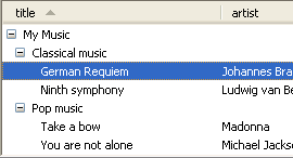
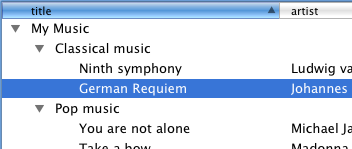
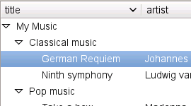
 Control Appearance
 Known Subclasses
wx.dataview.DataViewListCtrl, wx.dataview.DataViewTreeCtrl
 Methods Summary
Default Constructor. |
|
Call to allow using multiple columns for sorting. |
|
Appends a column for rendering a bitmap. |
|
Appends a wx.dataview.DataViewColumn to the control. |
|
Appends a column for rendering a date. |
|
Appends a column for rendering text with an icon. |
|
Appends a column for rendering a progress indicator. |
|
Appends a column for rendering text. |
|
Appends a column for rendering a toggle. |
|
Associates a wx.dataview.DataViewModel with the control. |
|
Associates a |
|
Removes all columns. |
|
Collapses the item. |
|
Create the control. |
|
Deletes given column. |
|
Programmatically starts editing given cell of item. |
|
Enable drag operations using the given format. |
|
Enable drop operations using the given format. |
|
Enable drop operations using any of the specified formats. |
|
Can be used to disable the system theme of controls using it by default. |
|
Call this to ensure that the given item is visible. |
|
Expands the item. |
|
Expands all ancestors of the item. |
|
Expand all children of the given item recursively. |
|
Returns pointer to the column. |
|
Returns the number of columns. |
|
Returns the position of the column or -1 if not found in the control. |
|
Returns a list of column objects. |
|
Return the number of items that can fit vertically in the visible area of the control. |
|
Returns the column that currently has focus. |
|
Returns the currently focused item. |
|
Returns column containing the expanders. |
|
Returns indentation. |
|
Returns item rectangle. |
|
Returns the window corresponding to the main area of the control. |
|
Returns pointer to the data model associated with the control (if any). |
|
Returns the number of currently selected items. |
|
Returns first selected item or an invalid item if none is selected. |
|
Returns a list of the currently selected items. |
|
Returns the wx.dataview.DataViewColumn currently responsible for sorting or nullptr if none has been selected. |
|
Return the topmost visible item. |
|
Returns |
|
HitTest(point) . (item, col) |
|
Inserts a wx.dataview.DataViewColumn to the control. |
|
Return |
|
Return |
|
Return |
|
Prepends a column for rendering a bitmap. |
|
Prepends a wx.dataview.DataViewColumn to the control. |
|
Prepends a column for rendering a date. |
|
Prepends a column for rendering text with an icon. |
|
Prepends a column for rendering a progress indicator. |
|
Prepends a column for rendering text. |
|
Prepends a column for rendering a toggle. |
|
Select the given item. |
|
Select all items. |
|
Set custom colour for the alternate rows used with |
|
Changes the currently focused item. |
|
Set which column shall contain the tree-like expanders. |
|
Set custom colours and/or font to use for the header. |
|
Sets the indentation. |
|
Sets the row height. |
|
Sets the selection to the array of DataViewItems. |
|
Toggle sorting by the given column. |
|
Unselect the given item. |
|
Unselect all item. |
 Properties Summary
See |
|
See |
|
See |
|
See |
|
See |
|
See |
|
See |
|
See |
|
See |
|
See |
|
See |
|
See |
 Class API
- class wx.dataview.DataViewCtrl(Control)
Possible constructors:
DataViewCtrl() -> None

DataViewCtrl(parent, id=ID_ANY, pos=DefaultPosition, size=DefaultSize,
             style=0, validator=DefaultValidator, name=DataViewCtrlNameStr) -> None
DataViewCtrl is a control to display data either in a tree like fashion or in a tabular form or both.
Methods
- __init__(self, *args, **kw)
 Overloaded Implementations:
__init__ (self)
Default Constructor.
- Return type:
None
__init__ (self, parent, id=ID_ANY, pos=DefaultPosition, size=DefaultSize, style=0, validator=DefaultValidator, name=DataViewCtrlNameStr)
Constructor.
Calls
Create.- Parameters:
parent (wx.Window)
id (wx.WindowID)
pos (wx.Point)
size (wx.Size)
style (long)
validator (wx.Validator)
name (string)
- Return type:
None
- AllowMultiColumnSort(self, allow)
Call to allow using multiple columns for sorting.
When using multiple columns for sorting, the
GetSortingColumnsmethod should be used to retrieve all the columns which should be used to effectively sort the data when processing the sorted event.Currently, multiple column sort is only implemented in the generic version; this functionality is not available when using the native wx.dataview.DataViewCtrl implementation in wxGTK nor wxOSX.
- Parameters:
allow (bool)
- Return type:
bool
- Returns:
Trueif sorting by multiple columns could be enabled,Falseotherwise, typically because this feature is not supported.
Added in version 4.1/wxWidgets-3.1.0.
- AppendBitmapColumn(self, *args, **kw)
Appends a column for rendering a bitmap.
Returns the wx.dataview.DataViewColumn created in the function or nullptr on failure.
Overloaded Implementations:AppendBitmapColumn (self, label, model_column, mode=DATAVIEW_CELL_INERT, width=COL_WIDTH_DEFAULT, align=ALIGN_CENTER, flags=DATAVIEW_COL_RESIZABLE)
- Parameters:
label (string)
model_column (int)
mode (DataViewCellMode)
width (int)
align (Alignment)
flags (int)
- Return type:
AppendBitmapColumn (self, label, model_column, mode=DATAVIEW_CELL_INERT, width=COL_WIDTH_DEFAULT, align=ALIGN_CENTER, flags=DATAVIEW_COL_RESIZABLE)
- Parameters:
label (wx.Bitmap)
model_column (int)
mode (DataViewCellMode)
width (int)
align (Alignment)
flags (int)
- Return type:
- AppendColumn(self, col)
Appends a wx.dataview.DataViewColumn to the control.
Returns
Trueon success.Note that there is a number of short cut methods which implicitly create a wx.dataview.DataViewColumn and a wx.dataview.DataViewRenderer for it (see below).
- Parameters:
- Return type:
bool
- AppendDateColumn(self, *args, **kw)
Appends a column for rendering a date.
Returns the wx.dataview.DataViewColumn created in the function or nullptr on failure.
Note
The align parameter is applied to both the column header and the column renderer.
Overloaded Implementations:AppendDateColumn (self, label, model_column, mode=DATAVIEW_CELL_ACTIVATABLE, width=COL_WIDTH_DEFAULT, align=ALIGN_NOT, flags=DATAVIEW_COL_RESIZABLE)
- Parameters:
label (string)
model_column (int)
mode (DataViewCellMode)
width (int)
align (Alignment)
flags (int)
- Return type:
AppendDateColumn (self, label, model_column, mode=DATAVIEW_CELL_ACTIVATABLE, width=COL_WIDTH_DEFAULT, align=ALIGN_NOT, flags=DATAVIEW_COL_RESIZABLE)
- Parameters:
label (wx.Bitmap)
model_column (int)
mode (DataViewCellMode)
width (int)
align (Alignment)
flags (int)
- Return type:
- AppendIconTextColumn(self, *args, **kw)
Appends a column for rendering text with an icon.
Returns the wx.dataview.DataViewColumn created in the function or nullptr on failure. This method uses the wx.dataview.DataViewIconTextRenderer class.
Note
The align parameter is applied to both the column header and the column renderer.
Overloaded Implementations:AppendIconTextColumn (self, label, model_column, mode=DATAVIEW_CELL_INERT, width=COL_WIDTH_DEFAULT, align=ALIGN_NOT, flags=DATAVIEW_COL_RESIZABLE)
- Parameters:
label (string)
model_column (int)
mode (DataViewCellMode)
width (int)
align (Alignment)
flags (int)
- Return type:
AppendIconTextColumn (self, label, model_column, mode=DATAVIEW_CELL_INERT, width=COL_WIDTH_DEFAULT, align=ALIGN_NOT, flags=DATAVIEW_COL_RESIZABLE)
- Parameters:
label (wx.Bitmap)
model_column (int)
mode (DataViewCellMode)
width (int)
align (Alignment)
flags (int)
- Return type:
- AppendProgressColumn(self, *args, **kw)
Appends a column for rendering a progress indicator.
Returns the wx.dataview.DataViewColumn created in the function or nullptr on failure.
Note
The align parameter is applied to both the column header and the column renderer.
Overloaded Implementations:AppendProgressColumn (self, label, model_column, mode=DATAVIEW_CELL_INERT, width=80, align=ALIGN_CENTER, flags=DATAVIEW_COL_RESIZABLE)
- Parameters:
label (string)
model_column (int)
mode (DataViewCellMode)
width (int)
align (Alignment)
flags (int)
- Return type:
AppendProgressColumn (self, label, model_column, mode=DATAVIEW_CELL_INERT, width=80, align=ALIGN_CENTER, flags=DATAVIEW_COL_RESIZABLE)
- Parameters:
label (wx.Bitmap)
model_column (int)
mode (DataViewCellMode)
width (int)
align (Alignment)
flags (int)
- Return type:
- AppendTextColumn(self, *args, **kw)
Appends a column for rendering text.
Returns the wx.dataview.DataViewColumn created in the function or nullptr on failure.
Note
The align parameter is applied to both the column header and the column renderer.
Overloaded Implementations:AppendTextColumn (self, label, model_column, mode=DATAVIEW_CELL_INERT, width=COL_WIDTH_DEFAULT, align=ALIGN_NOT, flags=DATAVIEW_COL_RESIZABLE)
- Parameters:
label (string)
model_column (int)
mode (DataViewCellMode)
width (int)
align (Alignment)
flags (int)
- Return type:
AppendTextColumn (self, label, model_column, mode=DATAVIEW_CELL_INERT, width=COL_WIDTH_DEFAULT, align=ALIGN_NOT, flags=DATAVIEW_COL_RESIZABLE)
- Parameters:
label (wx.Bitmap)
model_column (int)
mode (DataViewCellMode)
width (int)
align (Alignment)
flags (int)
- Return type:
- AppendToggleColumn(self, *args, **kw)
Appends a column for rendering a toggle.
Returns the wx.dataview.DataViewColumn created in the function or nullptr on failure.
Note
The align parameter is applied to both the column header and the column renderer.
Overloaded Implementations:AppendToggleColumn (self, label, model_column, mode=DATAVIEW_CELL_INERT, width=30, align=ALIGN_CENTER, flags=DATAVIEW_COL_RESIZABLE)
- Parameters:
label (string)
model_column (int)
mode (DataViewCellMode)
width (int)
align (Alignment)
flags (int)
- Return type:
AppendToggleColumn (self, label, model_column, mode=DATAVIEW_CELL_INERT, width=30, align=ALIGN_CENTER, flags=DATAVIEW_COL_RESIZABLE)
- Parameters:
label (wx.Bitmap)
model_column (int)
mode (DataViewCellMode)
width (int)
align (Alignment)
flags (int)
- Return type:
- _AssociateModel(self, model)
Associates a wx.dataview.DataViewModel with the control.
This increases the reference count of the model by 1.
- Parameters:
model (wx.dataview.DataViewModel)
- Return type:
bool
- AssociateModel(self, model)
Associates a
DataViewModelwith the control. Ownership of the model object is passed to C++, however it is reference counted so it can be shared with other views.
- ClearColumns(self)
Removes all columns.
- Return type:
bool
- Collapse(self, item)
Collapses the item.
- Parameters:
item (wx.dataview.DataViewItem)
- Return type:
None
- Create(self, parent, id=ID_ANY, pos=DefaultPosition, size=DefaultSize, style=0, validator=DefaultValidator, name=DataViewCtrlNameStr)
Create the control.
Useful for two step creation.
- Parameters:
parent (wx.Window)
id (wx.WindowID)
pos (wx.Point)
size (wx.Size)
style (long)
validator (wx.Validator)
name (string)
- Return type:
bool
- DeleteColumn(self, column)
Deletes given column.
- Parameters:
column (wx.dataview.DataViewColumn)
- Return type:
bool
- EditItem(self, item, column)
Programmatically starts editing given cell of item.
Doesn’t do anything if the item or this column is not editable.
- Parameters:
item (wx.dataview.DataViewItem)
column (wx.dataview.DataViewColumn)
- Return type:
None
Added in version 2.9.4.
- EnableDragSource(self, format)
Enable drag operations using the given format.
- Parameters:
format (wx.DataFormat)
- Return type:
bool
- EnableDropTarget(self, format)
Enable drop operations using the given format.
See
EnableDropTargetsfor providing more than one supported format.- Parameters:
format (wx.DataFormat)
- Return type:
bool
Note
Since 3.1.6
wx.DF_INVALIDcan be passed to disable drag and drop support.
- EnableDropTargets(self, formats)
Enable drop operations using any of the specified formats.
Currently this is fully implemented in the generic and native macOS versions. In wxGTK only the first element of the array is used.
- Parameters:
formats (Vector)
- Return type:
bool
Added in version 4.1/wxWidgets-3.1.6.
Note
Passing empty array disables drag and drop operations completely.
- EnableSystemTheme(self, enable=True)
Can be used to disable the system theme of controls using it by default.
On Windows there an alternative theme available for the list and list-like controls since Windows Vista. This theme is used by Windows Explorer list and tree view and so is arguably more familiar to the users than the standard appearance of these controls. This class automatically uses the new theme, but if that is not desired then this method can be used to turn it off.
Please note that this method should be called before the widget is actually created, using the 2-phase create pattern. Something like this:
# This creates the object, but not the window
widget = wx.dataview.DataViewCtrl()

# Disable the system theme
widget.EnableSystemTheme(False)

# Now create the window
widget.Create(parent, wx.``wx.ID_ANY``)
This method has no effect on other platorms
- Parameters:
enable (bool)
- Return type:
None
- EnsureVisible(self, item, column=nullptr)
Call this to ensure that the given item is visible.
- Parameters:
item (wx.dataview.DataViewItem)
column (wx.dataview.DataViewColumn)
- Return type:
None
- Expand(self, item)
Expands the item.
- Parameters:
item (wx.dataview.DataViewItem)
- Return type:
None
- ExpandAncestors(self, item)
Expands all ancestors of the item.
This method also ensures that the item itself as well as all ancestor items have been read from the model by the control.
- Parameters:
item (wx.dataview.DataViewItem)
- Return type:
None
- ExpandChildren(self, item)
Expand all children of the given item recursively.
This is the same as calling
Expandon the item itself and then calling it for all of its children, grandchildren etc recursively.- Parameters:
item (wx.dataview.DataViewItem)
- Return type:
None
Added in version 4.1/wxWidgets-3.1.5.
- static GetClassDefaultAttributes(variant=WINDOW_VARIANT_NORMAL)
- Parameters:
variant (WindowVariant)
- Return type:
VisualAttributes
- GetColumn(self, pos)
Returns pointer to the column.
pos refers to the position in the control which may change after reordering columns by the user.
- Parameters:
pos (int)
- Return type:
- GetColumnCount(self)
Returns the number of columns.
- Return type:
int
- GetColumnPosition(self, column)
Returns the position of the column or -1 if not found in the control.
- Parameters:
column (wx.dataview.DataViewColumn)
- Return type:
int
- GetColumns(self)
Returns a list of column objects.
- GetCountPerPage(self)
Return the number of items that can fit vertically in the visible area of the control.
Returns -1 if the number of items per page couldn’t be determined. On wxGTK this method can only determine the number of items per page if there is at least one item in the control.
- Return type:
int
Added in version 4.1/wxWidgets-3.1.1.
- GetCurrentColumn(self)
Returns the column that currently has focus.
If the focus is set to individual cell within the currently focused item (as opposed to being on the item as a whole), then this is the column that the focus is on.
Returns nullptr if no column currently has focus.
- Return type:
Added in version 2.9.4.
See also
- GetCurrentItem(self)
Returns the currently focused item.
This is the item that the keyboard commands apply to. It may be invalid if there is no focus currently.
This method is mostly useful for the controls with
DV_MULTIPLEstyle as in the case of single selection it returns the same thing asGetSelection.Notice that under all platforms except macOS the currently focused item may be selected or not but under macOS the current item is always selected.
- Return type:
Added in version 2.9.2.
See also
- GetExpanderColumn(self)
Returns column containing the expanders.
- Return type:
- GetIndent(self)
Returns indentation.
- Return type:
int
- GetItemRect(self, item, col=nullptr)
Returns item rectangle.
If item is not currently visible, either because its parent is collapsed or it is outside of the visible part of the control due to the current vertical scrollbar position, return an empty rectangle.
Coordinates of the rectangle are specified in wx.dataview.DataViewCtrl client area coordinates.
- Parameters:
item (wx.dataview.DataViewItem) – A valid item.
col (wx.dataview.DataViewColumn) – If non-null, the rectangle returned corresponds to the intersection of the item with the specified column. If nullptr, the rectangle spans all the columns.
- Return type:
Rect
- GetMainWindow(self)
Returns the window corresponding to the main area of the control.
This is the window that actually shows the control items and may be different from wx.dataview.DataViewCtrl window itself in some ports (currently this is only the case for the generic implementation used by default under MSW).
- Return type:
Window
- GetModel(self)
Returns pointer to the data model associated with the control (if any).
- Return type:
- GetSelectedItemsCount(self)
Returns the number of currently selected items.
This method may be called for both the controls with single and multiple selections and returns the number of selected item, possibly 0, in any case.
- Return type:
int
Added in version 2.9.3.
- GetSelection(self)
Returns first selected item or an invalid item if none is selected.
This method may be called for both the controls with single and multiple selections but returns an invalid item if more than one item is selected in the latter case, use
HasSelectionto determine if there are any selected items when using multiple selection.- Return type:
- GetSelections(self)
Returns a list of the currently selected items.
- Return type:
DataViewItemArray
- GetSortingColumn(self)
Returns the wx.dataview.DataViewColumn currently responsible for sorting or nullptr if none has been selected.
- Return type:
- GetTopItem(self)
Return the topmost visible item.
Returns an invalid item if there is no topmost visible item or if the method is not implemented for the current platform.
- Return type:
Added in version 4.1/wxWidgets-3.1.1.
- HasSelection(self)
Returns
Trueif any items are currently selected.This method may be called for both the controls with single and multiple selections.
Calling this method is equivalent to calling
GetSelectedItemsCountand comparing its result with 0 but is more clear and might also be implemented more efficiently in the future.- Return type:
bool
Added in version 2.9.3.
- HitTest(self, point)
HitTest(point) . (item, col)
Returns the item and column located at point, as a 2 element tuple.
- Return type:
Any
- InsertColumn(self, pos, col)
Inserts a wx.dataview.DataViewColumn to the control.
Returns
Trueon success.- Parameters:
pos (int)
- Return type:
bool
- IsExpanded(self, item)
Return
Trueif the item is expanded.- Parameters:
item (wx.dataview.DataViewItem)
- Return type:
bool
Note
When using the native macOS version this method has a bug which may result in returning
Trueeven for items without children.
- IsMultiColumnSortAllowed(self)
Return
Trueif using more than one column for sorting is allowed.See
AllowMultiColumnSortandGetSortingColumns.- Return type:
bool
Added in version 4.1/wxWidgets-3.1.0.
- IsSelected(self, item)
Return
Trueif the item is selected.- Parameters:
item (wx.dataview.DataViewItem)
- Return type:
bool
- PrependBitmapColumn(self, *args, **kw)
Prepends a column for rendering a bitmap.
Returns the wx.dataview.DataViewColumn created in the function or nullptr on failure.
Overloaded Implementations:PrependBitmapColumn (self, label, model_column, mode=DATAVIEW_CELL_INERT, width=COL_WIDTH_DEFAULT, align=ALIGN_CENTER, flags=DATAVIEW_COL_RESIZABLE)
- Parameters:
label (string)
model_column (int)
mode (DataViewCellMode)
width (int)
align (Alignment)
flags (int)
- Return type:
PrependBitmapColumn (self, label, model_column, mode=DATAVIEW_CELL_INERT, width=COL_WIDTH_DEFAULT, align=ALIGN_CENTER, flags=DATAVIEW_COL_RESIZABLE)
- Parameters:
label (wx.Bitmap)
model_column (int)
mode (DataViewCellMode)
width (int)
align (Alignment)
flags (int)
- Return type:
- PrependColumn(self, col)
Prepends a wx.dataview.DataViewColumn to the control.
Returns
Trueon success.Note that there is a number of short cut methods which implicitly create a wx.dataview.DataViewColumn and a wx.dataview.DataViewRenderer for it.
- Parameters:
- Return type:
bool
- PrependDateColumn(self, *args, **kw)
Prepends a column for rendering a date.
Returns the wx.dataview.DataViewColumn created in the function or nullptr on failure.
Note
The align parameter is applied to both the column header and the column renderer.
Overloaded Implementations:PrependDateColumn (self, label, model_column, mode=DATAVIEW_CELL_ACTIVATABLE, width=COL_WIDTH_DEFAULT, align=ALIGN_NOT, flags=DATAVIEW_COL_RESIZABLE)
- Parameters:
label (string)
model_column (int)
mode (DataViewCellMode)
width (int)
align (Alignment)
flags (int)
- Return type:
PrependDateColumn (self, label, model_column, mode=DATAVIEW_CELL_ACTIVATABLE, width=COL_WIDTH_DEFAULT, align=ALIGN_NOT, flags=DATAVIEW_COL_RESIZABLE)
- Parameters:
label (wx.Bitmap)
model_column (int)
mode (DataViewCellMode)
width (int)
align (Alignment)
flags (int)
- Return type:
- PrependIconTextColumn(self, *args, **kw)
Prepends a column for rendering text with an icon.
Returns the wx.dataview.DataViewColumn created in the function or nullptr on failure. This method uses the wx.dataview.DataViewIconTextRenderer class.
Note
The align parameter is applied to both the column header and the column renderer.
Overloaded Implementations:PrependIconTextColumn (self, label, model_column, mode=DATAVIEW_CELL_INERT, width=COL_WIDTH_DEFAULT, align=ALIGN_NOT, flags=DATAVIEW_COL_RESIZABLE)
- Parameters:
label (string)
model_column (int)
mode (DataViewCellMode)
width (int)
align (Alignment)
flags (int)
- Return type:
PrependIconTextColumn (self, label, model_column, mode=DATAVIEW_CELL_INERT, width=COL_WIDTH_DEFAULT, align=ALIGN_NOT, flags=DATAVIEW_COL_RESIZABLE)
- Parameters:
label (wx.Bitmap)
model_column (int)
mode (DataViewCellMode)
width (int)
align (Alignment)
flags (int)
- Return type:
- PrependProgressColumn(self, *args, **kw)
Prepends a column for rendering a progress indicator.
Returns the wx.dataview.DataViewColumn created in the function or nullptr on failure.
Note
The align parameter is applied to both the column header and the column renderer.
Overloaded Implementations:PrependProgressColumn (self, label, model_column, mode=DATAVIEW_CELL_INERT, width=80, align=ALIGN_CENTER, flags=DATAVIEW_COL_RESIZABLE)
- Parameters:
label (string)
model_column (int)
mode (DataViewCellMode)
width (int)
align (Alignment)
flags (int)
- Return type:
PrependProgressColumn (self, label, model_column, mode=DATAVIEW_CELL_INERT, width=80, align=ALIGN_CENTER, flags=DATAVIEW_COL_RESIZABLE)
- Parameters:
label (wx.Bitmap)
model_column (int)
mode (DataViewCellMode)
width (int)
align (Alignment)
flags (int)
- Return type:
- PrependTextColumn(self, *args, **kw)
Prepends a column for rendering text.
Returns the wx.dataview.DataViewColumn created in the function or nullptr on failure.
Note
The align parameter is applied to both the column header and the column renderer.
Overloaded Implementations:PrependTextColumn (self, label, model_column, mode=DATAVIEW_CELL_INERT, width=COL_WIDTH_DEFAULT, align=ALIGN_NOT, flags=DATAVIEW_COL_RESIZABLE)
- Parameters:
label (string)
model_column (int)
mode (DataViewCellMode)
width (int)
align (Alignment)
flags (int)
- Return type:
PrependTextColumn (self, label, model_column, mode=DATAVIEW_CELL_INERT, width=COL_WIDTH_DEFAULT, align=ALIGN_NOT, flags=DATAVIEW_COL_RESIZABLE)
- Parameters:
label (wx.Bitmap)
model_column (int)
mode (DataViewCellMode)
width (int)
align (Alignment)
flags (int)
- Return type:
- PrependToggleColumn(self, *args, **kw)
Prepends a column for rendering a toggle.
Returns the wx.dataview.DataViewColumn created in the function or nullptr on failure.
Note
The align parameter is applied to both the column header and the column renderer.
Overloaded Implementations:PrependToggleColumn (self, label, model_column, mode=DATAVIEW_CELL_INERT, width=30, align=ALIGN_CENTER, flags=DATAVIEW_COL_RESIZABLE)
- Parameters:
label (string)
model_column (int)
mode (DataViewCellMode)
width (int)
align (Alignment)
flags (int)
- Return type:
PrependToggleColumn (self, label, model_column, mode=DATAVIEW_CELL_INERT, width=30, align=ALIGN_CENTER, flags=DATAVIEW_COL_RESIZABLE)
- Parameters:
label (wx.Bitmap)
model_column (int)
mode (DataViewCellMode)
width (int)
align (Alignment)
flags (int)
- Return type:
- Select(self, item)
Select the given item.
In single selection mode this changes the (unique) currently selected item. In multi selection mode, the item is selected and the previously selected items remain selected.
- Parameters:
item (wx.dataview.DataViewItem)
- Return type:
None
- SelectAll(self)
Select all items.
- Return type:
None
- SetAlternateRowColour(self, colour)
Set custom colour for the alternate rows used with
wx.dataview.DV_ROW_LINESstyle.Note that calling this method has no effect if
wx.dataview.DV_ROW_LINESis off.- Parameters:
colour (wx.Colour) – The colour to use for the alternate rows.
- Return type:
bool
- Returns:
Trueif customizing this colour is supported (currently only in the generic version),Falseif this method is not implemented under this platform.
Added in version 4.1/wxWidgets-3.1.1.
- SetCurrentItem(self, item)
Changes the currently focused item.
The item parameter must be valid, there is no way to remove the current item from the control.
In single selection mode, calling this method is the same as calling
Selectand is thus not very useful. In multiple selection mode this method only moves the current item however without changing the selection except under macOS where the current item is always selected, so callingSetCurrentItemselects item if it hadn’t been selected before.- Parameters:
item (wx.dataview.DataViewItem)
- Return type:
None
Added in version 2.9.2.
See also
- SetExpanderColumn(self, col)
Set which column shall contain the tree-like expanders.
- Parameters:
- Return type:
None
- SetHeaderAttr(self, attr)
Set custom colours and/or font to use for the header.
This method allows customizing the display of the control header (it does nothing if
DV_NO_HEADERstyle is used).Currently it is only implemented in the generic version and just returns
Falsewithout doing anything elsewhere.- Parameters:
attr (wx.ItemAttr) – The attribute defining the colour(s) and font to use. It can be default, in which case the attributes are reset to their default values.
- Return type:
bool
- Returns:
Trueif the attributes were updated,Falseif the method is not implemented or failed.
Added in version 4.1/wxWidgets-3.1.1.
- SetIndent(self, indent)
Sets the indentation.
- Parameters:
indent (int)
- Return type:
None
- SetRowHeight(self, rowHeight)
Sets the row height.
This function can only be used when all rows have the same height, i.e. when
wx.dataview.DV_VARIABLE_LINE_HEIGHTflag is not used.Currently this is implemented in the generic and native GTK and macOS (since 3.1.1) versions.
Also notice that this method can only be used to increase the row height compared with the default one (as determined by the return value of DataViewRenderer.GetSize()), if it is set to a too small value then the minimum required by the renderers will be used.
- Parameters:
rowHeight (int)
- Return type:
bool
- Returns:
Trueif the line height was changed orFalseotherwise.
Added in version 2.9.2.
- SetSelections(self, sel)
Sets the selection to the array of DataViewItems.
Note that if sel contains any invalid items, they are simply ignored.
- Parameters:
sel (DataViewItemArray)
- Return type:
None
- ToggleSortByColumn(self, column)
Toggle sorting by the given column.
This method should only be used when sorting by multiple columns is allowed, see
AllowMultiColumnSort, and does nothing otherwise.- Parameters:
column (int)
- Return type:
None
Added in version 4.1/wxWidgets-3.1.0.
- Unselect(self, item)
Unselect the given item.
- Parameters:
item (wx.dataview.DataViewItem)
- Return type:
None
- UnselectAll(self)
Unselect all item.
This method only has effect if multiple selections are allowed.
- Return type:
None
Properties
- ColumnCount
See
GetColumnCount
- Columns
See
GetColumns
- CountPerPage
See
GetCountPerPage
- CurrentColumn
See
GetCurrentColumn
- CurrentItem
See
GetCurrentItemandSetCurrentItem
- ExpanderColumn
See
GetExpanderColumnandSetExpanderColumn
- MainWindow
See
GetMainWindow
- SelectedItemsCount
- Selection
See
GetSelection
- Selections
See
GetSelectionsandSetSelections
- SortingColumn
See
GetSortingColumn
- TopItem
See
GetTopItem
