
 wx.lib.agw.aui.auibar.AuiToolBar
AuiToolBar is a completely owner-drawn toolbar perfectly integrated with the AUI layout system. This allows drag and drop of toolbars, docking/floating behaviour and the possibility to define “overflow” items in the toolbar itself.
The default theme that is used is AuiDefaultToolBarArt, which provides a modern,
glossy look and feel. The theme can be changed by calling AuiToolBar.SetArtProvider.
 Class Hierarchy

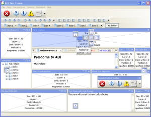
 Control Appearance

 Known Superclasses
 Methods Summary
Default class constructor. |
|
Adds a new check (or toggle) tool to the |
|
Adds any control to the toolbar, typically e.g. a |
|
Adds a label tool to the |
|
Adds a new radio tool to the toolbar. |
|
Adds a separator for spacing groups of tools. |
|
Adds a tool to the toolbar. This is the simplest method you can use to |
|
Adds a spacer for spacing groups of tools. |
|
Adds a stretchable spacer for spacing groups of tools. |
|
Adds a toggle tool to the toolbar. |
|
Adds a tool to the toolbar. This is the full feature version of |
|
Deletes all the tools in the |
|
Deletes all the tools in the |
|
Removes the specified tool from the toolbar and deletes it. |
|
This function behaves like |
|
Gets the size which best suits the window: for a control, it would be the |
|
Updates the toolbar during idle times. |
|
Sets the position and size of the window in pixels. The sizeFlags |
|
Enables or disables the tool. |
|
Returns a pointer to the control identified by id or |
|
Finds a tool for the given tool id. |
|
Finds a tool for the given tool position in the |
|
Finds a tool for the given label. |
|
Finds a tool for the given client id. |
|
Finds a tool for the given mouse position. |
|
Finds a tool for the given mouse position, taking into account also the tool packing. |
|
Returns the AGW-specific window style flag. |
|
Returns the current art provider being used. |
|
Returns the |
|
Returns whether the toolbar gripper is visible or not. |
|
Returns the standard size of a toolbar item. |
|
Returns the rectangle of the overflow button. |
|
Returns the state of the overflow button. |
|
Returns whether the overflow button is visible or not. |
|
Returns whether the |
|
Returns the tool bitmap for the tool identified by tool_id. |
|
Returns the size of bitmap that the toolbar expects to have. The default bitmap size is 16 by 15 pixels. |
|
Returns the padding between the tool border and the label, in pixels. |
|
Returns the number of tools in the |
|
Returns whether the toolbar item identified by tool_id has an associated drop down window menu or not. |
|
Returns whether the tool identified by tool_id is enabled or not. |
|
Returns whether the tool identified by tool_id fits into the toolbar or not. |
|
Returns whether the tool identified by tool_id fits into the toolbar or not. |
|
Returns the position of the tool in the toolbar given its identifier. |
|
Returns the tool label for the tool identified by tool_id. |
|
Returns the long help for the given tool. |
|
Returns the orientation for the toolbar items. |
|
Returns the value used for spacing tools. The default value is 1 pixel. |
|
Returns the position of the tool in the toolbar given its identifier. |
|
Returns the tool proportion in the toolbar. |
|
Returns the toolbar item rectangle |
|
Returns the separator size for the toolbar, in pixels. |
|
Returns the short help for the given tool. |
|
Returns whether the toolbar item identified by tool_id has a sticky behaviour or not. |
|
Returns the label orientation for the toolbar items. |
|
Returns whether a tool is toggled or not. |
|
Finds a tool for the given mouse position. |
|
Returns whether this |
|
Handles custom render for single |
|
Handles the |
|
Handles the |
|
Handles the |
|
Handles the |
|
Handles the |
|
Handles the |
|
Handles the |
|
Handles the |
|
Handles the |
|
Handles the |
|
Handles the |
|
Handles the |
|
Handles the |
|
Realizes the toolbar. This function should be called after you have added tools. |
|
Refreshes the overflow button. |
|
Sets the AGW-specific style of the window. |
|
Instructs |
|
Sets the |
|
Sets the two lists prepend and append as custom overflow items. |
|
Sets the |
|
Sets whether the toolbar gripper is visible or not. |
|
Sets a toolbar item to be currently hovered by the mouse. |
|
Set the values to be used as margins for the toolbar. |
|
Set the values to be used as margins for the toolbar. |
|
Set the values to be used as margins for the toolbar. |
|
Sets the toolbar orientation. |
|
Sets whether the overflow button is visible or not. |
|
Sets a toolbar item to be currently in a “pressed” state. |
|
This sets the alignment for all of the tools within the toolbar |
|
Sets the tool bitmap for the tool identified by tool_id. |
|
Sets the default size of each tool bitmap. The default bitmap size is 16 by 15 pixels. |
|
Sets the padding between the tool border and the label. |
|
Sets the tool disabled bitmap for the tool identified by tool_id. |
|
Assigns a drop down window menu to the toolbar item. |
|
Sets the tool label for the tool identified by tool_id. |
|
Sets the long help for the given tool. |
|
Sets the tool bitmap for the tool identified by tool_id. |
|
Sets the tool orientation for the toolbar items. |
|
Sets the value used for spacing tools. The default value is 1 pixel. |
|
Sets the tool proportion in the toolbar. |
|
Sets the separator size for the toolbar. |
|
Sets the short help for the given tool. |
|
Sets the toolbar item as sticky or non-sticky. |
|
Sets the label orientation for the toolbar items. |
|
Sets the style of the window. |
|
Starts a timer in |
|
Stops a timer in |
|
Toggles a tool on or off. This does not cause any event to get emitted. |
 Class API
- class AuiToolBar(wx.Control)
AuiToolBar is a completely owner-drawn toolbar perfectly integrated with the AUI layout system. This allows drag and drop of toolbars, docking/floating behaviour and the possibility to define “overflow” items in the toolbar itself.
The default theme that is used is
AuiDefaultToolBarArt, which provides a modern, glossy look and feel. The theme can be changed by callingAuiToolBar.SetArtProvider.
Methods
- __init__(self, parent, id=wx.ID_ANY, pos=wx.DefaultPosition, size=wx.DefaultSize, style=0, agwStyle=AUI_TB_DEFAULT_STYLE)
Default class constructor.
- Parameters:
parent (wx.Window) – the
AuiToolBarparent;id (integer) – an identifier for the control: a value of -1 is taken to mean a default;
pos (wx.Point) – the control position. A value of (-1, -1) indicates a default position, chosen by either the windowing system or wxPython, depending on platform;
size (wx.Size) – the control size. A value of (-1, -1) indicates a default size, chosen by either the windowing system or wxPython, depending on platform;
style (integer) – the control window style;
agwStyle (integer) –
the AGW-specific window style. This can be a combination of the following bits:
Flag name
Description
AUI_TB_TEXTShows the text in the toolbar buttons; by default only icons are shown
AUI_TB_NO_TOOLTIPSDon’t show tooltips on
AuiToolBaritemsAUI_TB_NO_AUTORESIZEDo not auto-resize the
AuiToolBarAUI_TB_GRIPPERShows a gripper on the
AuiToolBarAUI_TB_OVERFLOWThe
AuiToolBarcan contain overflow itemsAUI_TB_VERTICALThe
AuiToolBaris verticalAUI_TB_HORZ_LAYOUTShows the text and the icons alongside, not vertically stacked. This style must be used with
AUI_TB_TEXTAUI_TB_PLAIN_BACKGROUNDDon’t draw a gradient background on the toolbar
AUI_TB_HORZ_TEXTCombination of
AUI_TB_HORZ_LAYOUTandAUI_TB_TEXTThe default value for agwStyle is:
AUI_TB_DEFAULT_STYLE= 0
- AddCheckTool(self, tool_id, label, bitmap, disabled_bitmap, short_help_string='', long_help_string='', client_data=None)
Adds a new check (or toggle) tool to the
AuiToolBar.See also
AddToolfor an explanation of the input parameters.
- AddControl(self, control, label='')
Adds any control to the toolbar, typically e.g. a
ComboBox.- Parameters:
control (wx.Window) – the control to be added;
label (string) – the label which appears if the control goes into the overflow items in the toolbar.
- AddLabel(self, tool_id, label='', width=0)
Adds a label tool to the
AuiToolBar.- Parameters:
tool_id (integer) – an integer by which the tool may be identified in subsequent operations;
label (string) – the toolbar tool label;
width (integer) – the tool width.
- AddRadioTool(self, tool_id, label, bitmap, disabled_bitmap, short_help_string='', long_help_string='', client_data=None)
Adds a new radio tool to the toolbar.
Consecutive radio tools form a radio group such that exactly one button in the group is pressed at any moment, in other words whenever a button in the group is pressed the previously pressed button is automatically released. You should avoid having the radio groups of only one element as it would be impossible for the user to use such button.
Note
By default, the first button in the radio group is initially pressed, the others are not.
See also
AddToolfor an explanation of the input parameters.
- AddSeparator(self)
Adds a separator for spacing groups of tools.
- AddSimpleTool(self, tool_id, label, bitmap, short_help_string='', kind=ITEM_NORMAL, target=None)
Adds a tool to the toolbar. This is the simplest method you can use to add an item to the
AuiToolBar.- Parameters:
tool_id (integer) – an integer by which the tool may be identified in subsequent operations;
label (string) – the toolbar tool label;
bitmap (wx.Bitmap) – the primary tool bitmap;
short_help_string (string) – this string is used for the tools tooltip;
kind (integer) – the item kind. Can be one of the following:
Item Kind
Description
ITEM_CONTROLThe item in the
AuiToolBaris a controlITEM_LABELThe item in the
AuiToolBaris a text labelITEM_SPACERThe item in the
AuiToolBaris a spacerITEM_SEPARATORThe item in the
AuiToolBaris a separatorITEM_CHECKThe item in the
AuiToolBaris a toolbar check itemITEM_NORMALThe item in the
AuiToolBaris a standard toolbar itemITEM_RADIOThe item in the
AuiToolBaris a toolbar radio itemtarget – a custom string indicating that an instance of
AuiPaneInfohas been minimized into this toolbar.
- AddSpacer(self, pixels)
Adds a spacer for spacing groups of tools.
- Parameters:
pixels (integer) – the width of the spacer.
- AddStretchSpacer(self, proportion=1)
Adds a stretchable spacer for spacing groups of tools.
- Parameters:
proportion (integer) – the stretchable spacer proportion.
- AddToggleTool(self, tool_id, bitmap, disabled_bitmap, toggle=False, client_data=None, short_help_string='', long_help_string='')
Adds a toggle tool to the toolbar.
- Parameters:
tool_id (integer) – an integer by which the tool may be identified in subsequent operations;
bitmap (wx.Bitmap) – the primary tool bitmap;
disabled_bitmap (wx.Bitmap) – the bitmap to use when the tool is disabled. If it is equal to
NullBitmap, the disabled bitmap is automatically generated by greing the normal one;client_data (PyObject) – whatever Python object to associate with the toolbar item;
short_help_string (string) – this string is used for the tools tooltip;
long_help_string (string) – this string is shown in the statusbar (if any) of the parent frame when the mouse pointer is inside the tool.
- AddTool(self, tool_id, label, bitmap, disabled_bitmap, kind, short_help_string='', long_help_string='', client_data=None, target=None)
Adds a tool to the toolbar. This is the full feature version of
AddTool.- Parameters:
tool_id (integer) – an integer by which the tool may be identified in subsequent operations;
label (string) – the toolbar tool label;
bitmap (wx.Bitmap) – the primary tool bitmap;
disabled_bitmap (wx.Bitmap) – the bitmap to use when the tool is disabled. If it is equal to
NullBitmap, the disabled bitmap is automatically generated by greing the normal one;kind (integer) – the item kind. Can be one of the following:
Item Kind
Description
ITEM_CONTROLThe item in the
AuiToolBaris a controlITEM_LABELThe item in the
AuiToolBaris a text labelITEM_SPACERThe item in the
AuiToolBaris a spacerITEM_SEPARATORThe item in the
AuiToolBaris a separatorITEM_CHECKThe item in the
AuiToolBaris a toolbar check itemITEM_NORMALThe item in the
AuiToolBaris a standard toolbar itemITEM_RADIOThe item in the
AuiToolBaris a toolbar radio itemshort_help_string (string) – this string is used for the tools tooltip;
long_help_string (string) – this string is shown in the statusbar (if any) of the parent frame when the mouse pointer is inside the tool.
client_data (PyObject) – whatever Python object to associate with the toolbar item.
target – a custom string indicating that an instance of
AuiPaneInfohas been minimized into this toolbar.
- Clear(self)
Deletes all the tools in the
AuiToolBar.
- ClearTools(self)
Deletes all the tools in the
AuiToolBar.
- DeleteTool(self, tool)
Removes the specified tool from the toolbar and deletes it.
- Parameters:
tool – the
AuiToolBarItemor its integer identifier.- Returns:
Trueif the tool was deleted,Falseotherwise.
Note
Note that it is unnecessary to call
Realizefor the change to take place, it will happen immediately.
- DeleteToolByPos(self, pos)
This function behaves like
DeleteToolbut it deletes the tool at the specified position and not the one with the given id.- Parameters:
pos (integer) – the tool position.
See also
- DoGetBestSize(self)
Gets the size which best suits the window: for a control, it would be the minimal size which doesn’t truncate the control, for a panel - the same size as it would have after a call to Fit().
Note
Overridden from
wx.Control.
- DoIdleUpdate(self)
Updates the toolbar during idle times.
- DoSetSize(self, x, y, width, height, sizeFlags=wx.SIZE_AUTO)
Sets the position and size of the window in pixels. The sizeFlags parameter indicates the interpretation of the other params if they are equal to -1.
- Parameters:
x (integer) – the window x position;
y (integer) – the window y position;
width (integer) – the window width;
height (integer) – the window height;
sizeFlags (integer) – may have one of this bit set:
Size Flags
Description
wx.SIZE_AUTOA -1 indicates that a class-specific default should be used.
wx.SIZE_AUTO_WIDTHA -1 indicates that a class-specific default should be used for the width.
wx.SIZE_AUTO_HEIGHTA -1 indicates that a class-specific default should be used for the height.
wx.SIZE_USE_EXISTINGExisting dimensions should be used if -1 values are supplied.
wx.SIZE_ALLOW_MINUS_ONEAllow dimensions of -1 and less to be interpreted as real dimensions, not default values.
wx.SIZE_FORCENormally, if the position and the size of the window are already the same as the parameters of this function, nothing is done. but with this flag a window resize may be forced even in this case (supported in wx 2.6.2 and later and only implemented for MSW and ignored elsewhere currently)
Note
Overridden from
wx.Control.
- EnableTool(self, tool_id, state)
Enables or disables the tool.
- Parameters:
tool_id (integer) – identifier for the tool to enable or disable.
state (bool) – if
True, enables the tool, otherwise disables it.
- FindControl(self, id)
Returns a pointer to the control identified by id or
Noneif no corresponding control is found.- Parameters:
id (integer) – the control identifier.
- FindTool(self, tool_id)
Finds a tool for the given tool id.
- Parameters:
tool_id (integer) – the
AuiToolBarItemidentifier.
- FindToolByIndex(self, pos)
Finds a tool for the given tool position in the
AuiToolBar.- Parameters:
pos (integer) – the tool position in the toolbar.
- Returns:
a pointer to a
AuiToolBarItemif a tool is found, orNoneotherwise.
- FindToolByLabel(self, label)
Finds a tool for the given label.
- Parameters:
label (string) – the
AuiToolBarItemlabel.
- FindToolByUserData(self, userData)
Finds a tool for the given client id.
- Parameters:
userData (PyObject) – the user data object.
- FindToolForPosition(self, x, y)
Finds a tool for the given mouse position.
- Parameters:
x (integer) – mouse x position;
y (integer) – mouse y position.
- Returns:
a pointer to a
AuiToolBarItemif a tool is found, orNoneotherwise.
- FindToolForPositionWithPacking(self, x, y)
Finds a tool for the given mouse position, taking into account also the tool packing.
- Parameters:
x (integer) – mouse x position;
y (integer) – mouse y position.
- Returns:
a pointer to a
AuiToolBarItemif a tool is found, orNoneotherwise.
- GetAGWWindowStyleFlag(self)
Returns the AGW-specific window style flag.
See also
SetAGWWindowStyleFlagfor an explanation of various AGW-specific style.
- GetArtProvider(self)
Returns the current art provider being used.
- GetAuiManager(self)
Returns the
AuiManagerwhich manages the toolbar.
- GetGripperVisible(self)
Returns whether the toolbar gripper is visible or not.
- GetLabelSize(self, label)
Returns the standard size of a toolbar item.
- Parameters:
label (string) – a test label.
- GetOverflowRect(self)
Returns the rectangle of the overflow button.
- GetOverflowState(self)
Returns the state of the overflow button.
- GetOverflowVisible(self)
Returns whether the overflow button is visible or not.
- GetToolBarFits(self)
Returns whether the
AuiToolBarsize fits in a specified size.
- GetToolBitmap(self, tool_id)
Returns the tool bitmap for the tool identified by tool_id.
- Parameters:
tool_id (integer) – the tool identifier.
- GetToolBitmapSize(self)
Returns the size of bitmap that the toolbar expects to have. The default bitmap size is 16 by 15 pixels.
Note
Note that this is the size of the bitmap you pass to
AddTool, and not the eventual size of the tool button.Todo
Add
ToolBarcompatibility, actually implementing this method.
- GetToolBorderPadding(self)
Returns the padding between the tool border and the label, in pixels.
- GetToolCount(self)
Returns the number of tools in the
AuiToolBar.
- GetToolDropDown(self, tool_id)
Returns whether the toolbar item identified by tool_id has an associated drop down window menu or not.
- Parameters:
tool_id (integer) – the
AuiToolBarItemidentifier.
- GetToolEnabled(self, tool_id)
Returns whether the tool identified by tool_id is enabled or not.
- Parameters:
tool_id (integer) – the tool identifier.
- GetToolFits(self, tool_id)
Returns whether the tool identified by tool_id fits into the toolbar or not.
- Parameters:
tool_id (integer) – the toolbar item identifier.
- GetToolFitsByIndex(self, tool_id)
Returns whether the tool identified by tool_id fits into the toolbar or not.
- Parameters:
tool_id (integer) – the toolbar item identifier.
- GetToolIndex(self, tool_id)
Returns the position of the tool in the toolbar given its identifier.
- Parameters:
tool_id (integer) – the toolbar item identifier.
- GetToolLabel(self, tool_id)
Returns the tool label for the tool identified by tool_id.
- Parameters:
tool_id (integer) – the tool identifier.
- GetToolLongHelp(self, tool_id)
Returns the long help for the given tool.
- Parameters:
tool_id (integer) – the tool identifier.
- GetToolOrientation(self)
Returns the orientation for the toolbar items.
- GetToolPacking(self)
Returns the value used for spacing tools. The default value is 1 pixel.
- GetToolPos(self, tool_id)
Returns the position of the tool in the toolbar given its identifier.
- Parameters:
tool_id (integer) – the toolbar item identifier.
- GetToolProportion(self, tool_id)
Returns the tool proportion in the toolbar.
- Parameters:
tool_id (integer) – the
AuiToolBarItemidentifier.
- GetToolRect(self, tool_id)
Returns the toolbar item rectangle
- Parameters:
tool_id (integer) – the toolbar item identifier.
- GetToolSeparation(self)
Returns the separator size for the toolbar, in pixels.
- GetToolShortHelp(self, tool_id)
Returns the short help for the given tool.
- Parameters:
tool_id (integer) – the tool identifier.
- GetToolSticky(self, tool_id)
Returns whether the toolbar item identified by tool_id has a sticky behaviour or not.
- Parameters:
tool_id (integer) – the
AuiToolBarItemidentifier.
- GetToolTextOrientation(self)
Returns the label orientation for the toolbar items.
- GetToolToggled(self, tool_id)
Returns whether a tool is toggled or not.
- Parameters:
tool_id (integer) – the toolbar item identifier.
Note
This only applies to a tool that has been specified as a toggle tool.
- HitTest(self, x, y)
Finds a tool for the given mouse position.
- Parameters:
x (integer) – mouse x screen position;
y (integer) – mouse y screen position.
- Returns:
a pointer to a
AuiToolBarItemif a tool is found, orNoneotherwise.
Note
This method is similar to
FindToolForPositionbut it works with absolute coordinates.
- IsPaneMinimized(self)
Returns whether this
AuiToolBarcontains a minimized pane tool.
- OnCustomRender(self, dc, item, rect)
Handles custom render for single
AuiToolBaritems.- Parameters:
dc – a
wx.DCdevice context;item – an instance of
AuiToolBarItem;rect (wx.Rect) – the toolbar item rect.
Note
This method must be overridden to provide custom rendering of items.
- OnEraseBackground(self, event)
Handles the
wx.EVT_ERASE_BACKGROUNDevent forAuiToolBar.- Parameters:
event – a
EraseEventevent to be processed.
Note
This is intentionally empty, to reduce flicker.
- OnIdle(self, event)
Handles the
wx.EVT_IDLEevent forAuiToolBar.- Parameters:
event – a
IdleEventevent to be processed.
- OnLeaveWindow(self, event)
Handles the
wx.EVT_LEAVE_WINDOWevent forAuiToolBar.- Parameters:
event – a
MouseEventevent to be processed.
- OnLeftDown(self, event)
Handles the
wx.EVT_LEFT_DOWNevent forAuiToolBar.- Parameters:
event – a
MouseEventevent to be processed.
- OnLeftUp(self, event)
Handles the
wx.EVT_LEFT_UPevent forAuiToolBar.- Parameters:
event – a
MouseEventevent to be processed.
- OnMiddleDown(self, event)
Handles the
wx.EVT_MIDDLE_DOWNevent forAuiToolBar.- Parameters:
event – a
MouseEventevent to be processed.
- OnMiddleUp(self, event)
Handles the
wx.EVT_MIDDLE_UPevent forAuiToolBar.- Parameters:
event – a
MouseEventevent to be processed.
- OnMotion(self, event)
Handles the
wx.EVT_MOTIONevent forAuiToolBar.- Parameters:
event – a
MouseEventevent to be processed.
- OnPaint(self, event)
Handles the
wx.EVT_PAINTevent forAuiToolBar.- Parameters:
event – a
PaintEventevent to be processed.
- OnRightDown(self, event)
Handles the
wx.EVT_RIGHT_DOWNevent forAuiToolBar.- Parameters:
event – a
MouseEventevent to be processed.
- OnRightUp(self, event)
Handles the
wx.EVT_RIGHT_UPevent forAuiToolBar.- Parameters:
event – a
MouseEventevent to be processed.
- OnSetCursor(self, event)
Handles the
wx.EVT_SET_CURSORevent forAuiToolBar.- Parameters:
event – a
SetCursorEventevent to be processed.
- OnSize(self, event)
Handles the
wx.EVT_SIZEevent forAuiToolBar.- Parameters:
event – a
wx.SizeEventevent to be processed.
- Realize(self)
Realizes the toolbar. This function should be called after you have added tools.
- RefreshOverflowState(self)
Refreshes the overflow button.
- SetAGWWindowStyleFlag(self, agwStyle)
Sets the AGW-specific style of the window.
- Parameters:
agwStyle (integer) –
the new window style. This can be a combination of the following bits:
Flag name
Description
AUI_TB_TEXTShows the text in the toolbar buttons; by default only icons are shown
AUI_TB_NO_TOOLTIPSDon’t show tooltips on
AuiToolBaritemsAUI_TB_NO_AUTORESIZEDo not auto-resize the
AuiToolBarAUI_TB_GRIPPERShows a gripper on the
AuiToolBarAUI_TB_OVERFLOWThe
AuiToolBarcan contain overflow itemsAUI_TB_VERTICALThe
AuiToolBaris verticalAUI_TB_HORZ_LAYOUTShows the text and the icons alongside, not vertically stacked. This style must be used with
AUI_TB_TEXTAUI_TB_PLAIN_BACKGROUNDDon’t draw a gradient background on the toolbar
AUI_TB_HORZ_TEXTCombination of
AUI_TB_HORZ_LAYOUTandAUI_TB_TEXT
Note
Please note that some styles cannot be changed after the window creation and that
Refreshmight need to be be called after changing the others for the change to take place immediately.
- SetArtProvider(self, art)
Instructs
AuiToolBarto use art provider specified by parameter art for all drawing calls. This allows pluggable look-and-feel features.- Parameters:
art – an art provider.
Note
The previous art provider object, if any, will be deleted by
AuiToolBar.
- SetAuiManager(self, auiManager)
Sets the
AuiManagerwhich manages the toolbar.
- SetCustomOverflowItems(self, prepend, append)
Sets the two lists prepend and append as custom overflow items.
- Parameters:
prepend (list) – a list of
AuiToolBarItemto be prepended;append (list) – a list of
AuiToolBarItemto be appended.
- SetFont(self, font)
Sets the
AuiToolBarfont.- Parameters:
font (wx.Font) – the new toolbar font.
Note
Overridden from
wx.Control.
- SetGripperVisible(self, visible)
Sets whether the toolbar gripper is visible or not.
- Parameters:
visible (bool) –
Truefor a visible gripper,Falseotherwise.
- SetHoverItem(self, pitem)
Sets a toolbar item to be currently hovered by the mouse.
- Parameters:
pitem – an instance of
AuiToolBarItem.
- SetMargins(self, left=-1, right=-1, top=-1, bottom=-1)
Set the values to be used as margins for the toolbar.
- Parameters:
left (integer) – the left toolbar margin;
right (integer) – the right toolbar margin;
top (integer) – the top toolbar margin;
bottom (integer) – the bottom toolbar margin.
- SetMarginsSize(self, size)
Set the values to be used as margins for the toolbar.
- SetMarginsXY(self, x, y)
Set the values to be used as margins for the toolbar.
- Parameters:
x (integer) – left margin, right margin and inter-tool separation value;
y (integer) – top margin, bottom margin and inter-tool separation value.
- SetOrientation(self, orientation)
Sets the toolbar orientation.
- Parameters:
orientation (integer) – either
wx.VERTICALorwx.HORIZONTAL.
Note
This can be temporarily overridden by
AuiManagerwhen floating and docking aAuiToolBar.
- SetOverflowVisible(self, visible)
Sets whether the overflow button is visible or not.
- Parameters:
visible (bool) –
Truefor a visible overflow button,Falseotherwise.
- SetPressedItem(self, pitem)
Sets a toolbar item to be currently in a “pressed” state.
- Parameters:
pitem – an instance of
AuiToolBarItem.
- SetToolAlignment(self, alignment=wx.EXPAND)
This sets the alignment for all of the tools within the toolbar (only has an effect when the toolbar is expanded).
- Parameters:
alignment (integer) –
wx.Sizeralignment value (wx.ALIGN_CENTER_HORIZONTALorwx.ALIGN_CENTER_VERTICAL).
- SetToolBitmap(self, tool_id, bitmap)
Sets the tool bitmap for the tool identified by tool_id.
- Parameters:
tool_id (integer) – the tool identifier;
bitmap (wx.Bitmap) – the new bitmap for the toolbar item.
- SetToolBitmapSize(self, size)
Sets the default size of each tool bitmap. The default bitmap size is 16 by 15 pixels.
- Parameters:
size (wx.Size) – the size of the bitmaps in the toolbar.
Note
This should be called to tell the toolbar what the tool bitmap size is. Call it before you add tools.
Note
Note that this is the size of the bitmap you pass to
AddTool, and not the eventual size of the tool button.Todo
Add
ToolBarcompatibility, actually implementing this method.
- SetToolBorderPadding(self, padding)
Sets the padding between the tool border and the label.
- Parameters:
padding (integer) – the padding in pixels.
- SetToolDisabledBitmap(self, tool_id, bitmap)
Sets the tool disabled bitmap for the tool identified by tool_id.
- Parameters:
tool_id (integer) – the tool identifier;
bitmap (wx.Bitmap) – the new disabled bitmap for the toolbar item.
- SetToolDropDown(self, tool_id, dropdown)
Assigns a drop down window menu to the toolbar item.
- Parameters:
tool_id (integer) – the
AuiToolBarItemidentifier;dropdown (bool) – whether to assign a drop down menu or not.
- SetToolLabel(self, tool_id, label)
Sets the tool label for the tool identified by tool_id.
- Parameters:
tool_id (integer) – the tool identifier;
label (string) – the new toolbar item label.
- SetToolLongHelp(self, tool_id, help_string)
Sets the long help for the given tool.
- Parameters:
tool_id (integer) – the tool identifier;
help_string (string) – the string for the long help.
- SetToolNormalBitmap(self, tool_id, bitmap)
Sets the tool bitmap for the tool identified by tool_id.
- Parameters:
tool_id (integer) – the tool identifier;
bitmap (wx.Bitmap) – the new bitmap for the toolbar item.
- SetToolOrientation(self, orientation)
Sets the tool orientation for the toolbar items.
- Parameters:
orientation (integer) – the
AuiToolBarItemorientation.
- SetToolPacking(self, packing)
Sets the value used for spacing tools. The default value is 1 pixel.
- Parameters:
packing (integer) – the value for packing.
- SetToolProportion(self, tool_id, proportion)
Sets the tool proportion in the toolbar.
- Parameters:
tool_id (integer) – the
AuiToolBarItemidentifier;proportion (integer) – the tool proportion in the toolbar.
- SetToolSeparation(self, separation)
Sets the separator size for the toolbar.
- Parameters:
separation (integer) – the separator size in pixels.
- SetToolShortHelp(self, tool_id, help_string)
Sets the short help for the given tool.
- Parameters:
tool_id (integer) – the tool identifier;
help_string (string) – the string for the short help.
- SetToolSticky(self, tool_id, sticky)
Sets the toolbar item as sticky or non-sticky.
- Parameters:
tool_id (integer) – the
AuiToolBarItemidentifier;sticky (bool) – whether the tool should be sticky or not.
- SetToolTextOrientation(self, orientation)
Sets the label orientation for the toolbar items.
- Parameters:
orientation (integer) – the
AuiToolBarItemlabel orientation.
- SetWindowStyleFlag(self, style)
Sets the style of the window.
- Parameters:
style (integer) – the new window style.
Note
Please note that some styles cannot be changed after the window creation and that
Refreshmight need to be be called after changing the others for the change to take place immediately.Note
Overridden from
wx.Control.
- StartPreviewTimer(self)
Starts a timer in
AuiManagerto slide-in/slide-out the minimized pane.
- StopPreviewTimer(self)
Stops a timer in
AuiManagerto slide-in/slide-out the minimized pane.
- ToggleTool(self, tool_id, state)
Toggles a tool on or off. This does not cause any event to get emitted.
- Parameters:
tool_id (integer) – tool in question.
state (bool) – if
True, toggles the tool on, otherwise toggles it off.
Note
This only applies to a tool that has been specified as a toggle tool.
