
 wx.lib.agw.buttonpanel.ButtonPanel
A custom panel class with gradient background shading with the possibility to add buttons and controls still respecting the gradient background.
 Class Hierarchy

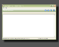
 Control Appearance

 Known Superclasses
 Methods Summary
Default class constructor. |
|
Adds a button to |
|
Adds a wxPython control to |
|
Adds a separator line to |
|
Adds a spacer (stretchable or fixed-size) to |
|
Clears the |
|
Gets the size which best suits |
|
Shows tooltips and long help strings in |
|
Do the Layout for |
|
Layout the items when the main caption exists. |
|
Returns the buttons alignment. |
|
Returns the main caption text. |
|
Returns the associated |
|
Returns the wxPython controls that belongs to |
|
Returns the size of an item in the main |
|
Returns all the |
|
Returns the |
|
Returns whether or not short and long help strings should be displayed as tooltips |
|
Returns whether |
|
HitTest method for |
|
Returns whether |
|
Returns whether |
|
Layout the items using a different algorithms depending on the existence |
|
Handles the |
|
Handles the |
|
Handles the |
|
Handles the |
|
Handles the |
|
Handles the |
|
Handles the |
|
Handles the |
|
Handles the timer expiring to delete the long help string in |
|
Recreates the |
|
Remove all the buttons from |
|
Remove all the separators from |
|
Removes the tooltips and statusbar help (if any) for a button. |
|
Removes the main caption text. |
|
Repaints the old selected/hovered button. |
|
Sets the buttons alignment. |
|
Sets the main caption text. |
|
Sets a new |
|
Sets the |
|
Sets whether or not short and long help strings should be displayed as tooltips |
|
Layout the items when no main caption exists. |
 Class API
- class ButtonPanel(wx.Panel)
A custom panel class with gradient background shading with the possibility to add buttons and controls still respecting the gradient background.
Methods
- __init__(self, parent, id=wx.ID_ANY, text='', agwStyle=BP_DEFAULT_STYLE, alignment=BP_ALIGN_LEFT, name='buttonPanel')
Default class constructor.
- Parameters:
parent (wx.Window) – the parent window. Must not be
None;id (integer) – window identifier. If
wx.ID_ANY, will automatically create an identifier;text (string) – the main caption text for
ButtonPanel;agwStyle (integer) – the AGW-specific window style (one of
BP_DEFAULT_STYLE,BP_USE_GRADIENT);alignment (integer) – alignment of buttons (left or right);
name (string) – window class name.
- AddButton(self, btnInfo)
Adds a button to
ButtonPanel.- Parameters:
btnInfo – an instance of
ButtonInfo.
Note
Remember to pass a
ButtonInfoinstance to this method, and not a standardButtonor aToolBartool.
- AddControl(self, control, proportion=0, flag=wx.ALIGN_CENTER | wx.ALL, border=None)
Adds a wxPython control to
ButtonPanel.- Parameters:
- AddSeparator(self)
Adds a separator line to
ButtonPanel.
- AddSpacer(self, size=(0, 0), proportion=1, flag=wx.EXPAND)
Adds a spacer (stretchable or fixed-size) to
ButtonPanel.- Parameters:
size (tuple) – the spacer size as a tuple;
proportion (integer) – the spacer proportion (0 for fixed-size, 1 or more for a stretchable one);
flag (integer) – one of the
BoxSizerflags.
- Clear(self)
Clears the
ButtonPanel.Can be used to reset the
ButtonPanelif you’d like have a new set of buttons on the panel.
- DoGetBestSize(self)
Gets the size which best suits
ButtonPanel: for a control, it would be the minimal size which doesn’t truncate the control, for a panel - the same size as it would have after a call to Fit().- Returns:
An instance of
wx.Size.
Note
Overridden from
Panel.
- DoGiveHelp(self, hit)
Shows tooltips and long help strings in
StatusBar.- Parameters:
hit – an instance of
ButtonInfowhere the mouse is hovering.
- DoLayout(self)
Do the Layout for
ButtonPanel.Note
Call this method every time you make a modification to the layout or to the customizable sizes of the pseudo controls.
- FlexibleLayout(self, nonspacers, allchildren)
Layout the items when the main caption exists.
- Parameters:
nonspacers (list) – a list of items which are not spacers;
allchildren (list) – a list of all the children of
ButtonPanel.
- GetAlignment(self)
Returns the buttons alignment.
- Returns:
An integer specifying the buttons alignment.
See also
SetAlignmentfor a set of valid alignment bits.
- GetBarText(self)
Returns the main caption text.
- Returns:
A string representing the caption text.
- GetControls(self)
Returns the wxPython controls that belongs to
ButtonPanel.- Returns:
A list of items inside
ButtonPanelthat are wxPython controls.
- GetItemSize(self, item, isVertical)
Returns the size of an item in the main
ButtonPanelsizer.- Parameters:
item – an instance of
ButtonInfo;isVertical (bool) –
TrueifButtonPanelis in vertical orientation,Falseotherwise.
- Returns:
An instance of
wx.Size.
- GetNonFlexibleChildren(self)
Returns all the
ButtonPanelmain sizer’s children that are not flexible spacers.- Returns:
A list of items inside
ButtonPanelthat are not flexible spacers.
- GetStyle(self)
Returns the
ButtonPanelwindow style.See also
SetStylefor a list of valid window styles.
- GetUseHelp(self)
Returns whether or not short and long help strings should be displayed as tooltips and
StatusBaritems respectively.- Returns:
Trueif the short and long help strings should be displayed as tooltips andStatusBaritems respectively,Falseotherwise.
- HasBarText(self)
Returns whether
ButtonPanelhas a main caption text or not.- Returns:
TrueifButtonPanelhas a main caption text,Falseotherwise.
- HitTest(self, pt)
HitTest method for
ButtonPanel.- Parameters:
pt – the mouse position, an instance of
wx.Point.- Returns:
an instance of
ButtonInfoand the hit flagBP_HT_BUTTONif a button client rectangle contains the input point pt, orwx.NOT_FOUNDandBP_HT_NONE.
- IsStandard(self)
Returns whether
ButtonPanelis aligned “Standard” (left/top) or not.- Returns:
TrueifButtonPanelis aligned “standard”,Falseotherwise.
- IsVertical(self)
Returns whether
ButtonPanelis vertically aligned or not.- Returns:
TrueifButtonPanelis vertically aligned,Falseotherwise.
- LayoutItems(self)
Layout the items using a different algorithms depending on the existence of the main caption.
- OnEraseBackground(self, event)
Handles the
wx.EVT_ERASE_BACKGROUNDevent forButtonPanel.- Parameters:
event – a
EraseEventevent to be processed.
Note
This is intentionally empty to reduce flicker.
- OnLeftDown(self, event)
Handles the
wx.EVT_LEFT_DOWNevent forButtonPanel.- Parameters:
event – a
MouseEventevent to be processed.
- OnLeftUp(self, event)
Handles the
wx.EVT_LEFT_UPevent forButtonPanel.- Parameters:
event – a
MouseEventevent to be processed.
- OnMouseEnterWindow(self, event)
Handles the
wx.EVT_ENTER_WINDOWevent forButtonPanel.- Parameters:
event – a
MouseEventevent to be processed.
- OnMouseLeave(self, event)
Handles the
wx.EVT_LEAVE_WINDOWevent forButtonPanel.- Parameters:
event – a
MouseEventevent to be processed.
- OnMouseMove(self, event)
Handles the
wx.EVT_MOTIONevent forButtonPanel.- Parameters:
event – a
MouseEventevent to be processed.
- OnPaint(self, event)
Handles the
wx.EVT_PAINTevent forButtonPanel.- Parameters:
event – a
PaintEventevent to be processed.
- OnSize(self, event)
Handles the
wx.EVT_SIZEevent forButtonPanel.- Parameters:
event – a
wx.SizeEventevent to be processed.
Todo
Improve the chain of methods
OnSize==>DoLayout==>LayoutItemsto avoid multiple calls toLayoutItems.
- OnStatusBarTimer(self)
Handles the timer expiring to delete the long help string in
StatusBar.
- ReCreateSizer(self, text=None)
Recreates the
ButtonPanelsizer accordingly to the alignment specified.- Parameters:
text (string) – the text to display as main caption. If text is set to
None, the main caption will not be displayed.
- RemoveAllButtons(self)
Remove all the buttons from
ButtonPanel.Note
This function is for internal use only. If you are interested in manipulating a
ButtonPanelin real time (ie. removing things on it) have a look at theClearmethod.
- RemoveAllSeparators(self)
Remove all the separators from
ButtonPanel.Note
This function is for internal use only. If you are interested in manipulating a
ButtonPanelin real time (ie. removing things on it) have a look at theClearmethod.
- RemoveHelp(self)
Removes the tooltips and statusbar help (if any) for a button.
- RemoveText(self)
Removes the main caption text.
- RepaintOldSelection(self)
Repaints the old selected/hovered button.
- SetAlignment(self, alignment)
Sets the buttons alignment.
- Parameters:
alignment (integer) – can be one of the following bits:
Alignment Flag
Value
Description
BP_ALIGN_RIGHT1
Buttons are aligned on the right
BP_ALIGN_LEFT2
Buttons are aligned on the left
BP_ALIGN_TOP4
Buttons are aligned at the top
BP_ALIGN_BOTTOM8
Buttons are aligned at the bottom
- SetBarText(self, text)
Sets the main caption text.
- Parameters:
text (string) – the main caption text label. An empty string erases the main caption text.
- SetBPArt(self, art)
Sets a new
BPArtart provider toButtonPanel.- Parameters:
art – an instance of
BPArt.
- SetStyle(self, agwStyle)
Sets the
ButtonPanelwindow style.- Parameters:
agwStyle (integer) – one of the following bits:
Window Styles
Hex Value
Description
BP_DEFAULT_STYLE0x1
ButtonPanelhas a plain solid background.BP_USE_GRADIENT0x2
ButtonPanelhas a gradient shading background.
- SetUseHelp(self, useHelp=True)
Sets whether or not short and long help strings should be displayed as tooltips and
StatusBaritems respectively.- Parameters:
useHelp (bool) –
Trueto display short and long help strings as tooltips andStatusBaritems respectively,Falseotherwise.
- SizeLayout(self, nonspacers, children)
Layout the items when no main caption exists.
- Parameters:
nonspacers (list) – a list of items which are not spacers;
children (list) – a list of all the children of
ButtonPanel.
