
 wx.lib.agw.customtreectrl.CustomTreeCtrl
CustomTreeCtrl is a class that mimics the behaviour of TreeCtrl, with almost the
same base functionalities plus some more enhancements. This class does not rely on
the native control, as it is a full owner-drawn tree control.
 Class Hierarchy

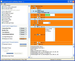
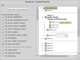
 Control Appearance

 Known Superclasses
 Methods Summary
Default class constructor. |
|
Can this window be given focus by mouse click? |
|
Adds a root item to the |
|
Internal method used to adjust the |
|
Appends an item as a last child of its parent. |
|
Appends an horizontal line separator as a last child of its parent. |
|
Assigns the button image list. |
|
Assigns the normal image list. |
|
Assigns the image list for |
|
Assigns the state image list. |
|
Transverses the tree and checks/unchecks the items. |
|
Traverses up the tree and checks/unchecks parent items. |
|
Transverses the tree and toggles the items. |
|
Calculates the level of an item inside the tree hierarchy. |
|
Calculates the height of a line. |
|
Calculates the positions of all items in the tree. |
|
Calculates the width and height of an item. Clears the dirty flag |
|
Programmatically check/uncheck item children. |
|
Actually checks/uncheks an item, sending (eventually) the two |
|
Used internally to avoid |
|
Uncheck radio items which are on the same level of the checked one. |
|
We are about to collapse or destroy the item’s children. Don’t |
|
Collapse an item, sending a |
|
Collapse the given item and deletes its children. |
|
Deletes an item. |
|
Deletes all items in the |
|
Delete all the item’s children. |
|
Deletes the window associated to an item (if any). |
|
Gets the size which best suits the window: for a control, it would be the |
|
Actually inserts an item in the tree. |
|
Actually selects/unselects an item, sending |
|
Gradient fill from colour 1 to colour 2 from left to right. |
|
Gradient fill from colour 1 to colour 2 from top to bottom. |
|
Draws the selected item(s) with the Windows Vista style. |
|
Internal function. Starts the editing of an item label, sending a |
|
Starts editing an item label. |
|
Enable or disable a beep if no item matches the search. |
|
Enables/disables the item children. |
|
Enables/disables an item. |
|
Enable or disable keyboard searching the entire tree. |
|
Globally enables/disables drawing of gradient selections. |
|
Globally enables/disables drawing of Windows Vista selections. |
|
Ends label editing. Mimicks wx.TreeCtrl’s method. |
|
Scrolls and/or expands items to ensure that the given item is visible. |
|
Expands an item, sending a |
|
Expands all |
|
Expands all the items children of the input item. |
|
Used to populate an array of selected items when the style |
|
Finds the first item starting with the given prefix after the given parent. |
|
Freeze |
|
Returns the |
|
Returns the |
|
Returns the pen used to draw the selected item border. |
|
Retrieves the rectangle bounding the item. |
|
Returns the buttons image list associated with |
|
Returns the item children count. |
|
Returns the default font and colours which are used by the control. This is |
|
Returns the pen used to draw the connecting lines between items. |
|
Returns a native looking checkbox or radio button bitmap. |
|
Returns the global number of items in the tree. |
|
Returns the colour for items in a disabled state. |
|
Returns whether built-in drag/drop will be full screen or not. |
|
Returns a reference to the edit |
|
Returns the item’s first child and an integer value ‘cookie’. |
|
Returns the first gradient colour for gradient-style selections. |
|
Returns the first visible item. |
|
Returns the gradient style for gradient-style selections. |
|
Returns the colour used to highlight focused selected items. |
|
Returns the colour used to highlight unfocused selected items. |
|
Returns the font used to render hypertext items. |
|
Returns the colour used to render a non-visited hypertext item. |
|
Returns the colour used to render a visited hypertext item. |
|
Returns the normal image list associated with |
|
Returns the image list used to build the check/radio buttons in |
|
Returns the item indentation, in pixels. |
|
Gets the state of a 3-state checkbox item. |
|
Returns the item background colour. |
|
Returns the item font. |
|
Returns the item image. |
|
Returns the item leftmost image, i.e. the image associated to the item on the leftmost |
|
Returns the item parent (can be |
|
Returns the horizontal space available in |
|
Returns the item text. |
|
Returns the item text colour or separator horizontal line colour. |
|
Returns the item type. |
|
Returns whether an hypertext item was visited. |
|
Returns the window associated to the item (if any). |
|
Returns whether the window associated to the item is enabled. |
|
Returns the item last child. |
|
Returns the image list for |
|
Returns the line height for the given item. |
|
Returns the maximum width of the |
|
Returns the next item. |
|
Returns the next active item. Deprecated, included for |
|
Returns the item’s next child. |
|
Returns the next expanded item after the input one. |
|
Returns the next item in the tree with speed enhancement. |
|
Returns the next displayed item in the tree. This is either the |
|
Returns the next displayed item in the tree. This is either the |
|
Returns the next sibling of an item. |
|
Returns the next sibling of an item with speed enhancement. |
|
Returns the next visible item. |
|
Returns the previous item. Only for internal use right now. |
|
Returns the previous expanded item before the input one. |
|
Returns the previous displayed item in the tree. This is either |
|
Returns the previous displayed item in the tree. This is either |
|
Returns the previous sibling of an item. |
|
Returns the previous sibling of an item. |
|
Returns the previous visible item. |
|
Returns the data associated to an item. |
|
Returns the root item, an instance of |
|
Returns the second gradient colour for gradient-style selections. |
|
Returns the current selected item (i.e. focused item). |
|
Returns a list of selected items. |
|
Returns the pen colour for separator-type items. |
|
Returns the spacing between the start and the text, in pixels. |
|
Returns the state image list associated with |
|
Handles the hyperlink items, sending the |
|
Returns |
|
Returns whether |
|
Returns whether an item has children or not. |
|
Hides/shows an item. |
|
Hide all windows belonging to the item and its children. |
|
Hides the windows associated to the items. Used internally. |
|
Calculates which (if any) item is under the given point, returning the tree item |
|
Inserts an item after the given previous. |
|
Inserts an item after the given previous. |
|
Inserts an item after the given previous. |
|
Inserts a separator item after the given previous. |
|
Returns whether the item font is bold or not. |
|
Checks if the given item is under another one in the tree hierarchy. |
|
Returns |
|
Returns whether the item is expanded or not. |
|
Returns whether the item font is italic or not. |
|
Returns whether or not the checkbox item is a 3-state checkbox. |
|
Returns whether an item is checked or not. |
|
Returns whether an item is enabled or disabled. |
|
Returns whether an item is hypertext or not. |
|
Returns whether an item is of separator type or not. |
|
Returns whether the item is visible or not (i.e., its hierarchy |
|
Returns whether the item is selected or not. |
|
Returns whether the item is visible or not to the user. |
|
Returns whether the item has children or not. |
|
Called by |
|
Called by |
|
Returns whether 2 items have the same text. |
|
Handles the |
|
The timer for editing has expired. Start editing. |
|
Handles the |
|
Process the tooltip event, to speed up event processing. Does not actually |
|
This method is normally only used internally, but sometimes an application |
|
Handles the |
|
Handles the |
|
Handles a bunch of |
|
Handles the |
|
Handles the |
|
Handles the |
|
Actually draws an item. |
|
Paint a level in the hierarchy of |
|
Prepends an item as a first child of parent. |
|
Prepends a separator item as a first child of parent. |
|
Recurses over all the children of the spcified items, calculating their |
|
Refreshes the items with which a window is associated. |
|
Refreshes a damaged item line. |
|
Refreshes a damaged selected item line. |
|
Refreshes the selected items under the given item. |
|
Refreshes a damaged subtree of an item. |
|
Called by |
|
Scrolls the specified item into view. |
|
Selects all the item in the tree. |
|
Selects all the children of the given item. Does not send events. |
|
Selects/deselects an item. |
|
Selects or unselects all the items between item1 and item2. |
|
Actually sends the |
|
Sets the |
|
Changes the background colour of |
|
Sets the |
|
Sets the pen used to draw the selected item border. |
|
Sets the buttons image list for |
|
Sets the pen used to draw the connecting lines between items. |
|
Sets the colour for items in a disabled state. |
|
Sets whether a drag operation will be performed full screen or not. |
|
Sets the first gradient colour for gradient-style selections. |
|
Sets the currently focused item. |
|
Sets the |
|
Changes the foreground colour of |
|
Sets the gradient style for gradient-style selections. |
|
Sets the colour used to highlight focused selected items. |
|
Sets the colour used to highlight unfocused selected items. |
|
Sets the font used to render hypertext items. |
|
Sets the colour used to render a non-visited hypertext item. |
|
Sets the colour used to render a visited hypertext item. |
|
Sets the normal image list for |
|
Sets the checkbox/radiobutton image list. |
|
Sets the indentation for |
|
Sets whether the item has a 3-state value checkbox assigned to it or not. |
|
Sets the checkbox item to the given state. |
|
Sets the item background colour. |
|
Sets the item font as bold/unbold. |
|
Gives the item the visual feedback for drag and drop operations. |
|
Sets the item font. |
|
Forces the appearance/disappearance of the button next to the item. |
|
Sets whether an item is selected or not (hilighted). |
|
Sets whether the item is hypertext or not. |
|
Sets the item image, depending on the item state. |
|
Sets the item font as italic/non-italic. |
|
Sets the item leftmost image, i.e. the image associated to the item on the leftmost |
|
Mark the item and all of its children to require size recalculation. |
|
Sets the item text. |
|
Sets the item text colour or separator horizontal line colour. |
|
Sets the item type. |
|
Sets whether an hypertext item was visited. |
|
Sets the window for the given item. |
|
Enables/disables the window associated to the item. |
|
Sets the image list for |
|
Sets the data associated to an item. |
|
Sets the second gradient colour for gradient-style selections. |
|
Sets the pen colour for separator-type items. |
|
Sets the spacing between items in |
|
Sets the state image list for |
|
Return |
|
Sorts the children of the given item using the |
|
Used internally to select a series of children in the tree. |
|
Used internally to select a series of items in the tree. |
|
Thaw |
|
Tiles the background image to fill all the available area. |
|
Toggles the item state (collapsed/expanded). |
|
Toggles the item selection. |
|
Used internally to handle radio node parent correctly. |
|
Unselects the current selection. |
|
Unselect all selected items in the tree. |
|
Unselects all the children of the given item. |
|
Unselects the given item, if it is selected. |
 Class API
- class CustomTreeCtrl(wx.ScrolledWindow)
CustomTreeCtrlis a class that mimics the behaviour ofTreeCtrl, with almost the same base functionalities plus some more enhancements. This class does not rely on the native control, as it is a full owner-drawn tree control.
Methods
- __init__(self, parent, id=wx.ID_ANY, pos=wx.DefaultPosition, size=wx.DefaultSize, style=0, agwStyle=TR_DEFAULT_STYLE, validator=wx.DefaultValidator, name='CustomTreeCtrl')
Default class constructor.
- Parameters:
parent (wx.Window) – parent window. Must not be
None;id (integer) – window identifier. A value of -1 indicates a default value;
pos (tuple or
wx.Point) – the control position. A value of (-1, -1) indicates a default position, chosen by either the windowing system or wxPython, depending on platform;size (tuple or
wx.Size) – the control size. A value of (-1, -1) indicates a default size, chosen by either the windowing system or wxPython, depending on platform;style (integer) – the underlying
ScrolledWindowstyle;agwStyle (integer) – can be a combination of various bits. See
customtreectrlfor a full list of flags.validator (wx.Validator) – window validator;
name (string) – window name.
- AcceptsFocus(self)
Can this window be given focus by mouse click?
Note
This method always returns
Trueas we always accept focus from mouse click.Note
Overridden from
ScrolledWindow.
- AddRoot(self, text, ct_type=0, wnd=None, image=-1, selImage=-1, data=None, on_the_right=True)
Adds a root item to the
CustomTreeCtrl.- Parameters:
text (string) – the item text label;
ct_type (integer) – the item type (see
SetItemTypefor a list of valid item types);wnd – if not
None, a non-toplevel window to show next to the item, any subclass ofwx.Windowexcept top-level windows;image (integer) – an index within the normal image list specifying the image to use for the item in unselected state;
selImage (integer) – an index within the normal image list specifying the image to use for the item in selected state; if image > -1 and selImage is -1, the same image is used for both selected and unselected items;
data (object) – associate the given Python object data with the item.
on_the_right (bool) –
Truepositions the window on the right of text,Falseon the left of text and overlapping the image.
- Returns:
An instance of
GenericTreeItemupon successful insertion.- Raise:
Exception in the following cases:
There already is a root item in the tree;
The item window is not
Nonebut theTR_HAS_VARIABLE_ROW_HEIGHTflag has not been set forCustomTreeCtrl;The item has multiline text (with line-breaks in it) but the
TR_HAS_VARIABLE_ROW_HEIGHTflag has not been set forCustomTreeCtrl;The ct_type attribute is less than
0or greater than2.
Warning
Only one root is allowed to exist in any given instance of
CustomTreeCtrl.
- AdjustMyScrollbars(self, tree_size=None)
Internal method used to adjust the
ScrolledWindowscrollbars.This method is always called at the end of CalculatePositions() if the tree size has changed.
- Parameters:
tree_size – The full size of the current tree as a wx.Size or (width, height) tuple. If not specified it will be calculated.
- AppendItem(self, parentId, text, ct_type=0, wnd=None, image=-1, selImage=-1, data=None, on_the_right=True)
Appends an item as a last child of its parent.
- Parameters:
parentId – an instance of
GenericTreeItemrepresenting the item’s parent;text (string) – the item text label;
ct_type (integer) – the item type (see
SetItemTypefor a list of valid item types);wnd – if not
None, a non-toplevel window to show next to the item, any subclass ofwx.Window;image (integer) – an index within the normal image list specifying the image to use for the item in unselected state;
selImage (integer) – an index within the normal image list specifying the image to use for the item in selected state; if image > -1 and selImage is -1, the same image is used for both selected and unselected items;
data (object) – associate the given Python object data with the item.
on_the_right (bool) –
Truepositions the window on the right of text,Falseon the left of text and overlapping the image.
- Returns:
An instance of
GenericTreeItemupon successful insertion.
See also
DoInsertItemfor possible exceptions generated by this method.
- AppendSeparator(self, parentId)
Appends an horizontal line separator as a last child of its parent.
- Parameters:
parentId – an instance of
GenericTreeItemrepresenting the separator’s parent.- Returns:
An instance of
GenericTreeItemupon successful insertion.
See also
DoInsertItemfor possible exceptions generated by this method.
- AssignButtonsImageList(self, imageList)
Assigns the button image list.
- Parameters:
imageList – an instance of
wx.ImageList.
- AssignImageList(self, imageList)
Assigns the normal image list.
- Parameters:
imageList – an instance of
wx.ImageList.
- AssignLeftImageList(self, imageList)
Assigns the image list for
CustomTreeCtrlfilled with images to be used on the leftmost part of the client area. Any item can have a leftmost image associated with it.- Parameters:
imageList – an instance of
wx.ImageList.
- AssignStateImageList(self, imageList)
Assigns the state image list.
- Parameters:
imageList – an instance of
wx.ImageList.
- AutoCheckChild(self, item, checked)
Transverses the tree and checks/unchecks the items.
- Parameters:
item – an instance of
GenericTreeItem;checked (bool) –
Trueto check an item,Falseto uncheck it.
Note
This method is meaningful only for checkbox-like and radiobutton-like items.
- AutoCheckParent(self, item, checked)
Traverses up the tree and checks/unchecks parent items.
- Parameters:
item – an instance of
GenericTreeItem;checked (bool) –
Trueto check an item,Falseto uncheck it.
Note
This method is meaningful only for checkbox-like and radiobutton-like items.
- AutoToggleChild(self, item)
Transverses the tree and toggles the items.
- Parameters:
item – an instance of
GenericTreeItem.
Note
This method is meaningful only for checkbox-like and radiobutton-like items.
- CalculateLevel(self, item, dc, level, x_colstart, y, align=0)
Calculates the level of an item inside the tree hierarchy.
- Parameters:
item – an instance of
GenericTreeItem;dc – an instance of
wx.DC;level (integer) – the item level in the tree hierarchy;
y (integer) – the current vertical position inside the
ScrolledWindow;align (integer) – an integer specifying the alignment type:
align Value
Description
0
No horizontal alignment of windows (in items with windows).
1
Windows (in items with windows) are aligned at the same horizontal position.
2
Windows (in items with windows) are aligned at the rightmost edge of
CustomTreeCtrl.
- Returns:
A 2-tuple of (x, y) where x is the maximum width of the tree thus far and y is the new vertical position inside the
ScrolledWindow.
- CalculateLineHeight(self)
Calculates the height of a line.
- CalculatePositions(self)
Calculates the positions of all items in the tree.
Used internally. Called to clear the self._dirty flag.
- CalculateSize(self, item, dc, level=-1, align=0)
Calculates the width and height of an item. Clears the dirty flag
- Parameters:
item – an instance of
GenericTreeItem;dc – an instance of
wx.DC;level (integer) – the item level in the tree hierarchy;
align (integer) – an integer specifying the alignment type:
align Value
Description
0
No horizontal alignment of windows (in items with windows).
1
Windows (in items with windows) are aligned at the same horizontal position.
2
Windows (in items with windows) are aligned at the rightmost edge of
CustomTreeCtrl.
- CheckChilds(self, item, checked=True)
Programmatically check/uncheck item children.
- Parameters:
item – an instance of
GenericTreeItem;checked (bool) –
Trueto check an item,Falseto uncheck it.
Note
This method is meaningful only for checkbox-like and radiobutton-like items.
Note
This method does not generate
EVT_TREE_ITEM_CHECKINGandEVT_TREE_ITEM_CHECKEDevents.
- CheckItem(self, item, checked=True)
Actually checks/uncheks an item, sending (eventually) the two events
EVT_TREE_ITEM_CHECKINGandEVT_TREE_ITEM_CHECKED.- Parameters:
item – an instance of
GenericTreeItem;checked (bool) – for a radiobutton-type item,
Trueto check it,Falseto uncheck it. For a checkbox-type item, it can be one ofwx.CHK_UNCHECKEDwhen the checkbox is unchecked,wx.CHK_CHECKEDwhen it is checked andwx.CHK_UNDETERMINEDwhen it’s in the undetermined state.
- CheckItem2(self, item, checked=True, torefresh=False)
Used internally to avoid
EVT_TREE_ITEM_CHECKEDevents.- Parameters:
item – an instance of
GenericTreeItem;checked (bool) –
Trueto check an item,Falseto uncheck it;torefresh (bool) – whether to redraw the item or not.
- CheckSameLevel(self, item, checked=False)
Uncheck radio items which are on the same level of the checked one. Used internally.
- Parameters:
item – an instance of
GenericTreeItem;checked (bool) –
Trueto check an item,Falseto uncheck it.
Note
This method is meaningful only for radiobutton-like items.
- ChildrenClosing(self, item)
We are about to collapse or destroy the item’s children. Don’t leave edit or selection on any descendants of this item as they are about to disappear. Shift selection to the item instead.
- Parameters:
item – an instance of
GenericTreeItem.
- Collapse(self, item)
Collapse an item, sending a
EVT_TREE_ITEM_COLLAPSINGandEVT_TREE_ITEM_COLLAPSEDevents.- Parameters:
item – an instance of
GenericTreeItem.- Raise:
Exception if you try to collapse a hidden root (i.e., when the
TR_HIDE_ROOTstyle is set forCustomTreeCtrl).
- CollapseAndReset(self, item)
Collapse the given item and deletes its children.
- Parameters:
item – an instance of
GenericTreeItem.
- Delete(self, item)
Deletes an item.
- Parameters:
item – an instance of
GenericTreeItem.
Note
This method sends the
EVT_TREE_DELETE_ITEMevent.
- DeleteAllItems(self)
Deletes all items in the
CustomTreeCtrl.
- DeleteChildren(self, item)
Delete all the item’s children.
- Parameters:
item – an instance of
GenericTreeItem.
- DeleteItemWindow(self, item)
Deletes the window associated to an item (if any).
- Parameters:
item – an instance of
GenericTreeItem.
- DoGetBestSize(self)
Gets the size which best suits the window: for a control, it would be the minimal size which doesn’t truncate the control, for a panel - the same size as it would have after a call to Fit().
- Returns:
An instance of
wx.Size.
Note
Overridden from
ScrolledWindow.
- DoInsertItem(self, parentId, previous, text, ct_type=0, wnd=None, image=-1, selImage=-1, data=None, separator=False, on_the_right=True)
Actually inserts an item in the tree.
- Parameters:
parentId – an instance of
GenericTreeItemrepresenting the item’s parent;previous (integer) – the index at which we should insert the item;
text (string) – the item text label;
ct_type (integer) – the item type (see
SetItemTypefor a list of valid item types);wnd – if not
None, a non-toplevel window to show next to the item, any subclass ofwx.Windowexcept top-level windows;image (integer) – an index within the normal image list specifying the image to use for the item in unselected state;
selImage (integer) – an index within the normal image list specifying the image to use for the item in selected state; if image > -1 and selImage is -1, the same image is used for both selected and unselected items;
data (object) – associate the given Python object data with the item;
separator (bool) –
Trueif the item is a separator,Falseotherwise.on_the_right (bool) –
Truepositions the window on the right of text,Falseon the left of text and overlapping the image.
- Returns:
An instance of
GenericTreeItemupon successful insertion.- Raise:
Exception in the following cases:
The item window is not
Nonebut theTR_HAS_VARIABLE_ROW_HEIGHTflag has not been set forCustomTreeCtrl;The item has multiline text (with line-breaks in it) but the
TR_HAS_VARIABLE_ROW_HEIGHTflag has not been set forCustomTreeCtrl;The ct_type attribute is less than
0or greater than2;The parent item is a separator;
The item is a separator but it has text or an associated window.
Note
Separator items should not have children, text labels or an associated window.
- DoSelectItem(self, item, unselect_others=True, extended_select=False, from_key=False)
Actually selects/unselects an item, sending
EVT_TREE_SEL_CHANGINGandEVT_TREE_SEL_CHANGEDevents.- Parameters:
item – an instance of
GenericTreeItem;unselect_others (bool) – if
True, all the other selected items are unselected.extended_select (bool) –
Trueif theCustomTreeCtrlis using theTR_EXTENDEDstyle;from_key (bool) –
Trueto indicate that the selection was made via a keyboard key,Falseif it was a mouse selection (can follow hyperlinks).
- DrawHorizontalGradient(self, dc, rect, hasfocus)
Gradient fill from colour 1 to colour 2 from left to right.
- Parameters:
dc – an instance of
wx.DC;rect (wx.Rect) – the rectangle to be filled with the gradient shading;
hasfocus (bool) –
Trueif the mainCustomTreeCtrlhas focus,Falseotherwise.
- DrawVerticalGradient(self, dc, rect, hasfocus)
Gradient fill from colour 1 to colour 2 from top to bottom.
- Parameters:
dc – an instance of
wx.DC;rect (wx.Rect) – the rectangle to be filled with the gradient shading;
hasfocus (bool) –
Trueif the mainCustomTreeCtrlhas focus,Falseotherwise.
- DrawVistaRectangle(self, dc, rect, hasfocus)
Draws the selected item(s) with the Windows Vista style.
- Parameters:
dc – an instance of
wx.DC;rect (wx.Rect) – the rectangle to be filled with the gradient shading;
hasfocus (bool) –
Trueif the mainCustomTreeCtrlhas focus,Falseotherwise.
- Edit(self, item)
Internal function. Starts the editing of an item label, sending a
EVT_TREE_BEGIN_LABEL_EDITevent.- Parameters:
item – an instance of
GenericTreeItem.
Warning
Separator-type items can not be edited.
- EditLabel(self, item)
Starts editing an item label.
- Parameters:
item – an instance of
GenericTreeItem.
- EnableBellOnNoMatch(self, on=True)
Enable or disable a beep if no item matches the search.
The default behavior of the tree is for no bell.
- Parameters:
on (bool) –
Trueto call wx.Bell() if no match is found to text entered via keyboard.Falsefor no bell.
Added in version 2.8.
- EnableChildren(self, item, enable=True)
Enables/disables the item children.
- Parameters:
item – an instance of
GenericTreeItem;enable (bool) –
Trueto enable the children,Falseto disable them.
Note
This method is used internally.
- EnableItem(self, item, enable=True, torefresh=True)
Enables/disables an item.
- Parameters:
item – an instance of
GenericTreeItem;enable (bool) –
Trueto enable the item,Falseto disable it;torefresh (bool) – whether to redraw the item or not.
- EnableSearchAll(self, all=True)
Enable or disable keyboard searching the entire tree.
- Parameters:
all (bool) –
Trueby default so that text typed into the tree with the keyboard will search all items in the tree, even items under unexpanded branches. Set toFalseto limit searching to only those items that are visible.
Added in version 2.8.
- EnableSelectionGradient(self, enable=True)
Globally enables/disables drawing of gradient selections.
- Parameters:
enable (bool) –
Trueto enable gradient-style selections,Falseto disable it.
Note
Calling this method disables any Vista-style selection previously enabled.
- EnableSelectionVista(self, enable=True)
Globally enables/disables drawing of Windows Vista selections.
- Parameters:
enable (bool) –
Trueto enable Vista-style selections,Falseto disable it.
Note
Calling this method disables any gradient-style selection previously enabled.
- EndEditLabel(self, item, discardChanges=False)
Ends label editing. Mimicks wx.TreeCtrl’s method.
- Parameters:
item – an instance of
GenericTreeItem. If an edit is not ongoing for this item, then nothing is done.
Added in version 2.8.
- EnsureVisible(self, item)
Scrolls and/or expands items to ensure that the given item is visible.
- Parameters:
item – an instance of
GenericTreeItem.
- Expand(self, item)
Expands an item, sending a
EVT_TREE_ITEM_EXPANDINGandEVT_TREE_ITEM_EXPANDEDevents.- Parameters:
item – an instance of
GenericTreeItem.- Raise:
Exception if you try to expand a hidden root (i.e., when the
TR_HIDE_ROOTstyle is set forCustomTreeCtrl).
- ExpandAll(self)
Expands all
CustomTreeCtrlitems.Note
This method suppresses the
EVT_TREE_ITEM_EXPANDINGandEVT_TREE_ITEM_EXPANDEDevents because expanding many items int the control would be too slow then.
- ExpandAllChildren(self, item)
Expands all the items children of the input item.
- Parameters:
item – an instance of
GenericTreeItem.
Note
This method suppresses the
EVT_TREE_ITEM_EXPANDINGandEVT_TREE_ITEM_EXPANDEDevents because expanding many items int the control would be too slow then.
- FillArray(self, item, array=[])
Used to populate an array of selected items when the style
TR_MULTIPLEis used. Only shown items (non-collapsed) are returned.- Parameters:
item – an instance of
GenericTreeItem;array (list) – a Python list containing the selected items.
- Returns:
A Python list containing the selected items.
- FindItem(self, idParent, prefixOrig, all=True)
Finds the first item starting with the given prefix after the given parent.
- Parameters:
idParent (integer) – an instance of
GenericTreeItem;prefixOrig (string) – a string containing the item text prefix.
all (bool) – defaults to
Trueto search all items in the tree. Set toFalseto search only the visible (expanded) tree items.
- Returns:
An instance of
GenericTreeItemorNoneif no item has been found.
- Freeze(self)
Freeze
CustomTreeCtrl.Freezes the window or, in other words, prevents any updates from taking place on screen, the window is not redrawn at all.
Thawmust be called to re-enable window redrawing. Calls to these two functions may be nested.Note
This method is useful for visual appearance optimization (for example, it is a good idea to use it before doing many large text insertions in a row into a
TextCtrlunder wxGTK) but is not implemented on all platforms nor for all controls so it is mostly just a hint to wxWidgets and not a mandatory directive.
- GetAGWWindowStyleFlag(self)
Returns the
CustomTreeCtrlstyle.See also
The
__init__method for a list of possible style flags.
- GetBackgroundImage(self)
Returns the
CustomTreeCtrlbackground image (if any).- Returns:
An instance of
wx.Bitmapif a background image is present,Noneotherwise.
Note
At present, the background image can only be used in “tile” mode.
Todo
Support background images also in stretch and centered modes.
- GetBorderPen(self)
Returns the pen used to draw the selected item border.
- Returns:
An instance of
wx.Pen.
Note
The border pen is not used if the Windows Vista selection style is applied.
- GetBoundingRect(self, item, textOnly=False)
Retrieves the rectangle bounding the item.
- Parameters:
item – an instance of
GenericTreeItem;textOnly (bool) – if
True, only the rectangle around the item’s label will be returned, otherwise the item’s image is also taken into account.
- Returns:
An instance of
wx.Rect.
Note
The rectangle coordinates are logical, not physical ones. So, for example, the x coordinate may be negative if the tree has a horizontal scrollbar and its position is not
0.Warning
The
textOnlyflag is currently ignored and this method always returns the rectangle including the item’s image, checkbox, and window (if they exist) along with the item’s text. A separator’s bounding box stretches the width of the entire client area. The height may be 0 for newly added items untilCustomTreeCtrl.CalculateSizeis called while the tree is not frozen.
- GetButtonsImageList(self)
Returns the buttons image list associated with
CustomTreeCtrl(from which application-defined button images are taken).- Returns:
An instance of
wx.ImageList.
- GetChildrenCount(self, item, recursively=True)
Returns the item children count.
- Parameters:
item – an instance of
GenericTreeItem;recursively (bool) – if
True, returns the total number of descendants, otherwise only one level of children is counted.
- classmethod GetClassDefaultAttributes(self)
Returns the default font and colours which are used by the control. This is useful if you want to use the same font or colour in your own control as in a standard control – which is a much better idea than hard coding specific colours or fonts which might look completely out of place on the users system, especially if it uses themes.
This static method is “overridden’’ in many derived classes and so calling, for example,
Button.GetClassDefaultAttributes() will typically return the values appropriate for a button which will be normally different from those returned by, say,ListCtrl.GetClassDefaultAttributes().- Returns:
An instance of
VisualAttributes.
Note
The
VisualAttributesstructure has at least the fields font, colFg and colBg. All of them may be invalid if it was not possible to determine the default control appearance or, especially for the background colour, if the field doesn’t make sense as is the case for colBg for the controls with themed background.Note
Overridden from
wx.Control.
- GetConnectionPen(self)
Returns the pen used to draw the connecting lines between items.
- Returns:
An instance of
wx.Pen.
- GetControlBmp(self, checkbox=True, checked=False, enabled=True, x=16, y=16)
Returns a native looking checkbox or radio button bitmap.
- Parameters:
checkbox (bool) –
Trueto get a checkbox image,Falsefor a radiobutton one;checked (bool) –
Trueif the control is marked,Falseif it is not;enabled (bool) –
Trueif the control is enabled,Falseif it is not;x (integer) – the width of the bitmap;
y (integer) – the height of the bitmap.
- Returns:
An instance of
wx.Bitmap, representing a native looking checkbox or radiobutton.
- GetCount(self)
Returns the global number of items in the tree.
- GetDisabledColour(self)
Returns the colour for items in a disabled state.
- Returns:
An instance of
wx.Colour.
- GetDragFullScreen(self)
Returns whether built-in drag/drop will be full screen or not.
- Returns:
Trueif the drag/drop operation will be full screen, orFalseif only within the tree.
- GetEditControl(self)
Returns a reference to the edit
TreeTextCtrlif the item is being edited orNoneotherwise (it is assumed that no more than one item may be edited simultaneously).
- GetFirstChild(self, item)
Returns the item’s first child and an integer value ‘cookie’. Call
GetNextChildfor the next child using this very ‘cookie’ return value as an input.- Parameters:
item – an instance of
GenericTreeItem.- Returns:
A tuple with the first value being an instance of
GenericTreeItemorNoneif there are no further children, and as second value an integer parameter ‘cookie’.
Note
This method returns
Noneif there are no further children.
- GetFirstGradientColour(self)
Returns the first gradient colour for gradient-style selections.
- Returns:
An instance of
wx.Colour.
- GetFirstVisibleItem(self)
Returns the first visible item.
- Returns:
An instance of
GenericTreeItemorNoneif there are no visible items.
- GetGradientStyle(self)
Returns the gradient style for gradient-style selections.
- Returns:
0for horizontal gradient-style selections,1for vertical gradient-style selections.
- GetHilightFocusColour(self)
Returns the colour used to highlight focused selected items.
- Returns:
An instance of
wx.Colour.
Note
This is used only if gradient and Windows Vista selection styles are disabled.
- GetHilightNonFocusColour(self)
Returns the colour used to highlight unfocused selected items.
- Returns:
An instance of
wx.Colour.
Note
This is used only if gradient and Windows Vista selection styles are disabled.
- GetHyperTextFont(self)
Returns the font used to render hypertext items.
- Returns:
An instance of
wx.Font.
Note
This method is meaningful only for hypertext-like items.
- GetHyperTextNewColour(self)
Returns the colour used to render a non-visited hypertext item.
- Returns:
An instance of
wx.Colour.
Note
This method is meaningful only for hypertext-like items.
- GetHyperTextVisitedColour(self)
Returns the colour used to render a visited hypertext item.
- Returns:
An instance of
wx.Colour.
Note
This method is meaningful only for hypertext-like items.
- GetImageList(self)
Returns the normal image list associated with
CustomTreeCtrl.- Returns:
An instance of
wx.ImageList.
- GetImageListCheck(self)
Returns the image list used to build the check/radio buttons in
CustomTreeCtrl.- Returns:
An instance of
wx.ImageList.
- GetIndent(self)
Returns the item indentation, in pixels.
- GetItem3StateValue(self, item)
Gets the state of a 3-state checkbox item.
- Parameters:
item – an instance of
GenericTreeItem.- Returns:
wx.CHK_UNCHECKEDwhen the checkbox is unchecked,wx.CHK_CHECKEDwhen it is checked andwx.CHK_UNDETERMINEDwhen it’s in the undetermined state.
Note
This method raises an exception when the function is used with a 2-state checkbox item.
Note
This method is meaningful only for checkbox-like items.
- GetItemBackgroundColour(self, item)
Returns the item background colour.
- Parameters:
item – an instance of
GenericTreeItem.- Returns:
An instance of
wx.Colour.
- GetItemFont(self, item)
Returns the item font.
- Parameters:
item – an instance of
GenericTreeItem.- Returns:
An instance of
wx.Font.
- GetItemImage(self, item, which=TreeItemIcon_Normal)
Returns the item image.
- Parameters:
item – an instance of
GenericTreeItem;which (integer) – can be one of the following bits:
Item State
Description
TreeItemIcon_NormalTo get the normal item image
TreeItemIcon_SelectedTo get the selected item image (i.e. the image which is shown when the item is currently selected)
TreeItemIcon_ExpandedTo get the expanded image (this only makes sense for items which have children - then this image is shown when the item is expanded and the normal image is shown when it is collapsed)
TreeItemIcon_SelectedExpandedTo get the selected expanded image (which is shown when an expanded item is currently selected)
- Returns:
An integer index that can be used to retrieve the item image inside a
wx.ImageList.
- GetItemLeftImage(self, item)
Returns the item leftmost image, i.e. the image associated to the item on the leftmost part of the
CustomTreeCtrlclient area.- Parameters:
item – an instance of
GenericTreeItem.- Returns:
An integer index that can be used to retrieve the item leftmost image inside a
wx.ImageList.
- GetItemParent(self, item)
Returns the item parent (can be
Nonefor root items).- Parameters:
item – an instance of
GenericTreeItem.- Returns:
An instance of
GenericTreeItemorNonefor root items.
- GetItemSize(self, item)
Returns the horizontal space available in
CustomTreeCtrl, in pixels, to draw this item.- Parameters:
item – an instance of
GenericTreeItem.
Added in version 0.9.3.
- GetItemText(self, item)
Returns the item text.
- Parameters:
item – an instance of
GenericTreeItem.
- GetItemTextColour(self, item)
Returns the item text colour or separator horizontal line colour.
- Parameters:
item – an instance of
GenericTreeItem.- Returns:
An instance of
wx.Colour.
- GetItemType(self, item)
Returns the item type.
- Parameters:
item – an instance of
GenericTreeItem.- Returns:
An integer representing the item type.
See also
SetItemTypefor a description of valid item types.
- GetItemVisited(self, item)
Returns whether an hypertext item was visited.
- Parameters:
item – an instance of
GenericTreeItem.- Returns:
Trueif the hypertext item has been visited,Falseotherwise.
Note
This method is meaningful only for hypertext-like items.
- GetItemWindow(self, item)
Returns the window associated to the item (if any).
- Parameters:
item – an instance of
GenericTreeItem.- Returns:
An instance of
wx.Windowif the item has an associated window,Noneotherwise.
- GetItemWindowEnabled(self, item)
Returns whether the window associated to the item is enabled.
- Parameters:
item – an instance of
GenericTreeItem.- Returns:
Trueif the item has an associated window and this window is enabled,Falsein all other cases.
- GetLastChild(self, item)
Returns the item last child.
- Parameters:
item – an instance of
GenericTreeItem.- Returns:
An instance of
GenericTreeItemorNoneif there are no further children.
- GetLeftImageList(self)
Returns the image list for
CustomTreeCtrlfilled with images to be used on the leftmost part of the client area. Any item can have a leftmost image associated with it.- Returns:
An instance of
wx.ImageList.
- GetLineHeight(self, item)
Returns the line height for the given item.
- Parameters:
item – an instance of
GenericTreeItem.- Returns:
the item height, in pixels.
- GetMaxWidth(self, respect_expansion_state=True)
Returns the maximum width of the
CustomTreeCtrl.- Parameters:
respect_expansion_state (bool) – if
True, only the expanded items (and their children) will be measured. Otherwise all the items are expanded and their width measured.- Returns:
the maximum width of
CustomTreeCtrl, in pixels.
- GetNext(self, item)
Returns the next item.
- Returns:
An instance of
GenericTreeItemorNoneif there are no further items.- Parameters:
item – an instance of
GenericTreeItem.
- GetNextActiveItem(self, item, down=True)
Returns the next active item. Deprecated, included for backwards compatibility.
- Parameters:
item – an instance of
GenericTreeItem;down (bool) –
Trueto search downwards in the hierarchy for an active item,Falseto search upwards.
- Returns:
An instance of
GenericTreeItemif an active item has been found orNoneif none has been found.
- GetNextChild(self, item, cookie)
Returns the item’s next child.
- Parameters:
item – an instance of
GenericTreeItem;cookie – a parameter which is opaque for the application but is necessary for the library to make these functions reentrant (i.e. allow more than one enumeration on one and the same object simultaneously).
- Returns:
A tuple with the first value being an instance of
GenericTreeItemorNoneif there are no further children, and as second value an integer parameter ‘cookie’.
Note
This method returns
Noneif there are no further children.
- GetNextExpanded(self, item)
Returns the next expanded item after the input one.
- Parameters:
item – an instance of
TreeListItem.
- GetNextFast(self, item, cookie=None)
Returns the next item in the tree with speed enhancement.
This is the fastest way to search the tree when you need to start searching at a particular item.
- Parameters:
item – an instance of
GenericTreeItem.cookie – a parameter which is opaque for the application but is necessary for the library to make this function fast. If cookie is None this function will still work but much slower.
- Returns:
A tuple with the first value being an instance of
GenericTreeItemorNoneif there are no further items, and as second value ‘cookie’ as a list.
Added in version 2.8.
- GetNextShown(self, item)
Returns the next displayed item in the tree. This is either the first child of the item (if it is expanded and has children) or its next sibling. If there is no next sibling the tree is walked backwards until a next sibling for one of its parents is found. This is repeated until a non-hidden item is found.
- Parameters:
item – an instance of
GenericTreeItem;- Returns:
An instance of
GenericTreeItemorNoneif no non-hidden item follows this one.
- GetNextShownFast(self, item, cookie=None)
Returns the next displayed item in the tree. This is either the first child of the item (if it is expanded and has children) or its next sibling. If there is no next sibling the tree is walked backwards until a next sibling for one of its parents is found. This is repeated until a non-hidden item is found.
- Parameters:
item – an instance of
GenericTreeItem;cookie – a parameter which is opaque for the application but is necessary for the library to make this function fast. If cookie is None this function will still work but much slower.
- Returns:
A tuple with the first value being an instance of
GenericTreeItemorNoneif no non-hidden item follows this one, and as second value an integer ‘cookie’.
Added in version 2.8.
- GetNextSibling(self, item)
Returns the next sibling of an item.
- Parameters:
item – an instance of
GenericTreeItem.- Returns:
An instance of
GenericTreeItemorNoneif there are no further siblings.
Note
This method returns
Noneif there are no further siblings.
- GetNextSiblingFast(self, item, cookie=None)
Returns the next sibling of an item with speed enhancement.
- Parameters:
item – an instance of
GenericTreeItem.cookie – a parameter which is opaque for the application but is necessary for the library to make this function fast. If cookie is None this function will still work but much slower.
- Returns:
A tuple with the first value being an instance of
GenericTreeItemorNoneif there are no further siblings, and as second value an integer parameter ‘cookie’.
Added in version 2.8.
- GetNextVisible(self, item)
Returns the next visible item.
- Parameters:
item – an instance of
GenericTreeItem.- Returns:
An instance of
GenericTreeItemorNoneif there are no next visible items.
- GetPrev(self, item)
Returns the previous item. Only for internal use right now.
- Parameters:
item – an instance of
GenericTreeItem.- Returns:
An instance of
GenericTreeItem
- GetPrevExpanded(self, item)
Returns the previous expanded item before the input one.
- Parameters:
item – an instance of
TreeListItem.
- GetPrevShown(self, item)
Returns the previous displayed item in the tree. This is either the last displayed child of its previous sibling, or its parent item. This logic is repeated until a non-hidden item is found.
- Parameters:
item – an instance of
GenericTreeItem;- Returns:
An instance of
GenericTreeItemorNoneif no previous non-hidden item is found (root).
- GetPrevShownFast(self, item, cookie=None)
Returns the previous displayed item in the tree. This is either the last displayed child of its previous sibling, or its parent item. This logic is repeated until a non-hidden item is found.
- Parameters:
item – an instance of
GenericTreeItem;cookie – a parameter which is opaque for the application but is necessary for the library to make this function fast. If cookie is None this function will still work but much slower.
- Returns:
A tuple with the first value an instance of
GenericTreeItemorNoneif no previous non-hiddenitem is found (root), and as second value an integer ‘cookie’.
Added in version 2.8.
- GetPrevSibling(self, item)
Returns the previous sibling of an item.
- Parameters:
item – an instance of
GenericTreeItem.- Returns:
An instance of
GenericTreeItemorNoneif there are no further siblings.
Note
This method returns
Noneif there are no previous siblings.
- GetPrevSiblingFast(self, item, cookie=None)
Returns the previous sibling of an item.
- Parameters:
item – an instance of
GenericTreeItem.cookie – a parameter which is opaque for the application but is necessary for the library to make this function fast. If cookie is None this function will still work but much slower.
- Returns:
An instance of
GenericTreeItemorNoneif there are no further siblings.- Returns:
A tuple with the first value being an instance of
GenericTreeItemorNoneif there are no previous siblings, and as second value an integer parameter ‘cookie’.
Added in version 2.8.
- GetPrevVisible(self, item)
Returns the previous visible item.
- Parameters:
item – an instance of
GenericTreeItem.- Returns:
An instance of
GenericTreeItemorNoneif there are no previous visible items.
- GetPyData(self, item)
Returns the data associated to an item.
- Parameters:
item – an instance of
GenericTreeItem.- Returns:
A Python object representing the item data, or
Noneif no data has been assigned to this item.
- GetRootItem(self)
Returns the root item, an instance of
GenericTreeItem.
- GetSecondGradientColour(self)
Returns the second gradient colour for gradient-style selections.
- Returns:
An instance of
wx.Colour.
- GetSelection(self)
Returns the current selected item (i.e. focused item).
- Returns:
An instance of
GenericTreeItem.
Note
Similar to GetFocusedItem of wx.TreeCtrl. Use
GetSelectionsfor obtaining all items selected in multiple-selection trees (i.e. TR_MULTIPLE flag set).
- GetSelections(self)
Returns a list of selected items.
Note
This method can be used regardless if
CustomTreeCtrlhas theTR_MULTIPLEorTR_EXTENDEDstyle set or not but the return value is always a list (possibly empty).- Returns:
A Python list containing the selected items, all instances of
GenericTreeItem.
- GetSeparatorColour(self, colour)
Returns the pen colour for separator-type items.
- Returns:
An instance of
wx.Colourrepresenting the separator pen colour.
- GetSpacing(self)
Returns the spacing between the start and the text, in pixels.
- GetStateImageList(self)
Returns the state image list associated with
CustomTreeCtrl(from which application-defined state images are taken).- Returns:
An instance of
wx.ImageList.
- HandleHyperLink(self, item)
Handles the hyperlink items, sending the
EVT_TREE_ITEM_HYPERLINKevent.- Parameters:
item – an instance of
GenericTreeItem.
- HasAGWFlag(self, flag)
Returns
TrueifCustomTreeCtrlhas the flag bit set.- Parameters:
flag (integer) – any possible window style for
CustomTreeCtrl.
See also
The
__init__method for the flag parameter description.
- HasButtons(self)
Returns whether
CustomTreeCtrlhas theTR_HAS_BUTTONSflag set.- Returns:
TrueifCustomTreeCtrlhas theTR_HAS_BUTTONSflag set,Falseotherwise.
- HasChildren(self, item)
Returns whether an item has children or not.
- Parameters:
item – an instance of
GenericTreeItem.
- HideItem(self, item, hide=True)
Hides/shows an item.
- Parameters:
item – an instance of
GenericTreeItem;hide –
Trueto hide the item,Falseto show it.
Note
A hidden item always reports that it is collapsed and disabled.
- HideItemWindows(self, item)
Hide all windows belonging to the item and its children.
- HideWindows(self)
Hides the windows associated to the items. Used internally.
- HitTest(self, point, flags=0)
Calculates which (if any) item is under the given point, returning the tree item at this point plus extra information flags.
- Parameters:
point – an instance of
wx.Point, a point to test for hits;flags (integer) – a bitlist of the following values:
HitTest Flags
Hex Value
Description
TREE_HITTEST_ABOVE0x1
Above the client area
TREE_HITTEST_BELOW0x2
Below the client area
TREE_HITTEST_NOWHERE0x4
No item has been hit
TREE_HITTEST_ONITEMBUTTON0x8
On the button associated to an item
TREE_HITTEST_ONITEMICON0x10
On the icon associated to an item
TREE_HITTEST_ONITEMINDENT0x20
On the indent associated to an item
TREE_HITTEST_ONITEMLABEL0x40
On the label (string) associated to an item
TREE_HITTEST_ONITEM0x50
Anywhere on the item
TREE_HITTEST_ONITEMRIGHT0x80
On the right of the label associated to an item
TREE_HITTEST_TOLEFT0x200
On the left of the client area
TREE_HITTEST_TORIGHT0x400
On the right of the client area
TREE_HITTEST_ONITEMUPPERPART0x800
On the upper part (first half) of the item
TREE_HITTEST_ONITEMLOWERPART0x1000
On the lower part (second half) of the item
TREE_HITTEST_ONITEMCHECKICON0x2000
On the check/radio icon, if present
- Returns:
A tuple with the first value being an instance of
GenericTreeItemorNoneif no item has been hit-tested, and as second value an integer parameter flag.
Note
both the item (if any,
Noneotherwise) and the flags are always returned as a tuple.
- InsertItem(self, parentId, input, text, ct_type=0, wnd=None, image=-1, selImage=-1, data=None, separator=False, on_the_right=True)
Inserts an item after the given previous.
- Returns:
An instance of
GenericTreeItemupon successful insertion.
See also
InsertItemByIndexandInsertItemByItemfor an explanation of the input parameters.See also
DoInsertItemfor possible exceptions generated by this method.
- InsertItemByIndex(self, parentId, idPrevious, text, ct_type=0, wnd=None, image=-1, selImage=-1, data=None, separator=False, on_the_right=True)
Inserts an item after the given previous.
- Parameters:
parentId – an instance of
GenericTreeItemrepresenting the item’s parent;idPrevious – the index at which we should insert the new item;
text (string) – the item text label;
ct_type (integer) – the item type (see
SetItemTypefor a list of valid item types);wnd – if not
None, a non-toplevel window to show next to the item, any subclass ofwx.Window;image (integer) – an index within the normal image list specifying the image to use for the item in unselected state;
selImage (integer) – an index within the normal image list specifying the image to use for the item in selected state; if image > -1 and selImage is -1, the same image is used for both selected and unselected items;
data (object) – associate the given Python object data with the item;
separator (bool) –
Trueif the item is a separator,Falseotherwise.on_the_right (bool) –
Truepositions the window on the right of text,Falseon the left of text and overlapping the image.
- Returns:
An instance of
GenericTreeItemupon successful insertion.
See also
DoInsertItemfor possible exceptions generated by this method.
- InsertItemByItem(self, parentId, idPrevious, text, ct_type=0, wnd=None, image=-1, selImage=-1, data=None, separator=False, on_the_right=True)
Inserts an item after the given previous.
- Parameters:
parentId – an instance of
GenericTreeItemrepresenting the item’s parent;idPrevious – an instance of
GenericTreeItemrepresenting the previous item;text (string) – the item text label;
ct_type (integer) – the item type (see
SetItemTypefor a list of valid item types);wnd – if not
None, a non-toplevel window to show next to the item, any subclass ofwx.Window;image (integer) – an index within the normal image list specifying the image to use for the item in unselected state;
selImage (integer) – an index within the normal image list specifying the image to use for the item in selected state; if image > -1 and selImage is -1, the same image is used for both selected and unselected items;
data (object) – associate the given Python object data with the item;
separator (bool) –
Trueif the item is a separator,Falseotherwise.on_the_right (bool) –
Truepositions the window on the right of text,Falseon the left of text and overlapping the image.
- Returns:
An instance of
GenericTreeItemupon successful insertion.- Raise:
Exception if the previous item is not a sibling.
See also
DoInsertItemfor other possible exceptions generated by this method.
- InsertSeparator(self, parentId, input)
Inserts a separator item after the given previous.
- Returns:
An instance of
GenericTreeItemupon successful insertion.
See also
InsertItemByIndexandInsertItemByItemfor an explanation of the input parameters.See also
DoInsertItemfor possible exceptions generated by this method.
- IsBold(self, item)
Returns whether the item font is bold or not.
- Parameters:
item – an instance of
GenericTreeItem.- Returns:
Trueif the item has bold text,Falseotherwise.
- IsDescendantOf(self, parent, item)
Checks if the given item is under another one in the tree hierarchy.
- Parameters:
parent – an instance of
GenericTreeItem, representing the possible parent of item;item – another instance of
GenericTreeItem.
- Returns:
Trueif item is a descendant of parent,Falseotherwise.
- IsEmpty(self)
Returns
Trueif the control is empty (i.e. has no items, even no root one).- Returns:
Trueif the tree is empty,Falseotherwise.
Added in version 2.8.
- IsExpanded(self, item)
Returns whether the item is expanded or not.
- Parameters:
item – an instance of
GenericTreeItem.- Returns:
Trueif the item is expanded,Falseif it is collapsed.
- IsItalic(self, item)
Returns whether the item font is italic or not.
- Parameters:
item – an instance of
GenericTreeItem.- Returns:
Trueif the item has italic text,Falseotherwise.
- IsItem3State(self, item)
Returns whether or not the checkbox item is a 3-state checkbox.
- Parameters:
item – an instance of
GenericTreeItem.- Returns:
Trueif this checkbox is a 3-state checkbox,Falseif it’s a 2-state checkbox item.
Note
This method is meaningful only for checkbox-like items.
- IsItemChecked(self, item)
Returns whether an item is checked or not.
- Parameters:
item – an instance of
GenericTreeItem.- Returns:
Trueif the item is in a ‘checked’ state,Falseotherwise.
Note
This method is meaningful only for checkbox-like and radiobutton-like items.
- IsItemEnabled(self, item)
Returns whether an item is enabled or disabled.
- Parameters:
item – an instance of
GenericTreeItem.
- IsItemHyperText(self, item)
Returns whether an item is hypertext or not.
- Parameters:
item – an instance of
GenericTreeItem.- Returns:
Trueif the item is hypertext-like,Falseotherwise.
- IsItemSeparator(self, item)
Returns whether an item is of separator type or not.
- Parameters:
item – an instance of
GenericTreeItem.
- IsItemShown(self, item)
Returns whether the item is visible or not (i.e., its hierarchy is expanded enough to show the item and it has not been hidden).
- Parameters:
item – an instance of
GenericTreeItem.- Returns:
Trueif the item is shown,Falseif it is hidden.
Added in version 2.8.
- IsSelected(self, item)
Returns whether the item is selected or not.
- Parameters:
item – an instance of
GenericTreeItem.- Returns:
Trueif the item is selected,Falseotherwise.
- IsVisible(self, item)
Returns whether the item is visible or not to the user.
It must be shown (i.e., its hierarchy is expanded enough to show the item, and it has not been hidden) and present in the current client area view.
- Parameters:
item – an instance of
GenericTreeItem.- Returns:
Trueif the item is visible,Falseif it is hidden.
- ItemHasChildren(self, item)
Returns whether the item has children or not.
- Parameters:
item – an instance of
GenericTreeItem.- Returns:
Trueif the item has children,Falseotherwise.
- OnAcceptEdit(self, item, value)
Called by
TreeTextCtrl, to accept the changes and to send theEVT_TREE_END_LABEL_EDITevent.- Parameters:
item – an instance of
GenericTreeItem;value (string) – the new value of the item label.
- Returns:
Trueif the editing has not been vetoed,Falseotherwise.
- OnCancelEdit(self, item)
Called by
TreeTextCtrl, to cancel the changes and to send theEVT_TREE_END_LABEL_EDITevent.- Parameters:
item – an instance of
GenericTreeItem.
- OnCompareItems(self, item1, item2)
Returns whether 2 items have the same text.
Override this function in the derived class to change the sort order of the items in the
CustomTreeCtrl. The function should return a negative, zero or positive value if the first item is less than, equal to or greater than the second one.- Parameters:
item1 – an instance of
GenericTreeItem;item2 – another instance of
GenericTreeItem.
- Returns:
The return value is negative if item1 < item2, zero if item1 == item2 and strictly positive if item1 < item2.
Note
The base class version compares items alphabetically.
- OnDestroy(self, event)
Handles the
wx.EVT_WINDOW_DESTROYevent forCustomTreeCtrl.- Parameters:
event – a
wx.WindowDestroyEventevent to be processed.
- OnEditTimer(self)
The timer for editing has expired. Start editing.
- OnEraseBackground(self, event)
Handles the
wx.EVT_ERASE_BACKGROUNDevent forCustomTreeCtrl.- Parameters:
event – a
EraseEventevent to be processed.
- OnGetToolTip(self, event)
Process the tooltip event, to speed up event processing. Does not actually get a tooltip.
- Parameters:
event – a
CommandTreeEventevent to be processed.
- OnInternalIdle(self)
This method is normally only used internally, but sometimes an application may need it to implement functionality that should not be disabled by an application defining an OnIdle handler in a derived class.
This method may be used to do delayed painting, for example, and most implementations call
wx.Window.UpdateWindowUIin order to send update events to the window in idle time.
- OnKeyDown(self, event)
Handles the
wx.EVT_KEY_DOWNevent forCustomTreeCtrl, sending aEVT_TREE_KEY_DOWNevent.- Parameters:
event – a
KeyEventevent to be processed.
- OnKillFocus(self, event)
Handles the
wx.EVT_KILL_FOCUSevent forCustomTreeCtrl.- Parameters:
event – a
FocusEventevent to be processed.
- OnMouse(self, event)
Handles a bunch of
wx.EVT_MOUSE_EVENTSevents forCustomTreeCtrl.- Parameters:
event – a
MouseEventevent to be processed.
- OnPaint(self, event)
Handles the
wx.EVT_PAINTevent forCustomTreeCtrl.- Parameters:
event – a
PaintEventevent to be processed.
- OnSetFocus(self, event)
Handles the
wx.EVT_SET_FOCUSevent forCustomTreeCtrl.- Parameters:
event – a
FocusEventevent to be processed.
- OnSize(self, event)
Handles the
wx.EVT_SIZEevent forCustomTreeCtrl.- Parameters:
event – a
wx.SizeEventevent to be processed.
- PaintItem(self, item, dc, level, align)
Actually draws an item.
- Parameters:
item – an instance of
GenericTreeItem;dc – an instance of
wx.DC;level (integer) – the item level in the tree hierarchy;
align (integer) – an integer specifying the alignment type:
align Value
Description
0
No horizontal alignment of windows (in items with windows).
1
Windows (in items with windows) are aligned at the same horizontal position.
2
Windows (in items with windows) are aligned at the rightmost edge of
CustomTreeCtrl.
- PaintLevel(self, item, dc, level, y, align)
Paint a level in the hierarchy of
CustomTreeCtrl.- Parameters:
item – an instance of
GenericTreeItem;dc – an instance of
wx.DC;level (integer) – the item level in the tree hierarchy;
y (integer) – the current vertical position in the
ScrolledWindow;align (integer) – an integer specifying the alignment type:
align Value
Description
0
No horizontal alignment of windows (in items with windows).
1
Windows (in items with windows) are aligned at the same horizontal position.
2
Windows (in items with windows) are aligned at the rightmost edge of
CustomTreeCtrl.
- PrependItem(self, parent, text, ct_type=0, wnd=None, image=-1, selImage=-1, data=None, separator=False, on_the_right=True)
Prepends an item as a first child of parent.
- Parameters:
parent – an instance of
GenericTreeItemrepresenting the item’s parent;text (string) – the item text label;
ct_type (integer) – the item type (see
SetItemTypefor a list of valid item types);wnd – if not
None, a non-toplevel window to show next to the item, any subclass ofwx.Windowexcept top-level windows;image (integer) – an index within the normal image list specifying the image to use for the item in unselected state;
selImage (integer) – an index within the normal image list specifying the image to use for the item in selected state; if image > -1 and selImage is -1, the same image is used for both selected and unselected items;
data (object) – associate the given Python object data with the item;
separator (bool) –
Trueif the item is a separator,Falseotherwise.on_the_right (bool) –
Truepositions the window on the right of text,Falseon the left of text and overlapping the image.
- Returns:
An instance of
GenericTreeItemupon successful insertion.
See also
DoInsertItemfor possible exceptions generated by this method.
- PrependSeparator(self, parent)
Prepends a separator item as a first child of parent.
- Parameters:
parent – an instance of
GenericTreeItemrepresenting the item’s parent.- Returns:
An instance of
GenericTreeItemupon successful insertion.
See also
DoInsertItemfor possible exceptions generated by this method.
- RecurseOnChildren(self, item, maxwidth, respect_expansion_state)
Recurses over all the children of the spcified items, calculating their maximum width.
- Parameters:
item – an instance of
GenericTreeItem;maxwidth (integer) – the current maximum width for
CustomTreeCtrl, in pixels;respect_expansion_state (bool) – if
True, only the expanded items (and their children) will be measured. Otherwise all the items are expanded and their width measured.
- Returns:
A tuple containing the maximum width and item height, in pixels.
- RefreshItemWithWindows(self, item=None)
Refreshes the items with which a window is associated.
- Parameters:
item – an instance of
GenericTreeItem. If item isNone, then the recursive refresh starts from the root node.
Note
This method is called only if the style
TR_ALIGN_WINDOWS_RIGHTis used.
- RefreshLine(self, item)
Refreshes a damaged item line.
- Parameters:
item – an instance of
GenericTreeItem.
- RefreshSelected(self)
Refreshes a damaged selected item line.
- RefreshSelectedUnder(self, item)
Refreshes the selected items under the given item.
- Parameters:
item – an instance of
GenericTreeItem.
- RefreshSubtree(self, item)
Refreshes a damaged subtree of an item.
- Parameters:
item – an instance of
GenericTreeItem.
- ResetEditControl(self)
Called by
TreeTextCtrlwhen it marks itself for deletion.
- ScrollTo(self, item)
Scrolls the specified item into view.
- Parameters:
item – an instance of
GenericTreeItem.
- SelectAll(self)
Selects all the item in the tree.
- Raise:
Exception if used without the
TR_EXTENDEDorTR_MULTIPLEstyle set.
Note
This method can be used only if
CustomTreeCtrlhas theTR_MULTIPLEorTR_EXTENDEDstyle set.
- SelectAllChildren(self, item)
Selects all the children of the given item. Does not send events.
- Parameters:
item – an instance of
GenericTreeItem.- Raise:
Exception if used without the
TR_EXTENDEDorTR_MULTIPLEstyle set.
Note
This method can be used only if
CustomTreeCtrlhas theTR_MULTIPLEorTR_EXTENDEDstyle set.
- SelectItem(self, item, select=True)
Selects/deselects an item.
- Parameters:
item – an instance of
GenericTreeItem;select (bool) –
Trueto select an item,Falseto deselect it.
Note
If TR_MULTIPLE is set, this actually toggles selection when select=True.
- SelectItemRange(self, item1, item2)
Selects or unselects all the items between item1 and item2.
The selection state of all items will be set to the same as the current item. Will not select Hidden items but will select disabled items.
- Parameters:
item1 – an instance of
GenericTreeItem, representing the first item in the range to select;item2 – an instance of
GenericTreeItem, representing the last item in the range to select.
- Raise:
Exception if used without the
TR_EXTENDEDorTR_MULTIPLEstyle set.
Note
This method can be used only if
CustomTreeCtrlhas theTR_MULTIPLEorTR_EXTENDEDstyle set.
- SendDeleteEvent(self, item)
Actually sends the
EVT_TREE_DELETE_ITEMevent.- Parameters:
item – an instance of
GenericTreeItem.
- SetAGWWindowStyleFlag(self, agwStyle)
Sets the
CustomTreeCtrlwindow style.- Parameters:
agwStyle (integer) – the new
CustomTreeCtrlwindow style.
See also
The
__init__method for the agwStyle parameter description.
- SetBackgroundColour(self, colour)
Changes the background colour of
CustomTreeCtrl.- Parameters:
colour – the colour to be used as the background colour, pass
NullColourto reset to the default colour.- Returns:
Falseif the underlyingScrolledWindowdoes not accept the new colour,Trueotherwise.
Note
The background colour is usually painted by the default
EraseEventevent handler function under Windows and automatically under GTK.Note
Setting the background colour does not cause an immediate refresh, so you may wish to call
wx.Window.ClearBackgroundorwx.Window.Refreshafter calling this function.Note
Overridden from
ScrolledWindow.
- SetBackgroundImage(self, image)
Sets the
CustomTreeCtrlbackground image.- Parameters:
image – if not
None, an instance ofwx.Bitmap.
Note
At present, the background image can only be used in “tile” mode.
Todo
Support background images also in stretch and centered modes.
- SetBorderPen(self, pen)
Sets the pen used to draw the selected item border.
- Parameters:
pen – an instance of
wx.Pen.
Note
The border pen is not used if the Windows Vista selection style is applied.
- SetButtonsImageList(self, imageList)
Sets the buttons image list for
CustomTreeCtrl(from which application-defined button images are taken).- Parameters:
imageList – an instance of
wx.ImageList.
- SetConnectionPen(self, pen)
Sets the pen used to draw the connecting lines between items.
- Parameters:
pen – an instance of
wx.Pen.
- SetDisabledColour(self, colour)
Sets the colour for items in a disabled state.
- Parameters:
colour – a valid
wx.Colourinstance.
- SetDragFullScreen(self, fullScreen=False)
Sets whether a drag operation will be performed full screen or not.
A full screen drag allows the user to drag outside of the tree to other controls. When the drag is finished the destination will have to be found manually in the
EVT_TREE_END_DRAGhandler with something like:example:
wnd = wx.FindWindowAtPoint(self.ClientToScreen(event.GetPoint()))
- Parameters:
fullScreen (bool) –
False(default) to drag within tree only.
- SetFirstGradientColour(self, colour=None)
Sets the first gradient colour for gradient-style selections.
- Parameters:
colour – if not
None, a validwx.Colourinstance. Otherwise, the colour is taken from the system valuewx.SYS_COLOUR_HIGHLIGHT.
- SetFocusedItem(self, item)
Sets the currently focused item.
Sends selection events, and can be vetoed. Simply calls
SelectItemto select the item. For multi-selection controls it is better to useSetItemHilightto select items.- Parameters:
item – an instance of
GenericTreeItem.
Added in version 2.8.
- SetFont(self, font)
Sets the
CustomTreeCtrlfont.- Parameters:
font – a valid
wx.Fontinstance.
Note
Overridden from
ScrolledWindow.
- SetForegroundColour(self, colour)
Changes the foreground colour of
CustomTreeCtrl.- Parameters:
colour – the colour to be used as the foreground colour, pass
NullColourto reset to the default colour.- Returns:
Falseif the underlyingScrolledWindowdoes not accept the new colour,Trueotherwise.
Note
Overridden from
ScrolledWindow.
- SetGradientStyle(self, vertical=0)
Sets the gradient style for gradient-style selections.
- Parameters:
vertical (integer) –
0for horizontal gradient-style selections,1for vertical gradient-style selections.
- SetHilightFocusColour(self, colour)
Sets the colour used to highlight focused selected items.
- Parameters:
colour – a valid
wx.Colourinstance.
Note
This is applied only if gradient and Windows Vista selection styles are disabled.
- SetHilightNonFocusColour(self, colour)
Sets the colour used to highlight unfocused selected items.
- Parameters:
colour – a valid
wx.Colourinstance.
Note
This is applied only if gradient and Windows Vista selection styles are disabled.
- SetHyperTextFont(self, font)
Sets the font used to render hypertext items.
- Parameters:
font – a valid
wx.Fontinstance.
Note
This method is meaningful only for hypertext-like items.
- SetHyperTextNewColour(self, colour)
Sets the colour used to render a non-visited hypertext item.
- Parameters:
colour – a valid
wx.Colourinstance.
Note
This method is meaningful only for hypertext-like items.
- SetHyperTextVisitedColour(self, colour)
Sets the colour used to render a visited hypertext item.
- Parameters:
colour – a valid
wx.Colourinstance.
Note
This method is meaningful only for hypertext-like items.
- SetImageList(self, imageList)
Sets the normal image list for
CustomTreeCtrl.- Parameters:
imageList – an instance of
wx.ImageList.
- SetImageListCheck(self, sizex, sizey, imglist=None)
Sets the checkbox/radiobutton image list.
- Parameters:
sizex (integer) – the width of the bitmaps in the imglist, in pixels;
sizey (integer) – the height of the bitmaps in the imglist, in pixels;
imglist – an instance of
wx.ImageList.
- SetIndent(self, indent)
Sets the indentation for
CustomTreeCtrl.- Parameters:
indent (integer) – an integer representing the indentation for the items in the tree.
- SetItem3State(self, item, allow)
Sets whether the item has a 3-state value checkbox assigned to it or not.
- Parameters:
item – an instance of
GenericTreeItem;allow (bool) –
Trueto set an item as a 3-state checkbox,Falseto set it to a 2-state checkbox.
- Returns:
Trueif the change was successful,Falseotherwise.
Note
This method is meaningful only for checkbox-like items.
- SetItem3StateValue(self, item, state)
Sets the checkbox item to the given state.
- Parameters:
item – an instance of
GenericTreeItem;state (integer) – can be one of:
wx.CHK_UNCHECKED(check is off),wx.CHK_CHECKED(check is on) orwx.CHK_UNDETERMINED(check is mixed).
Note
This method raises an exception when the checkbox item is a 2-state checkbox and setting the state to
wx.CHK_UNDETERMINED.Note
This method is meaningful only for checkbox-like items.
- SetItemBackgroundColour(self, item, colour)
Sets the item background colour.
- Parameters:
item – an instance of
GenericTreeItem;colour – a valid
wx.Colourinstance.
- SetItemBold(self, item, bold=True)
Sets the item font as bold/unbold.
- Parameters:
item – an instance of
GenericTreeItem;bold (bool) –
Trueto set the item font as bold,Falseotherwise.
- SetItemDropHighlight(self, item, highlight=True)
Gives the item the visual feedback for drag and drop operations. This is useful when something is dragged from outside the
CustomTreeCtrl.- Parameters:
item – an instance of
GenericTreeItem;highlight (bool) –
Trueto highlight the dragged items,Falseotherwise.
- SetItemFont(self, item, font)
Sets the item font.
- Parameters:
item – an instance of
GenericTreeItem;font – a valid
wx.Fontinstance.
- SetItemHasChildren(self, item, has=True)
Forces the appearance/disappearance of the button next to the item.
- Parameters:
item – an instance of
GenericTreeItem;has (bool) –
Trueto have a button next to an item,Falseotherwise.
- SetItemHilight(self, item, selected=True)
Sets whether an item is selected or not (hilighted).
- Parameters:
item – an instance of
GenericTreeItem;selected (bool) –
Trueto hilight the item,Falseotherwise.
Added in version 2.8.
- SetItemHyperText(self, item, hyper=True)
Sets whether the item is hypertext or not.
- Parameters:
item – an instance of
GenericTreeItem;hyper (bool) –
Trueto have an item with hypertext behaviour,Falseotherwise.
- SetItemImage(self, item, image, which=TreeItemIcon_Normal)
Sets the item image, depending on the item state.
- Parameters:
item – an instance of
GenericTreeItem;image (integer) – an index within the normal image list specifying the image to use for the item in the state specified by the which parameter;
which (integer) – the item state.
See also
GetItemImagefor an explanation of the which parameter.
- SetItemItalic(self, item, italic=True)
Sets the item font as italic/non-italic.
- Parameters:
item – an instance of
GenericTreeItem;italic (bool) –
Trueto set the item font as italic,Falseotherwise.
- SetItemLeftImage(self, item, image)
Sets the item leftmost image, i.e. the image associated to the item on the leftmost part of the
CustomTreeCtrlclient area.- Parameters:
item – an instance of
GenericTreeItem;image (integer) – an index within the left image list specifying the image to use for the item in the leftmost part of the client area.
- SetItemsDirty(self, item, clear_extents=False)
Mark the item and all of its children to require size recalculation.
Added in version 2.8.
- SetItemText(self, item, text)
Sets the item text.
- Parameters:
item – an instance of
GenericTreeItem;text (string) – the new item label.
- Raise:
Exception if the input item is a separator.
- SetItemTextColour(self, item, colour)
Sets the item text colour or separator horizontal line colour.
- Parameters:
item – an instance of
GenericTreeItem;colour – a valid
wx.Colourinstance.
- SetItemType(self, item, ct_type)
Sets the item type.
- Parameters:
item – an instance of
GenericTreeItem;ct_type (integer) – may be one of the following integers:
ct_type Value
Description
0
A normal item
1
A checkbox-like item
2
A radiobutton-type item
Note
Regarding radiobutton-type items (with ct_type = 2), the following approach is used:
All peer-nodes that are radiobuttons will be mutually exclusive. In other words, only one of a set of radiobuttons that share a common parent can be checked at once. If a radiobutton node becomes checked, then all of its peer radiobuttons must be unchecked.
If a radiobutton node becomes unchecked, then all of its child nodes will become inactive.
- SetItemVisited(self, item, visited=True)
Sets whether an hypertext item was visited.
- Parameters:
item – an instance of
GenericTreeItem;visited (bool) –
Trueto mark an hypertext item as visited,Falseotherwise.
Note
This method is meaningful only for hypertext-like items.
- SetItemWindow(self, item, wnd, on_the_right=True)
Sets the window for the given item.
- Parameters:
item – an instance of
GenericTreeItem;wnd – if not
None, a non-toplevel window to be displayed next to the item.on_the_right (bool) –
Truepositions the window on the right of text,Falseon the left of text and overlapping the image. New in wxPython 4.0.4.
- Raise:
Exception if the input item is a separator and wnd is not
None.
- SetItemWindowEnabled(self, item, enable=True)
Enables/disables the window associated to the item.
- Parameters:
item – an instance of
GenericTreeItem;enable (bool) –
Trueto enable the associated window,Falseto disable it.
- SetLeftImageList(self, imageList)
Sets the image list for
CustomTreeCtrlfilled with images to be used on the leftmost part of the client area. Any item can have a leftmost image associated with it.- Parameters:
imageList – an instance of
wx.ImageList.
- SetPyData(self, item, data)
Sets the data associated to an item.
- Parameters:
item – an instance of
GenericTreeItem;data (object) – can be any Python object.
- SetSecondGradientColour(self, colour=None)
Sets the second gradient colour for gradient-style selections.
- Parameters:
colour – if not
None, a validwx.Colourinstance. Otherwise, the colour generated is a slightly darker version of theCustomTreeCtrlbackground colour.
- SetSeparatorColour(self, colour)
Sets the pen colour for separator-type items.
- Parameters:
colour – a valid instance of
wx.Colour.
- SetSpacing(self, spacing)
Sets the spacing between items in
CustomTreeCtrl.- Parameters:
spacing (integer) – an integer representing the spacing between items in the tree.
- SetStateImageList(self, imageList)
Sets the state image list for
CustomTreeCtrl(from which application-defined state images are taken). State images are currently not implemented.- Parameters:
imageList – an instance of
wx.ImageList.
- ShouldInheritColours(self)
Return
Truefrom here to allow the colours of this window to be changed byInheritAttributes, returningFalseforbids inheriting them from the parent window.The base class version returns
False, but this method is overridden inwx.Controlwhere it returnsTrue.CustomTreeCtrldoes not inherit colours from anyone.
- SortChildren(self, item)
Sorts the children of the given item using the
OnCompareItemsmethod ofCustomTreeCtrl.- Parameters:
item – an instance of
GenericTreeItem.
Note
You should override the
OnCompareItemsmethod in your derived class to change the sort order (the default is ascending case-sensitive alphabetical order).
- TagAllChildrenUntilLast(self, crt_item, last_item, select)
Used internally to select a series of children in the tree.
- Parameters:
crt_item – an instance of
GenericTreeItem, representing the current item in the series.last_item – an instance of
GenericTreeItem, representing the last item in the series to select.select (bool) –
Trueto select items,Falseto deselect them.
- Returns:
Trueif last_item has been reached,Falseotherwise.
- TagNextChildren(self, crt_item, last_item, select)
Used internally to select a series of items in the tree.
It traverses the complete tree looking for
last_itemincluding all siblings and siblings of its parents.- Parameters:
crt_item – an instance of
GenericTreeItem, representing the current item in the series.last_item – an instance of
GenericTreeItem, representing the last item in the series to select.select (bool) –
Trueto select items,Falseto deselect them.
- Returns:
Trueif last_item has been reached,Falseotherwise.
- Thaw(self)
Thaw
CustomTreeCtrl.Re-enables window updating after a previous call to
Freeze. To really thaw the control, it must be called exactly the same number of times asFreeze.
- TileBackground(self, dc)
Tiles the background image to fill all the available area.
- Parameters:
dc – an instance of
wx.DC.
Todo
Support background images also in stretch and centered modes.
- Toggle(self, item)
Toggles the item state (collapsed/expanded).
- Parameters:
item – an instance of
GenericTreeItem.
- ToggleItemSelection(self, item)
Toggles the item selection.
- Parameters:
item – an instance of
GenericTreeItem.
- UnCheckRadioParent(self, item, checked=False)
Used internally to handle radio node parent correctly.
- Parameters:
item – an instance of
GenericTreeItem;checked (bool) –
Trueto check an item,Falseto uncheck it.
- Unselect(self)
Unselects the current selection.
- UnselectAll(self)
Unselect all selected items in the tree.
- UnselectAllChildren(self, item)
Unselects all the children of the given item. Mostly deprecated (no longer used internally as it’s too slow).
- Parameters:
item – an instance of
GenericTreeItem.
- UnselectItem(self, item)
Unselects the given item, if it is selected.
For multi-selection controls only. Simply calls
SetItemHilightto unselect the item. UseUnselectfor single-selection controls.- Parameters:
item – an instance of
GenericTreeItem.
Added in version 2.8.
