
 wx.lib.agw.foldpanelbar.FoldPanelBar
The FoldPanelBar is a class which can maintain a list of
collapsible panels. Once a panel is collapsed, only it’s caption
bar is visible to the user. This will provide more space for the
other panels, or allow the user to close panels which are not used
often to get the most out of the work area.
This control is easy to use. Simply create it as a child for a
panel or sash window, and populate panels with
FoldPanelBar.AddFoldPanel(). Then use the
FoldPanelBar.AddFoldPanelWindow() to add
wx.Window derived controls to the current fold panel. Use
FoldPanelBar.AddFoldPanelSeparator() to put separators between the groups of
controls that need a visual separator to group them
together. After all is constructed, the user can fold the panels
by double clicking on the bar or single click on the arrow, which
will indicate the collapsed or expanded state.
 Class Hierarchy

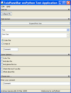
 Control Appearance

 Known Superclasses
 Methods Summary
Default class constructor. |
|
Adds a fold panel to the list of panels. |
|
Adds a separator line to the current fold panel. |
|
Adds a |
|
Sets the style of the caption bar ( |
|
Sets the style of all the caption bars of the fold panel. |
|
Collapses the given fold panel reference, and updates the foldpanel bar. |
|
Expands the given fold panel reference, and updates the foldpanel bar. |
|
Returns the currently used caption style for the fold panel. |
|
Returns the number of panels in the |
|
Returns the panel associated with the index item. |
|
Returns the length of the panels that are expanded and |
|
Returns whether the |
|
Handles the |
|
Handles the |
|
Resizes the fold panels so they match the width. |
|
Refreshes all the panels from given one down to last one. |
|
Repositions all the collapsed panels to the bottom. |
 Class API
- class FoldPanelBar(wx.Panel)
The
FoldPanelBaris a class which can maintain a list of collapsible panels. Once a panel is collapsed, only it’s caption bar is visible to the user. This will provide more space for the other panels, or allow the user to close panels which are not used often to get the most out of the work area.This control is easy to use. Simply create it as a child for a panel or sash window, and populate panels with
FoldPanelBar.AddFoldPanel(). Then use theFoldPanelBar.AddFoldPanelWindow()to addwx.Windowderived controls to the current fold panel. UseFoldPanelBar.AddFoldPanelSeparator()to put separators between the groups of controls that need a visual separator to group them together. After all is constructed, the user can fold the panels by double clicking on the bar or single click on the arrow, which will indicate the collapsed or expanded state.
Methods
- __init__(self, parent, id=-1, pos=wx.DefaultPosition, size=wx.DefaultSize, style=wx.TAB_TRAVERSAL | wx.NO_BORDER, agwStyle=0)
Default class constructor.
- Parameters:
parent – the
FoldPanelBarparent window;id – an identifier for the control: a value of -1 is taken to mean a default;
pos – the control position. A value of (-1, -1) indicates a default position, chosen by either the windowing system or wxPython, depending on platform;
size – the control size. A value of (-1, -1) indicates a default size, chosen by either the windowing system or wxPython, depending on platform;
style – the underlying
Panelwindow style;agwStyle –
the AGW-specific
FoldPanelBarwindow style. It can be one of the following bits:Window Styles
Hex Value
Description
FPB_SINGLE_FOLD0x1
Single fold forces other panels to close when they are open, and only opens the current panel. This will allow the open panel to gain the full size left in the client area.
FPB_COLLAPSE_TO_BOTTOM0x2
All panels are stacked to the bottom. When they are expanded again they show up at the top.
FPB_EXCLUSIVE_FOLD0x4
FPB_SINGLE_FOLDstyle plus the panels will be stacked at the bottom.FPB_HORIZONTAL0x4
FoldPanelBarwill be horizontal.FPB_VERTICAL0x8
FoldPanelBarwill be vertical.
- AddFoldPanel(self, caption='', collapsed=False, foldIcons=None, cbstyle=None)
Adds a fold panel to the list of panels.
- Parameters:
caption – the caption to be displayed in the associated
CaptionBar;collapsed – if set to
True, the panel is collapsed initially;foldIcons – an instance of
wx.ImageListcontaining the icons to display next to the caption text;cbstyle – an instance of
CaptionBarStyle.
Note
The FoldPanel item which is returned, can be used as a reference to perform actions upon the fold panel like collapsing it, expanding it, or deleting it from the list. Use this foldpanel to add windows to it.
See also
AddFoldPanelWindowandAddFoldPanelSeparatorto see how to add items derived fromwx.Windowto the panels.
- AddFoldPanelSeparator(self, panel, colour=wx.BLACK, spacing=FPB_DEFAULT_SPACING, leftSpacing=FPB_DEFAULT_LEFTLINESPACING, rightSpacing=FPB_DEFAULT_RIGHTLINESPACING)
Adds a separator line to the current fold panel.
The separator is a simple line which is drawn and is no real component. It can be used to separate groups of controls which belong to each other.
- Parameters:
colour – the separator colour, an instance of
wx.Colour;spacing – the separator to be added can be slightly indented from left and right so it is more visibly placed in the fold panel. Use spacing > 0 to give the control an y offset from the previous
wx.Windowadded;leftSpacing – give the added separator a slight indent from the left;
rightSpacing – give the added separator a slight indent from the right.
- AddFoldPanelWindow(self, panel, window, flags=FPB_ALIGN_WIDTH, spacing=FPB_DEFAULT_SPACING, leftSpacing=FPB_DEFAULT_LEFTLINESPACING, rightSpacing=FPB_DEFAULT_RIGHTLINESPACING)
Adds a
wx.Windowderived instance to the referenced fold panel.- Parameters:
panel – an instance of
FoldPanelItem;window – the window we wish to add to the fold panel, an instance of
wx.Window;flags – can be one of the following bits:
Align Flag
Value
Description
FPB_ALIGN_WIDTH1
The
wx.Windowto be added will be aligned to fit the width of the FoldPanel when it is resized. Very handy for sizer items, buttons and text boxes.FPB_ALIGN_LEFT0
Aligns left instead of fitting the width of the child window to be added. Use either this one or
FPB_ALIGN_WIDTH.spacing – the
wx.Windowto be added can be slightly indented from left and right so it is more visibly placed in the fold panel. Use spacing > 0 to give the control an y offset from the previouswx.Windowadded;leftSpacing – give the
wx.Windowadded a slight indent from the left;rightSpacing – give the
wx.Windowadded a slight indent from the right;
Note
Make the window be a child of the fold panel!
The following example adds a FoldPanel to the
FoldPanelBarand adds twowx.Windowderived controls to the FoldPanel:# Create the FoldPanelBar m_pnl = FoldPanelBar(self, wx.ID_ANY, wx.DefaultPosition, wx.DefaultSize, agwStyle=0x2) # Add a foldpanel to the control. "Test me" is the caption and it is # initially not collapsed. item = m_pnl.AddFoldPanel("Test me", False) # Now add a button to the fold panel. Mind that the button should be # made child of the FoldPanel and not of the main form. m_pnl.AddFoldPanelWindow(item, wx.Button(item, ID_COLLAPSEME, "Collapse Me")) # Add a separator between the two controls. This is purely a visual # line that can have a certain colour and also the indents and width # aligning like a control. m_pnl.AddFoldPanelSeparator(item) # Now add a text ctrl. Also very easy. Align this on width so that # when the control gets wider the text control also sizes along. m_pnl.AddFoldPanelWindow(item, wx.TextCtrl(item, wx.ID_ANY, "Comment"), FPB_ALIGN_WIDTH, FPB_DEFAULT_SPACING, 20)
- ApplyCaptionStyle(self, foldpanel, cbstyle)
Sets the style of the caption bar (
CaptionBar) of the fold panel.- Parameters:
foldpanel – an instance of
FoldPanelItem;cbstyle – an instance of
CaptionBarStyle.
Note
The changes are applied immediately. All styles not set in the
CaptionBarStyleclass are not applied. Use theCaptionBarreference to indicate what captionbar you want to apply the style to. To apply one style to allCaptionBaritems, useApplyCaptionStyleAll.
- ApplyCaptionStyleAll(self, cbstyle)
Sets the style of all the caption bars of the fold panel. The changes are applied immediately.
- Parameters:
cbstyle – an instance of
CaptionBarStyle.
- Collapse(self, foldpanel)
Collapses the given fold panel reference, and updates the foldpanel bar.
- Parameters:
foldpanel – an instance of
FoldPanelItem.
Note
With the
FPB_COLLAPSE_TO_BOTTOMstyle set, all collapsed captions are put at the bottom of the control. In the normal mode, they stay where they are.
- Expand(self, foldpanel)
Expands the given fold panel reference, and updates the foldpanel bar.
- Parameters:
foldpanel – an instance of
FoldPanelItem.
Note
With the
FPB_COLLAPSE_TO_BOTTOMstyle set, they will be removed from the bottom and the order where the panel originally was placed is restored.
- GetCaptionStyle(self, foldpanel)
Returns the currently used caption style for the fold panel.
It is returned as a
CaptionBarStyleclass. After modifying it, it can be set again.- Parameters:
foldpanel – an instance of
FoldPanelItem.
- GetCount(self)
Returns the number of panels in the
FoldPanelBar.
- GetFoldPanel(self, item)
Returns the panel associated with the index item.
- Parameters:
item – an integer representing the
FoldPanelItemin the list of panels in thisFoldPanelBar.
- GetPanelsLength(self, collapsed, expanded)
Returns the length of the panels that are expanded and collapsed.
- Parameters:
collapsed – the current value of the collapsed panels;
expanded – the current value of the expanded panels.
Note
This is useful to determine quickly what size is used to display, and what is left at the bottom (right) to align the collapsed panels.
- IsVertical(self)
Returns whether the
CaptionBarhas default orientation or not. Default is vertical.
- OnPressCaption(self, event)
Handles the
wx.EVT_CAPTIONBARevent forCaptionBar.- Parameters:
event – a
CaptionBarEventevent to be processed.
- OnSizePanel(self, event)
Handles the
wx.EVT_SIZEevent forFoldPanelBar.- Parameters:
event – a
wx.SizeEventevent to be processed.
- RedisplayFoldPanelItems(self)
Resizes the fold panels so they match the width.
- RefreshPanelsFrom(self, item)
Refreshes all the panels from given one down to last one.
- Parameters:
item – the first
FoldPanelItemto be refreshed.
- RepositionCollapsedToBottom(self)
Repositions all the collapsed panels to the bottom.
When it is not possible to align them to the bottom, stick them behind the visible panels.
