
 wx.lib.agw.gradientbutton.GradientButton
This is the main class implementation of GradientButton.
 Class Hierarchy

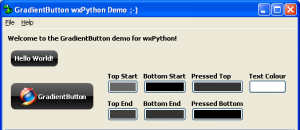
 Control Appearance

 Known Superclasses
 Methods Summary
Default class constructor. |
|
Can this window be given focus by mouse click? |
|
Overridden base class virtual. Determines the best size of the |
|
Enables/disables the button. |
|
Returns the bottom end colour for the gradient shading. |
|
Returns the bottom start colour for the gradient shading. |
|
Overridden base class virtual. By default we should use |
|
Returns a rounded |
|
Returns the pressed bottom start colour for the gradient shading. |
|
Returns the pressed top start colour for the gradient shading. |
|
Returns the top end colour for the gradient shading. |
|
Returns the top start colour for the gradient shading. |
|
Return light contrast of colour. The colour returned is from the scale of |
|
Actually sends a |
|
Handles the |
|
Handles the |
|
Handles the |
|
Handles the |
|
Handles the |
|
Handles the |
|
Handles the |
|
Handles the |
|
Handles the |
|
Handles the |
|
Sets the bottom, top, pressed and foreground colour |
|
Sets the bitmap label for the button. |
|
Sets the bottom end colour for the gradient shading. |
|
Sets the top bottom colour for the gradient shading. |
|
Sets the default button. |
|
Sets the |
|
Given the current font and bezel width settings, calculate |
|
Sets the pressed bottom start colour for the gradient shading. |
|
Sets the pressed top start colour for the gradient shading. |
|
Sets the top end colour for the gradient shading. |
|
Sets the top start colour for the gradient shading. |
|
Overridden base class virtual. Buttons usually don’t inherit |
 Class API
- class GradientButton(wx.Control)
This is the main class implementation of
GradientButton.
Methods
- __init__(self, parent, id=wx.ID_ANY, bitmap=None, label='', pos=wx.DefaultPosition, size=wx.DefaultSize, style=wx.NO_BORDER, align=wx.CENTER, validator=wx.DefaultValidator, name='gradientbutton')
Default class constructor.
- Parameters:
parent – the
GradientButtonparent;id – window identifier. A value of -1 indicates a default value;
bitmap – the button bitmap (if any);
label – the button text label;
pos – the control position. A value of (-1, -1) indicates a default position, chosen by either the windowing system or wxPython, depending on platform;
size – the control size. A value of (-1, -1) indicates a default size, chosen by either the windowing system or wxPython, depending on platform;
style – the button style (unused);
align – text/bitmap alignment. wx.CENTER or wx.LEFT;
validator – the validator associated to the button;
name – the button name.
- AcceptsFocus(self)
Can this window be given focus by mouse click?
Note
Overridden from
wx.Control.
- DoGetBestSize(self)
Overridden base class virtual. Determines the best size of the button based on the label and bezel size.
Note
Overridden from
wx.Control.
- Enable(self, enable=True)
Enables/disables the button.
- Parameters:
enable –
Trueto enable the button,Falseto disable it.
Note
Overridden from
wx.Control.
- GetBottomEndColour(self)
Returns the bottom end colour for the gradient shading.
- GetBottomStartColour(self)
Returns the bottom start colour for the gradient shading.
- GetDefaultAttributes(self)
Overridden base class virtual. By default we should use the same font/colour attributes as the native
Button.
- GetPath(self, gc, rc, r)
Returns a rounded
GraphicsPathrectangle.- Parameters:
gc – an instance of
GraphicsContext;rc – a client rectangle;
r – the radious of the rounded part of the rectangle.
- GetPressedBottomColour(self)
Returns the pressed bottom start colour for the gradient shading.
- GetPressedTopColour(self)
Returns the pressed top start colour for the gradient shading.
- GetTopEndColour(self)
Returns the top end colour for the gradient shading.
- GetTopStartColour(self)
Returns the top start colour for the gradient shading.
- LightColour(self, colour, percent)
Return light contrast of colour. The colour returned is from the scale of colour ==> white.
- Parameters:
colour – the input colour to be brightened;
percent – determines how light the colour will be. percent = 100 returns white, percent = 0 returns colour.
- Notify(self)
Actually sends a
wx.EVT_BUTTONevent to the listener (if any).
- OnGainFocus(self, event)
Handles the
wx.EVT_SET_FOCUSevent forGradientButton.- Parameters:
event – a
FocusEventevent to be processed.
- OnKeyDown(self, event)
Handles the
wx.EVT_KEY_DOWNevent forGradientButton.- Parameters:
event – a
KeyEventevent to be processed.
- OnKeyUp(self, event)
Handles the
wx.EVT_KEY_UPevent forGradientButton.- Parameters:
event – a
KeyEventevent to be processed.
- OnLeftDown(self, event)
Handles the
wx.EVT_LEFT_DOWNevent forGradientButton.- Parameters:
event – a
MouseEventevent to be processed.
- OnLeftUp(self, event)
Handles the
wx.EVT_LEFT_UPevent forGradientButton.- Parameters:
event – a
MouseEventevent to be processed.
- OnLoseFocus(self, event)
Handles the
wx.EVT_KILL_FOCUSevent forGradientButton.- Parameters:
event – a
FocusEventevent to be processed.
- OnMouseEnter(self, event)
Handles the
wx.EVT_ENTER_WINDOWevent forGradientButton.- Parameters:
event – a
MouseEventevent to be processed.
- OnMouseLeave(self, event)
Handles the
wx.EVT_LEAVE_WINDOWevent forGradientButton.- Parameters:
event – a
MouseEventevent to be processed.
- OnPaint(self, event)
Handles the
wx.EVT_PAINTevent forGradientButton.- Parameters:
event – a
PaintEventevent to be processed.
- OnSize(self, event)
Handles the
wx.EVT_SIZEevent forGradientButton.- Parameters:
event – a
wx.SizeEventevent to be processed.
- SetBaseColours(self, startcolour=wx.BLACK, foregroundcolour=wx.WHITE)
Sets the bottom, top, pressed and foreground colour
- Parameters:
startcolour – based colour to be used for bottom, top and pressed
foregroundcolour – colour used for the text
- SetBitmapLabel(self, bitmap)
Sets the bitmap label for the button.
- Parameters:
bitmap – the bitmap label to set, an instance of
wx.Bitmap.
- SetBottomEndColour(self, colour)
Sets the bottom end colour for the gradient shading.
- Parameters:
colour – a valid
wx.Colourobject.
- SetBottomStartColour(self, colour)
Sets the top bottom colour for the gradient shading.
- Parameters:
colour – a valid
wx.Colourobject.
- SetDefault(self)
Sets the default button.
- SetForegroundColour(self, colour)
Sets the
GradientButtonforeground (text) colour.- Parameters:
colour – a valid
wx.Colourobject.
Note
Overridden from
wx.Control.
- SetInitialSize(self, size=None)
Given the current font and bezel width settings, calculate and set a good size.
- Parameters:
size – an instance of
wx.Size.
- SetPressedBottomColour(self, colour)
Sets the pressed bottom start colour for the gradient shading.
- Parameters:
colour – a valid
wx.Colourobject.
- SetPressedTopColour(self, colour)
Sets the pressed top start colour for the gradient shading.
- Parameters:
colour – a valid
wx.Colourobject.
- SetTopEndColour(self, colour)
Sets the top end colour for the gradient shading.
- Parameters:
colour – a valid
wx.Colourobject.
- SetTopStartColour(self, colour)
Sets the top start colour for the gradient shading.
- Parameters:
colour – a valid
wx.Colourobject.
- ShouldInheritColours(self)
Overridden base class virtual. Buttons usually don’t inherit the parent’s colours.
Note
Overridden from
wx.Control.
