
 wx.lib.agw.infobar.InfoBar
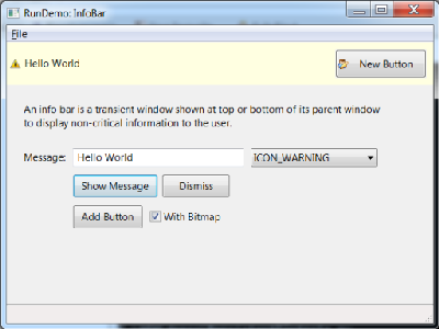
An info bar is a transient window shown at top or bottom of its parent window to display non-critical information to the user.
This is the main class implementation, plainly translated from C++.
 Class Hierarchy

 Control Appearance

 Known Superclasses
 Methods Summary
Default class constructor. |
|
Adds a button to be shown in the info bar. |
|
Hides the |
|
Hides this |
|
Shows this |
|
Determines the placement of the bar from its position in the containing |
|
Returns the default border style for |
|
Return the effect animation duration currently used, in milliseconds. |
|
Return the effect currently used for hiding the bar. |
|
Return the effect currently used for showing the bar. |
|
Common initialization code. |
|
Default event handler for the Close button in |
|
Remove a button previously added by |
|
Sets the duration of the animation used when showing or hiding the bar. |
|
Overridden base class methods changes the font of the text message. |
|
Set the effects to use when showing and hiding the bar. |
|
Show a message in the bar. |
|
Updates the parent layout appearance, but only if this |
 Class API
- class InfoBar(wx.Control)
An info bar is a transient window shown at top or bottom of its parent window to display non-critical information to the user.
This is the main class implementation, plainly translated from C++.
Methods
- __init__(self, parent, id=wx.ID_ANY, pos=wx.DefaultPosition, size=wx.DefaultSize, style=0, name='InfoBar')
Default class constructor.
- Parameters:
parent – parent window. Must not be
None;id (integer) – window identifier. A value of -1 indicates a default value;
pos (tuple or
wx.Point) – the control position. A value of (-1, -1) indicates a default position, chosen by either the windowing system or wxPython, depending on platform;size (tuple or
wx.Size) – the control size. A value of (-1, -1) indicates a default size, chosen by either the windowing system or wxPython, depending on platform;style (integer) – the
InfoBarstyle (unused at present);name (string) – the control name.
- AddButton(self, btnid, label='', bitmap=wx.NullBitmap)
Adds a button to be shown in the info bar.
The button added by this method will be shown to the right of the text (in LTR layout), with each successive button being added to the right of the previous one. If any buttons are added to the info bar using this method, the default
Closebutton is not shown as it is assumed that the extra buttons already allow the user to close it.Clicking the button will generate a normal
wx.wxEVT_COMMAND_BUTTON_CLICKEDevent which can be handled as usual. The default handler inInfoBaritself closes the window whenever a button in it is clicked so if you wish the info bar to be hidden when the button is clicked, simply call event.Skip() in the button handler to let the base class handler do it (callingDismissexplicitly works too, of course). On the other hand, if you don’t skip the event, the info bar will remain opened so make sure to do it for at least some buttons to allow the user to close it.- Parameters:
btnid (integer) – id of the button. It will be used in the button message clicking this button will generate;
label (string) – the label of the button. It may only be empty if btnid is one of the stock ids in which case the corresponding stock label will be used;
bitmap – if not equal to
NullBitmap, a validwx.Bitmapimage to show beside the button text.
- Dismiss(self)
Hides the
InfoBarwindow.This method hides the window and lays out the parent window to account for its disappearance (unlike a simple Hide()), but only if this
InfoBarparent is not managed byframemanagerorAuiManager.
- GetBarPlacement(self)
Determines the placement of the bar from its position in the containing sizer.
- GetEffectDuration(self)
Return the effect animation duration currently used, in milliseconds.
- GetHideEffect(self)
Return the effect currently used for hiding the bar.
- Returns:
One of the following integer bits:
ShowEffect Flag
Hex Value
Description
wx.SHOW_EFFECT_NONE0x0
No effect, equivalent to normal Show() or Hide() call.
wx.SHOW_EFFECT_SLIDE_TO_TOP0x7
Slide the
InfoBarwindow to the top.wx.SHOW_EFFECT_SLIDE_TO_BOTTOM0x8
Slide the
InfoBarwindow to the bottom.
- GetShowEffect(self)
Return the effect currently used for showing the bar.
- Returns:
One of the following integer bits:
ShowEffect Flag
Hex Value
Description
wx.SHOW_EFFECT_NONE0x0
No effect, equivalent to normal Show() or Hide() call.
wx.SHOW_EFFECT_SLIDE_TO_TOP0x7
Slide the
InfoBarwindow to the top.wx.SHOW_EFFECT_SLIDE_TO_BOTTOM0x8
Slide the
InfoBarwindow to the bottom.
- Init(self)
Common initialization code.
- OnButton(self, event)
Default event handler for the
Closebutton inInfoBar.- Parameters:
event – a
CommandEventto be processed.
- RemoveButton(self, btnid)
Remove a button previously added by
AddButton.- Parameters:
btnid (integer) – id of the button to remove. If more than one button with the same id is used in the
InfoBar(which is in any case not recommended), the last, i.e. most recently added, button with this id is removed.
- SetEffectDuration(self, duration)
Sets the duration of the animation used when showing or hiding the bar.
By default, 500ms duration is used.
- Parameters:
duration (integer) – duration of the animation, in milliseconds.
- SetFont(self, font)
Overridden base class methods changes the font of the text message.
InfoBaroverrides this method to use the font passed to it for its text message part. By default a larger and bold version of the standard font is used.- Parameters:
font – a valid instance of
wx.Font.
Note
Reimplemented from
wx.Window.
- SetShowHideEffects(self, showEffect, hideEffect)
Set the effects to use when showing and hiding the bar.
Either or both of the parameters can be set to
wx.SHOW_EFFECT_NONEto disable using effects entirely.By default, the info bar uses
wx.SHOW_EFFECT_SLIDE_TO_BOTTOMeffect for showing itself andwx.SHOW_EFFECT_SLIDE_TO_TOPfor hiding if it is the first element of the containing sizer and reverse effects if it’s the last one. If it is neither the first nor the last element, no effect is used to avoid the use of an inappropriate one and this function must be called if an effect is desired.- Parameters:
showEffect (integer) – the effect to use when showing the bar;
hideEffect (integer) – the effect to use when hiding the bar.
The showEffect and hideEffect parameters can take one of the following bit:
ShowEffect Flag
Description
SHOW_EFFECT_NONENo effect, equivalent to normal Show() or Hide() call.
SHOW_EFFECT_ROLL_TO_LEFTRoll window to the left.
SHOW_EFFECT_ROLL_TO_RIGHTRoll window to the right.
SHOW_EFFECT_ROLL_TO_TOPRoll window to the top.
SHOW_EFFECT_ROLL_TO_BOTTOMRoll window to the bottom.
SHOW_EFFECT_SLIDE_TO_LEFTSlide window to the left.
SHOW_EFFECT_SLIDE_TO_RIGHTSlide window to the right.
SHOW_EFFECT_SLIDE_TO_TOPSlide window to the top.
SHOW_EFFECT_SLIDE_TO_BOTTOMSlide window to the bottom.
SHOW_EFFECT_BLENDFade in or out effect.
SHOW_EFFECT_EXPANDExpanding or collapsing effect.
- ShowMessage(self, msg, flags=wx.ICON_INFORMATION)
Show a message in the bar.
If the bar is currently hidden, it will be shown. Otherwise its message will be updated in place.
- Parameters:
msg (string) – the text of the message;
flags (integer) –
one of
wx.ICON_NONE,wx.ICON_INFORMATION(default),wx.ICON_QUESTION,wx.ICON_WARNINGorwx.ICON_ERRORvalues.Note
These flags have the same meaning as in
MessageDialogfor the generic version, i.e. show (or not, in case ofwx.ICON_NONE) the corresponding icon in the bar but can be interpreted by the native versions. For example, the GTK+ native implementation doesn’t show icons at all but uses this parameter to select the appropriate background colour for the notification.
- UpdateParent(self)
Updates the parent layout appearance, but only if this
InfoBarparent is not managed byframemanagerorAuiManager.
