
 wx.lib.agw.ultimatelistctrl.UltimateListCtrl
UltimateListCtrl is a class that mimics the behaviour of ListCtrl, with almost
the same base functionalities plus some more enhancements. This class does
not rely on the native control, as it is a full owner-drawn list control.
 Class Hierarchy

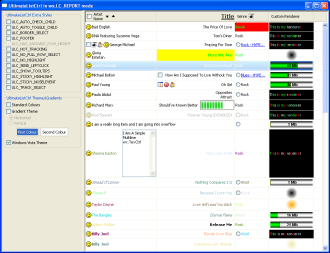
 Control Appearance

 Known Superclasses
 Methods Summary
Default class constructor. |
|
Append an item to the |
|
Arranges the items in icon or small icon view. |
|
Assigns the image list associated with the control. |
|
Deletes everything in |
|
Clears all the images in the specified column. |
|
Converts to screen coordinates from coordinates relative to this window. |
|
Converts to screen coordinates from coordinates relative to this window. |
|
Creates or destroys the footer window depending on the window style flags. |
|
Creates or destroys the header window depending on the window style flags. |
|
Deletes all the column in |
|
Deletes all items in the |
|
Deletes the specified column. |
|
Deletes the specified item. |
|
Deletes the window associated to an item (if any). |
|
Gets the size which best suits the window: for a control, it would be the |
|
Layouts the header, main and footer windows. This is an auxiliary method to avoid code |
|
Starts editing an item label. |
|
Enables/disables an item. |
|
Globally enables/disables drawing of gradient selections. |
|
Globally enables/disables drawing of Windows Vista selections. |
|
Ensures this item is visible. |
|
Find an item whose label matches this string. |
|
Find an item nearest this position. |
|
Find an item whose data matches this data. |
|
Focus and show the given item. |
|
Returns the |
|
Returns the background colour of the window. |
|
Returns the |
|
Returns the number of checked items in the given column. |
|
Returns the default font and colours which are used by the control. This is |
|
Returns information about this column. |
|
Returns the total number of columns in the |
|
Returns the column width for the input column. |
|
Returns the number of items that can fit vertically in the visible area |
|
Returns the default window border. |
|
Returns the items disabled colour. |
|
Returns the associated drop target, which may be |
|
Returns a pointer to the edit |
|
Returns the first gradient colour for gradient-style selections. |
|
Return first selected item, or -1 when none is selected. |
|
Returns the currently focused item or -1 if none is focused. |
|
Returns the |
|
Returns the foreground colour of the window. |
|
Returns the gradient style for gradient-style selections. |
|
Returns the |
|
Returns the font used to render an hypertext item. |
|
Returns the colour used to render a non-visited hypertext item. |
|
Returns the colour used to render a visited hypertext item. |
|
Returns the image list associated with the control. |
|
Returns the information about the input item. |
|
Returns the item background colour. |
|
Returns the number of items in the |
|
Returns the custom renderer used to draw the input item (if any). |
|
Gets the application-defined data associated with this item. |
|
Returns the item font. |
|
Returns the item kind. |
|
Returns if the item is in the overflow state. |
|
Returns the position of the item, in icon or small icon view. |
|
Returns the data for the item, which can be any Python object. |
|
Returns the rectangle representing the item’s size and position, in physical |
|
Returns the spacing between item texts and icons, in pixels. |
|
Returns the item state flags for the input item. |
|
Returns the item text. |
|
Returns the item text colour. |
|
Returns whether an hypertext item was visited. |
|
Returns the window associated to the item (if any). |
|
Returns whether the window associated to the item is enabled. |
|
Searches for an item with the given geometry or state, starting from item |
|
Returns subsequent selected items, or -1 when no more are selected. |
|
Returns the header window owner. |
|
Returns the scrollbar position. |
|
Returns the scrollbar range in pixels. |
|
Returns the scrollbar size in pixels. |
|
Returns the second gradient colour for gradient-style selections. |
|
Returns the number of selected items in |
|
Returns the rectangle representing the size and position, in physical coordinates, |
|
Returns the |
|
Gets the index of the topmost visible item when in list or report view. |
|
Returns the custom value for the |
|
Returns the rectangle taken by all items in the control. In other words, |
|
Returns the |
|
Returns |
|
Returns |
|
Returns |
|
HitTest method for a |
|
Inserts a column into |
|
Inserts a column into |
|
Inserts an image item at the given location. |
|
Inserts an image+string item at the given location. |
|
Inserts an item into |
|
Inserts a string item at the given location. |
|
Returns |
|
Returns whether an item is checked or not. |
|
Returns whether an item is enabled or not. |
|
Returns whether an item is hypertext or not. |
|
Returns |
|
Returns |
|
This function may be overloaded in the derived class for a control with |
|
This function may be overloaded in the derived class for a control with |
|
This function must be overloaded in the derived class for a control with |
|
This function must be overloaded in the derived class for a control with |
|
This function must be overloaded in the derived class for a control with |
|
This function must be overloaded in the derived class for a control with |
|
This function must be overloaded in the derived class for a control with |
|
This function must be overloaded in the derived class for a control with |
|
This function must be overloaded in the derived class for a control with |
|
This function must be overloaded in the derived class for a control with |
|
This method is normally only used internally, but sometimes an application |
|
Handles the |
|
Handles the |
|
Pops up the given menu at the specified coordinates, relative to this window, |
|
Causes this window, and all of its children recursively (except under wxGTK1 |
|
Redraws the given item. |
|
Redraws the items between itemFrom and itemTo. |
|
Converts from screen to client window coordinates. |
|
Converts from screen to client window coordinates. |
|
Scrolls the |
|
Selects/deselects an item. |
|
Sets the |
|
Changes the background colour of |
|
Sets the |
|
Sets information about this column. |
|
Associate a custom renderer to this column’s header. |
|
Sets one or more images to the specified column. |
|
Sets the specified column as shown or hidden. |
|
Sets the tooltip for the column header |
|
Sets the column width. |
|
Sets the window’s cursor. |
|
Sets the items disabled colour. |
|
Associates a drop target with this window. |
|
Sets the first gradient colour for gradient-style selections. |
|
This sets the window to receive keyboard input. |
|
Sets the |
|
Associate a custom renderer with the footer - all columns will use it. |
|
Sets the |
|
Changes the foreground colour of |
|
Sets the gradient style for gradient-style selections. |
|
Associate a custom renderer with the header - all columns will use it. |
|
Sets the |
|
Sets the font used to render hypertext items. |
|
Sets the colour used to render a non-visited hypertext item. |
|
Sets the colour used to render a visited hypertext item. |
|
Sets the image list associated with the control. |
|
Sets the information about the input item. |
|
Sets the item background colour. |
|
Sets a Python list of image indexes associated with the item in the input |
|
Sets the total number of items we handle. |
|
Associate a custom renderer to this item. |
|
Sets the application-defined data associated with this item. |
|
Sets the item font. |
|
Sets whether the item is hypertext or not. |
|
Sets a Python list of image indexes associated with the item. |
|
Sets the item kind. |
|
Sets the item in the overflow/non overflow state. |
|
Sets the position of the item, in icon or small icon view. |
|
Sets the data for the item, which can be any Python object. |
|
Sets the spacing between item texts and icons. |
|
Sets the item state flags for the input item. |
|
Sets the item text. |
|
Sets the item text colour. |
|
Sets whether an hypertext item was visited or not. |
|
Sets the window for the given item. |
|
Enables/disables the window associated to the item. |
|
Sets the scrollbar position. |
|
Sets the second gradient colour for gradient-style selections. |
|
Adds or removes a single window style. |
|
Sets a string or image at the given location. |
|
Sets the |
|
Sets a custom value for the |
|
Sets the |
|
Call this function to sort the items in the |
|
Calling this method immediately repaints the invalidated area of the window |
 Class API
- class UltimateListCtrl(wx.Control)
UltimateListCtrl is a class that mimics the behaviour of
ListCtrl, with almost the same base functionalities plus some more enhancements. This class does not rely on the native control, as it is a full owner-drawn list control.
Methods
- __init__(self, parent, id=wx.ID_ANY, pos=wx.DefaultPosition, size=wx.DefaultSize, style=0, agwStyle=0, validator=wx.DefaultValidator, name='UltimateListCtrl')
Default class constructor.
- Parameters:
parent – parent window. Must not be
None;id – window identifier. A value of -1 indicates a default value;
pos – the control position. A value of (-1, -1) indicates a default position, chosen by either the windowing system or wxPython, depending on platform;
size – the control size. A value of (-1, -1) indicates a default size, chosen by either the windowing system or wxPython, depending on platform;
style – the underlying
wx.Controlwindow style;agwStyle –
the AGW-specific window style; can be almost any combination of the following bits:
Window Styles
Hex Value
Description
ULC_VRULES0x1
Draws light vertical rules between rows in report mode.
ULC_HRULES0x2
Draws light horizontal rules between rows in report mode.
ULC_ICON0x4
Large icon view, with optional labels.
ULC_SMALL_ICON0x8
Small icon view, with optional labels.
ULC_LIST0x10
Multicolumn list view, with optional small icons. Columns are computed automatically, i.e. you don’t set columns as in
ULC_REPORT. In other words, the list wraps, unlike aListBox.ULC_REPORT0x20
Single or multicolumn report view, with optional header.
ULC_ALIGN_TOP0x40
Icons align to the top. Win32 default, Win32 only.
ULC_ALIGN_LEFT0x80
Icons align to the left.
ULC_AUTOARRANGE0x100
Icons arrange themselves. Win32 only.
ULC_VIRTUAL0x200
The application provides items text on demand. May only be used with
ULC_REPORT.ULC_EDIT_LABELS0x400
Labels are editable: the application will be notified when editing starts.
ULC_NO_HEADER0x800
No header in report mode.
ULC_NO_SORT_HEADER0x1000
No Docs.
ULC_SINGLE_SEL0x2000
Single selection (default is multiple).
ULC_SORT_ASCENDING0x4000
Sort in ascending order. (You must still supply a comparison callback in
ListCtrl.SortItems.)ULC_SORT_DESCENDING0x8000
Sort in descending order. (You must still supply a comparison callback in
ListCtrl.SortItems.)ULC_TILE0x10000
Each item appears as a full-sized icon with a label of one or more lines beside it (partially implemented).
ULC_NO_HIGHLIGHT0x20000
No highlight when an item is selected.
ULC_STICKY_HIGHLIGHT0x40000
Items are selected by simply hovering on them, with no need to click on them.
ULC_STICKY_NOSELEVENT0x80000
Don’t send a selection event when using
ULC_STICKY_HIGHLIGHTstyle.ULC_SEND_LEFTCLICK0x100000
Send a left click event when an item is selected.
ULC_HAS_VARIABLE_ROW_HEIGHT0x200000
The list has variable row heights.
ULC_AUTO_CHECK_CHILD0x400000
When a column header has a checkbox associated, auto-check all the subitems in that column.
ULC_AUTO_TOGGLE_CHILD0x800000
When a column header has a checkbox associated, toggle all the subitems in that column.
ULC_AUTO_CHECK_PARENT0x1000000
Only meaningful foe checkbox-type items: when an item is checked/unchecked its column header item is checked/unchecked as well.
ULC_SHOW_TOOLTIPS0x2000000
Show tooltips for ellipsized items/subitems (text too long to be shown in the available space) containing the full item/subitem text.
ULC_HOT_TRACKING0x4000000
Enable hot tracking of items on mouse motion.
ULC_BORDER_SELECT0x8000000
Changes border colour when an item is selected, instead of highlighting the item.
ULC_TRACK_SELECT0x10000000
Enables hot-track selection in a list control. Hot track selection means that an item is automatically selected when the cursor remains over the item for a certain period of time. The delay is retrieved on Windows using the
win32apicall win32gui.SystemParametersInfo(win32con.SPI_GETMOUSEHOVERTIME), and is defaulted to 400ms on other platforms. This style applies to all views ofUltimateListCtrl.ULC_HEADER_IN_ALL_VIEWS0x20000000
Show column headers in all view modes.
ULC_NO_FULL_ROW_SELECT0x40000000
When an item is selected, the only the item in the first column is highlighted.
ULC_FOOTER0x80000000
Show a footer too (only when header is present).
ULC_USER_ROW_HEIGHT0x100000000
Allows to set a custom row height (one value for all the items, only in report mode).
validator – the window validator;
name – the window name.
- Append(self, entry)
Append an item to the
UltimateListCtrl.- Parameters:
entry – should be a sequence with an item for each column.
- Arrange(self, flag)
Arranges the items in icon or small icon view.
- Parameters:
flag – one of the following bits:
Alignment Flag
Hex Value
Description
ULC_ALIGN_DEFAULT0x0
Default alignment
ULC_ALIGN_SNAP_TO_GRID0x3
Snap to grid
Note
This method is currently unimplemented and does nothing.
- AssignImageList(self, imageList, which)
Assigns the image list associated with the control.
- Parameters:
imageList – an instance of
wx.ImageListor an instance ofPyImageList;which – one of
wx.IMAGE_LIST_NORMAL,wx.IMAGE_LIST_SMALL,wx.IMAGE_LIST_STATE(the last is unimplemented).
Note
Using
PyImageListenables you to have images of different size inside the image list. In your derived class, instead of doing this:imageList = wx.ImageList(16, 16) imageList.Add(someBitmap) self.SetImageList(imageList, wx.IMAGE_LIST_SMALL)
You should do this:
imageList = PyImageList(16, 16)
imageList.Add(someBitmap)
self.SetImageList(imageList, wx.IMAGE_LIST_SMALL)
- ClearAll(self)
Deletes everything in
UltimateListCtrl.
- ClearColumnImage(self, col)
Clears all the images in the specified column.
- Parameters:
col – the column index;
- ClientToScreen(self, pointOrTuple)
Converts to screen coordinates from coordinates relative to this window.
- Parameters:
pointOrTuple – an instance of
wx.Pointor a tuple representing the x, y coordinates for this point.- Returns:
the coordinates relative to the screen.
Note
Overridden from
wx.Control.
- ClientToScreenXY(self, x, y)
Converts to screen coordinates from coordinates relative to this window.
- Parameters:
x – an integer specifying the x client coordinate;
y – an integer specifying the y client coordinate.
- Returns:
the coordinates relative to the screen.
Note
Overridden from
wx.Control.
Creates or destroys the footer window depending on the window style flags.
- CreateOrDestroyHeaderWindowAsNeeded(self)
Creates or destroys the header window depending on the window style flags.
- DeleteAllColumns(self)
Deletes all the column in
UltimateListCtrl.
- DeleteAllItems(self)
Deletes all items in the
UltimateListCtrl.Note
This function does not send the
EVT_LIST_DELETE_ITEMevent because deleting many items from the control would be too slow then (unlikeDeleteItem).
- DeleteColumn(self, col)
Deletes the specified column.
- Parameters:
col – the index of the column to delete.
- DeleteItem(self, item)
Deletes the specified item.
- Parameters:
item – the index of the item to delete.
Note
This function sends the
EVT_LIST_DELETE_ITEMevent for the item being deleted.
- DeleteItemWindow(self, itemOrId, col=0)
Deletes the window associated to an item (if any).
- Parameters:
itemOrId – an instance of
UltimateListItemor the item index;col – the column index to which the input item belongs to.
- DoGetBestSize(self)
Gets the size which best suits the window: for a control, it would be the minimal size which doesn’t truncate the control, for a panel - the same size as it would have after a call to Fit().
- DoLayout(self)
Layouts the header, main and footer windows. This is an auxiliary method to avoid code duplication.
- EditLabel(self, item)
Starts editing an item label.
- Parameters:
item – the index of the item to edit.
- EnableItem(self, itemOrId, col=0, enable=True)
Enables/disables an item.
- Parameters:
itemOrId – an instance of
UltimateListItemor the item index;col – the column index to which the input item belongs to;
enable –
Trueto enable the item,Falseotherwise.
- EnableSelectionGradient(self, enable=True)
Globally enables/disables drawing of gradient selections.
- Parameters:
enable –
Trueto enable gradient-style selections,Falseto disable it.
Note
Calling this method disables any Vista-style selection previously enabled.
- EnableSelectionVista(self, enable=True)
Globally enables/disables drawing of Windows Vista selections.
- Parameters:
enable –
Trueto enable Vista-style selections,Falseto disable it.
Note
Calling this method disables any gradient-style selection previously enabled.
- EnsureVisible(self, item)
Ensures this item is visible.
- Parameters:
index – the index of the item to scroll into view.
- FindItem(self, start, str, partial=False)
Find an item whose label matches this string.
- Parameters:
start – the starting point of the input
stringor the beginning if start is -1;string – the string to look for matches;
partial – if
Truethen this method will look for items which begin withstring.
Note
The string comparison is case insensitive.
- FindItemAtPos(self, start, pt)
Find an item nearest this position.
- Parameters:
pt – an instance of
wx.Point.
- FindItemData(self, start, data)
Find an item whose data matches this data.
- Parameters:
start – the starting point of the input data or the beginning if start is -1;
data – the data to look for matches.
- Focus(self, idx)
Focus and show the given item.
- Parameters:
idx – the index of the item to be focused.
- GetAGWWindowStyleFlag(self)
Returns the
UltimateListCtrlAGW-specific style flag.See also
SetAGWWindowStyleFlagfor a list of possible style flags.
- GetBackgroundColour(self)
Returns the background colour of the window.
Note
Overridden from
wx.Control.
- GetBackgroundImage(self)
Returns the
UltimateListCtrlbackground image (if any).Note
At present, the background image can only be used in “tile” mode.
Todo
Support background images also in stretch and centered modes.
- GetCheckedItemCount(self, col=0)
Returns the number of checked items in the given column.
- Parameters:
'col' – an integer specifying the column index.
- Returns:
the number of checked items.
- Return type:
int
- GetClassDefaultAttributes(self, variant)
Returns the default font and colours which are used by the control. This is useful if you want to use the same font or colour in your own control as in a standard control – which is a much better idea than hard coding specific colours or fonts which might look completely out of place on the users system, especially if it uses themes.
This static method is “overridden’’ in many derived classes and so calling, for example,
Button.GetClassDefaultAttributes() will typically return the values appropriate for a button which will be normally different from those returned by, say,ListCtrl.GetClassDefaultAttributes().Note
The
VisualAttributesstructure has at least the fields font, colFg and colBg. All of them may be invalid if it was not possible to determine the default control appearance or, especially for the background colour, if the field doesn’t make sense as is the case for colBg for the controls with themed background.Note
Overridden from
wx.Control.
- GetColumn(self, col)
Returns information about this column.
- Parameters:
col – an integer specifying the column index.
- GetColumnCount(self)
Returns the total number of columns in the
UltimateListCtrl.
- GetColumnWidth(self, col)
Returns the column width for the input column.
- Parameters:
col – an integer specifying the column index.
- GetCountPerPage(self)
Returns the number of items that can fit vertically in the visible area of the
UltimateListCtrl(list or report view) or the total number of items in the list control (icon or small icon view).
- GetDefaultBorder(self)
Returns the default window border.
- GetDisabledTextColour(self)
Returns the items disabled colour.
- GetDropTarget(self)
Returns the associated drop target, which may be
None.Note
Overridden from
wx.Control.
- GetEditControl(self)
Returns a pointer to the edit
UltimateListTextCtrlif the item is being edited orNoneotherwise (it is assumed that no more than one item may be edited simultaneously).
- GetFirstGradientColour(self)
Returns the first gradient colour for gradient-style selections.
- GetFirstSelected(self)
Return first selected item, or -1 when none is selected.
- GetFocusedItem(self)
Returns the currently focused item or -1 if none is focused.
Returns the
UltimateListHeaderWindowheight, in pixels.
- GetForegroundColour(self)
Returns the foreground colour of the window.
Note
Overridden from
wx.Control.
- GetGradientStyle(self)
Returns the gradient style for gradient-style selections.
- Returns:
0 for horizontal gradient-style selections, 1 for vertical gradient-style selections.
- GetHeaderHeight(self)
Returns the
UltimateListHeaderWindowheight, in pixels.
- GetHyperTextFont(self)
Returns the font used to render an hypertext item.
- GetHyperTextNewColour(self)
Returns the colour used to render a non-visited hypertext item.
- GetHyperTextVisitedColour(self)
Returns the colour used to render a visited hypertext item.
- GetImageList(self, which)
Returns the image list associated with the control.
- Parameters:
which – one of
wx.IMAGE_LIST_NORMAL,wx.IMAGE_LIST_SMALL,wx.IMAGE_LIST_STATE(the last is unimplemented).
Note
As
UltimateListCtrlallows you to use a standardwx.ImageListorPyImageList, the returned object depends on which kind of image list you chose.
- GetItem(self, itemOrId, col=0)
Returns the information about the input item.
- Parameters:
itemOrId – an instance of
UltimateListItemor an integer specifying the item index;col – the column to which the item belongs to.
- GetItemBackgroundColour(self, item)
Returns the item background colour.
- Parameters:
item – the index of the item.
- GetItemCount(self)
Returns the number of items in the
UltimateListCtrl.
- GetItemCustomRenderer(self, itemOrId, col=0)
Returns the custom renderer used to draw the input item (if any).
- Parameters:
itemOrId – an instance of
UltimateListItemor the item index;col – the column index to which the input item belongs to.
- GetItemData(self, item)
Gets the application-defined data associated with this item.
- Parameters:
item – an integer specifying the item index.
- GetItemFont(self, item)
Returns the item font.
- Parameters:
item – the index of the item.
- GetItemKind(self, itemOrId, col=0)
Returns the item kind.
- Parameters:
itemOrId – an instance of
UltimateListItemor the item index;col – the column index to which the input item belongs to.
See also
SetItemKindfor a list of valid item kinds.
- GetItemOverFlow(self, itemOrId, col=0)
Returns if the item is in the overflow state.
An item/subitem may overwrite neighboring items/subitems if its text would not normally fit in the space allotted to it.
- Parameters:
itemOrId – an instance of
UltimateListItemor the item index;col – the column index to which the input item belongs to.
- GetItemPosition(self, item)
Returns the position of the item, in icon or small icon view.
- Parameters:
item – the row in which the item lives.
- GetItemPyData(self, item)
Returns the data for the item, which can be any Python object.
- Parameters:
item – an integer specifying the item index.
Note
Please note that Python data is associated with the item and not with subitems.
- GetItemRect(self, item, code=ULC_RECT_BOUNDS)
Returns the rectangle representing the item’s size and position, in physical coordinates.
- Parameters:
item – the row in which the item lives;
code – one of
ULC_RECT_BOUNDS,ULC_RECT_ICON,ULC_RECT_LABEL.
- GetItemSpacing(self, isSmall=False)
Returns the spacing between item texts and icons, in pixels.
- Parameters:
isSmall –
Trueif using awx.IMAGE_LIST_SMALLimage list,Falseif using awx.IMAGE_LIST_NORMALimage list.
- GetItemState(self, item, stateMask)
Returns the item state flags for the input item.
- Parameters:
item – the index of the item;
stateMask – the bitmask for the state flag.
See also
SetItemStatefor a list of valid state flags.
- GetItemText(self, item)
Returns the item text.
- Parameters:
item – an instance of
UltimateListItemor an integer specifying the item index.
- GetItemTextColour(self, item)
Returns the item text colour.
- Parameters:
item – the index of the item.
- GetItemVisited(self, itemOrId, col=0)
Returns whether an hypertext item was visited.
- Parameters:
itemOrId – an instance of
UltimateListItemor the item index;col – the column index to which the input item belongs to.
- GetItemWindow(self, itemOrId, col=0)
Returns the window associated to the item (if any).
- Parameters:
itemOrId – an instance of
UltimateListItemor the item index;col – the column index to which the input item belongs to.
- GetItemWindowEnabled(self, itemOrId, col=0)
Returns whether the window associated to the item is enabled.
- Parameters:
itemOrId – an instance of
UltimateListItemor the item index;col – the column index to which the input item belongs to;
- GetNextItem(self, item, geometry=ULC_NEXT_ALL, state=ULC_STATE_DONTCARE)
Searches for an item with the given geometry or state, starting from item but excluding the item itself.
- Parameters:
item – the item at which starting the search. If set to -1, the first item that matches the specified flags will be returned.
geometry – can be one of:
Geometry Flag
Hex Value
Description
ULC_NEXT_ABOVE0x0
Searches for an item above the specified item
ULC_NEXT_ALL0x1
Searches for subsequent item by index
ULC_NEXT_BELOW0x2
Searches for an item below the specified item
ULC_NEXT_LEFT0x3
Searches for an item to the left of the specified item
ULC_NEXT_RIGHT0x4
Searches for an item to the right of the specified item
state – any combination of the following bits:
State Bits
Hex Value
Description
ULC_STATE_DONTCARE0x0
Don’t care what the state is
ULC_STATE_DROPHILITED0x1
The item is highlighted to receive a drop event
ULC_STATE_FOCUSED0x2
The item has the focus
ULC_STATE_SELECTED0x4
The item is selected
ULC_STATE_CUT0x8
The item is in the cut state
ULC_STATE_DISABLED0x10
The item is disabled
ULC_STATE_FILTERED0x20
The item has been filtered
ULC_STATE_INUSE0x40
The item is in use
ULC_STATE_PICKED0x80
The item has been picked
ULC_STATE_SOURCE0x100
The item is a drag and drop source
- Returns:
The first item with given state following item or -1 if no such item found.
Note
This function may be used to find all selected items in the control like this:
item = -1

while 1:
    item = listctrl.GetNextItem(item, ULC_NEXT_ALL, ULC_STATE_SELECTED)

    if item == -1:
        break

    # This item is selected - do whatever is needed with it

    wx.LogMessage("Item %ld is selected."%item)
- GetNextSelected(self, item)
Returns subsequent selected items, or -1 when no more are selected.
- Parameters:
item – the index of the item.
- GetScrolledWin(self)
Returns the header window owner.
- GetScrollPos(self, orientation)
Returns the scrollbar position.
Note
This method is forwarded to
UltimateListMainWindow.- Parameters:
orientation – May be wx.HORIZONTAL or wx.VERTICAL.
- GetScrollRange(self)
Returns the scrollbar range in pixels.
Note
This method is forwarded to
UltimateListMainWindow.
- GetScrollThumb(self)
Returns the scrollbar size in pixels.
Note
This method is forwarded to
UltimateListMainWindow.
- GetSecondGradientColour(self)
Returns the second gradient colour for gradient-style selections.
- GetSelectedItemCount(self)
Returns the number of selected items in
UltimateListCtrl.
- GetSubItemRect(self, item, subItem, code)
Returns the rectangle representing the size and position, in physical coordinates, of the given subitem, i.e. the part of the row item in the column subItem.
- Parameters:
item – the row in which the item lives;
subItem – the column in which the item lives. If set equal to the special value
ULC_GETSUBITEMRECT_WHOLEITEMthe return value is the same as forGetItemRect;code – one of
ULC_RECT_BOUNDS,ULC_RECT_ICON,ULC_RECT_LABEL.
Note
This method is only meaningful when the
UltimateListCtrlis in the report mode.
- GetTextColour(self)
Returns the
UltimateListCtrlforeground colour.
- GetTopItem(self)
Gets the index of the topmost visible item when in list or report view.
- GetUserLineHeight(self)
Returns the custom value for the
UltimateListCtrlitem height, if previously set withSetUserLineHeight.Note
This method can be used only with
ULC_REPORTandULC_USER_ROW_HEIGHTstyles set.
- GetViewRect(self)
Returns the rectangle taken by all items in the control. In other words, if the controls client size were equal to the size of this rectangle, no scrollbars would be needed and no free space would be left.
Note
This function only works in the icon and small icon views, not in list or report views.
- GetWaterMark(self)
Returns the
UltimateListCtrlwatermark image (if any), displayed in the bottom right part of the window.Todo
Better support for this is needed.
- HasAGWFlag(self, flag)
Returns
Trueif the window has the given flag bit set.- Parameters:
flag – the window style to check.
See also
SetAGWWindowStyleFlagfor a list of valid window styles.
Returns
TrueifUltimateListCtrlhas a footer window.
- HasHeader(self)
Returns
TrueifUltimateListCtrlhas a header window.
- HitTest(self, pointOrTuple)
HitTest method for a
UltimateListCtrl.- Parameters:
pointOrTuple – an instance of
wx.Pointor a tuple representing the mouse x, y position.
See also
UltimateListMainWindow.HitTestLine()for a list of return flags.
- InsertColumn(self, col, heading, format=ULC_FORMAT_LEFT, width=-1)
Inserts a column into
UltimateListCtrl.- Parameters:
col – the column index at which we wish to insert a column;
heading – the header text;
format –
the column alignment flag. This can be one of the following bits:
Alignment Bits
Hex Value
Description
ULC_FORMAT_LEFT0x0
The item is left-aligned
ULC_FORMAT_RIGHT0x1
The item is right-aligned
ULC_FORMAT_CENTRE0x2
The item is centre-aligned
ULC_FORMAT_CENTER0x2
The item is center-aligned
width – can be a width in pixels or
wx.LIST_AUTOSIZE(-1) orwx.LIST_AUTOSIZE_USEHEADER(-2) orLIST_AUTOSIZE_FILL(-3).wx.LIST_AUTOSIZEwill resize the column to the length of its longest item.wx.LIST_AUTOSIZE_USEHEADERwill resize the column to the length of the header (Win32) or 80 pixels (other platforms).LIST_AUTOSIZE_FILLwill resize the column fill the remaining width of the window.
- Returns:
the index at which the column has been inserted.
- InsertColumnInfo(self, col, item)
Inserts a column into
UltimateListCtrl.- Parameters:
col – the column index at which we wish to insert a column;
item – an instance of
UltimateListItem.
- Returns:
the index at which the column has been inserted.
- InsertImageItem(self, index, imageIds, it_kind=0)
Inserts an image item at the given location.
- Parameters:
index – the index at which we wish to insert the item;
imageIds – a Python list containing the image indexes for the images associated to this item;
it_kind – the item kind.
See also
SetStringItemfor a list of valid item kinds.
- InsertImageStringItem(self, index, label, imageIds, it_kind=0)
Inserts an image+string item at the given location.
- Parameters:
index – the index at which we wish to insert the item;
label – the item text;
imageIds – a Python list containing the image indexes for the images associated to this item;
it_kind – the item kind.
See also
SetStringItemfor a list of valid item kinds.
- InsertItem(self, info)
Inserts an item into
UltimateListCtrl.- Parameters:
info – an instance of
UltimateListItem.
- InsertStringItem(self, index, label, it_kind=0)
Inserts a string item at the given location.
- Parameters:
index – the index at which we wish to insert the item;
label – the item text;
it_kind – the item kind.
See also
SetStringItemfor a list of valid item kinds.
- IsColumnShown(self, column)
Returns
Trueif the input column is shown,Falseif it is hidden.- Parameters:
column – an integer specifying the column index.
- IsItemChecked(self, itemOrId, col=0)
Returns whether an item is checked or not.
- Parameters:
itemOrId – an instance of
UltimateListItemor the item index;col – the column index to which the input item belongs to.
- IsItemEnabled(self, itemOrId, col=0)
Returns whether an item is enabled or not.
- Parameters:
itemOrId – an instance of
UltimateListItemor the item index;col – the column index to which the input item belongs to.
- IsItemHyperText(self, itemOrId, col=0)
Returns whether an item is hypertext or not.
- Parameters:
itemOrId – an instance of
UltimateListItemor the item index;col – the column index to which the input item belongs to.
- IsSelected(self, idx)
Returns
Trueif the item is selected.- Parameters:
idx – the index of the item to check for selection.
- IsVirtual(self)
Returns
Trueif theUltimateListCtrlhas theULC_VIRTUALstyle set.
- OnGetItemAttr(self, item)
This function may be overloaded in the derived class for a control with
ULC_VIRTUALstyle. It should return the attribute for the specified item orNoneto use the default appearance parameters.- Parameters:
item – an integer specifying the item index.
Note
UltimateListCtrlwill not delete the pointer or keep a reference of it. You can return the sameUltimateListItemAttrpointer for everyOnGetItemAttrcall.Note
The base class version always returns
None.
- OnGetItemCheck(self, item)
This function may be overloaded in the derived class for a control with
ULC_VIRTUALstyle. It should return whether a checkbox-like item or a radiobutton-like item is checked or unchecked.- Parameters:
item – an integer specifying the item index.
Note
The base class version always returns an empty list.
- OnGetItemColumnCheck(self, item, column=0)
This function must be overloaded in the derived class for a control with
ULC_VIRTUALandULC_REPORTstyle. It should return whether a checkbox-like item or a radiobutton-like item in the column header is checked or unchecked.- Parameters:
item – an integer specifying the item index.
Note
The base class version always returns an empty Python list.
- OnGetItemColumnImage(self, item, column=0)
This function must be overloaded in the derived class for a control with
ULC_VIRTUALandULC_REPORTstyle. It should return a Python list of indexes representing the images associated to the input item or an empty list for no images.- Parameters:
item – an integer specifying the item index.
Note
The base class version always returns an empty Python list.
- OnGetItemColumnKind(self, item, column=0)
This function must be overloaded in the derived class for a control with
ULC_VIRTUALstyle. It should return the item kind for the input item in the header window.- Parameters:
item – an integer specifying the item index;
column – the column index.
Note
The base class version always returns 0 (a standard item).
See also
SetItemKindfor a list of valid item kinds.
- OnGetItemImage(self, item)
This function must be overloaded in the derived class for a control with
ULC_VIRTUALstyle having an image list (if the control doesn’t have an image list, it is not necessary to overload it). It should return a Python list of indexes representing the images associated to the input item or an empty list for no images.- Parameters:
item – an integer specifying the item index;
Note
In a control with
ULC_REPORTstyle,OnGetItemImageonly gets called for the first column of each line.Note
The base class version always returns an empty Python list.
- OnGetItemKind(self, item)
This function must be overloaded in the derived class for a control with
ULC_VIRTUALstyle. It should return the item kind for the input item.- Parameters:
item – an integer specifying the item index.
Note
The base class version always returns 0 (a standard item).
See also
SetItemKindfor a list of valid item kinds.
- OnGetItemText(self, item, col)
This function must be overloaded in the derived class for a control with
ULC_VIRTUALstyle. It should return the string containing the text of the given column for the specified item.- Parameters:
item – an integer specifying the item index;
col – the column index to which the item belongs to.
- OnGetItemTextColour(self, item, col)
This function must be overloaded in the derived class for a control with
ULC_VIRTUALstyle. It should return awx.Colourobject orNonefor the default color.- Parameters:
item – an integer specifying the item index;
col – the column index to which the item belongs to.
- OnGetItemToolTip(self, item, col)
This function must be overloaded in the derived class for a control with
ULC_VIRTUALstyle. It should return the string containing the text of the tooltip for the specified item.- Parameters:
item – an integer specifying the item index;
col – the column index to which the item belongs to.
- OnInternalIdle(self)
This method is normally only used internally, but sometimes an application may need it to implement functionality that should not be disabled by an application defining an OnIdle handler in a derived class.
This method may be used to do delayed painting, for example, and most implementations call
wx.Window.UpdateWindowUIin order to send update events to the window in idle time.
- OnSetFocus(self, event)
Handles the
wx.EVT_SET_FOCUSevent forUltimateListCtrl.- Parameters:
event – a
FocusEventevent to be processed.
- OnSize(self, event)
Handles the
wx.EVT_SIZEevent forUltimateListCtrl.- Parameters:
event – a
wx.SizeEventevent to be processed.
- PopupMenu(self, menu, pos=wx.DefaultPosition)
Pops up the given menu at the specified coordinates, relative to this window, and returns control when the user has dismissed the menu. If a menu item is selected, the corresponding menu event is generated and will be processed as usual. If the coordinates are not specified, the current mouse cursor position is used.
- Parameters:
menu – an instance of
wx.Menuto pop up;pos – the position where the menu will appear.
Note
Overridden from
wx.Control.
- Refresh(self, eraseBackground=True, rect=None)
Causes this window, and all of its children recursively (except under wxGTK1 where this is not implemented), to be repainted.
- Parameters:
eraseBackground – If
True, the background will be erased;rect – If not
None, only the given rectangle will be treated as damaged.
Note
Note that repainting doesn’t happen immediately but only during the next event loop iteration, if you need to update the window immediately you should use
Updateinstead.Note
Overridden from
wx.Control.
- RefreshItem(self, item)
Redraws the given item.
- Parameters:
item – an integer specifying the item index;
Note
This is only useful for the virtual list controls as without calling this function the displayed value of the item doesn’t change even when the underlying data does change.
- RefreshItems(self, itemFrom, itemTo)
Redraws the items between itemFrom and itemTo. The starting item must be less than or equal to the ending one.
Just as
RefreshItemthis is only useful for virtual list controls- Parameters:
itemFrom – the first index of the refresh range;
itemTo – the last index of the refresh range.
- ScreenToClient(self, pointOrTuple)
Converts from screen to client window coordinates.
- Parameters:
pointOrTuple – an instance of
wx.Pointor a tuple representing the x, y coordinates for this point.- Returns:
the coordinates relative to this window.
Note
Overridden from
wx.Control.
- ScreenToClientXY(self, x, y)
Converts from screen to client window coordinates.
- Parameters:
x – an integer specifying the x screen coordinate;
y – an integer specifying the y screen coordinate.
- Returns:
the coordinates relative to this window.
Note
Overridden from
wx.Control.
- ScrollList(self, dx, dy)
Scrolls the
UltimateListCtrl.- Parameters:
dx – if in icon, small icon or report view mode, specifies the number of pixels to scroll. If in list view mode, dx specifies the number of columns to scroll.
dy – always specifies the number of pixels to scroll vertically.
- Select(self, idx, on=True)
Selects/deselects an item.
- Parameters:
idx – the index of the item to select;
on –
Trueto select the item,Falseto deselect it.
- SetAGWWindowStyleFlag(self, style)
Sets the
UltimateListCtrlAGW-specific style flag.- Parameters:
style –
the AGW-specific window style; can be almost any combination of the following bits:
Window Styles
Hex Value
Description
ULC_VRULES0x1
Draws light vertical rules between rows in report mode.
ULC_HRULES0x2
Draws light horizontal rules between rows in report mode.
ULC_ICON0x4
Large icon view, with optional labels.
ULC_SMALL_ICON0x8
Small icon view, with optional labels.
ULC_LIST0x10
Multicolumn list view, with optional small icons. Columns are computed automatically, i.e. you don’t set columns as in
ULC_REPORT. In other words, the list wraps, unlike aListBox.ULC_REPORT0x20
Single or multicolumn report view, with optional header.
ULC_ALIGN_TOP0x40
Icons align to the top. Win32 default, Win32 only.
ULC_ALIGN_LEFT0x80
Icons align to the left.
ULC_AUTOARRANGE0x100
Icons arrange themselves. Win32 only.
ULC_VIRTUAL0x200
The application provides items text on demand. May only be used with
ULC_REPORT.ULC_EDIT_LABELS0x400
Labels are editable: the application will be notified when editing starts.
ULC_NO_HEADER0x800
No header in report mode.
ULC_NO_SORT_HEADER0x1000
No Docs.
ULC_SINGLE_SEL0x2000
Single selection (default is multiple).
ULC_SORT_ASCENDING0x4000
Sort in ascending order. (You must still supply a comparison callback in
ListCtrl.SortItems.)ULC_SORT_DESCENDING0x8000
Sort in descending order. (You must still supply a comparison callback in
ListCtrl.SortItems.)ULC_TILE0x10000
Each item appears as a full-sized icon with a label of one or more lines beside it (partially implemented).
ULC_NO_HIGHLIGHT0x20000
No highlight when an item is selected.
ULC_STICKY_HIGHLIGHT0x40000
Items are selected by simply hovering on them, with no need to click on them.
ULC_STICKY_NOSELEVENT0x80000
Don’t send a selection event when using
ULC_STICKY_HIGHLIGHTstyle.ULC_SEND_LEFTCLICK0x100000
Send a left click event when an item is selected.
ULC_HAS_VARIABLE_ROW_HEIGHT0x200000
The list has variable row heights.
ULC_AUTO_CHECK_CHILD0x400000
When a column header has a checkbox associated, auto-check all the subitems in that column.
ULC_AUTO_TOGGLE_CHILD0x800000
When a column header has a checkbox associated, toggle all the subitems in that column.
ULC_AUTO_CHECK_PARENT0x1000000
Only meaningful foe checkbox-type items: when an item is checked/unchecked its column header item is checked/unchecked as well.
ULC_SHOW_TOOLTIPS0x2000000
Show tooltips for ellipsized items/subitems (text too long to be shown in the available space) containing the full item/subitem text.
ULC_HOT_TRACKING0x4000000
Enable hot tracking of items on mouse motion.
ULC_BORDER_SELECT0x8000000
Changes border colour when an item is selected, instead of highlighting the item.
ULC_TRACK_SELECT0x10000000
Enables hot-track selection in a list control. Hot track selection means that an item is automatically selected when the cursor remains over the item for a certain period of time. The delay is retrieved on Windows using the
win32apicall win32gui.SystemParametersInfo(win32con.SPI_GETMOUSEHOVERTIME), and is defaulted to 400ms on other platforms. This style applies to all views ofUltimateListCtrl.ULC_HEADER_IN_ALL_VIEWS0x20000000
Show column headers in all view modes.
ULC_NO_FULL_ROW_SELECT0x40000000
When an item is selected, the only the item in the first column is highlighted.
ULC_FOOTER0x80000000
Show a footer too (only when header is present).
ULC_USER_ROW_HEIGHT0x100000000
Allows to set a custom row height (one value for all the items, only in report mode).
- SetBackgroundColour(self, colour)
Changes the background colour of
UltimateListCtrl.- Parameters:
colour – the colour to be used as the background colour, pass
NullColourto reset to the default colour.
Note
The background colour is usually painted by the default
EraseEventevent handler function under Windows and automatically under GTK.Note
Setting the background colour does not cause an immediate refresh, so you may wish to call
wx.Window.ClearBackgroundorwx.Window.Refreshafter calling this function.Note
Overridden from
wx.Control.
- SetBackgroundImage(self, image=None)
Sets the
UltimateListCtrlbackground image.- Parameters:
image – if not
None, an instance ofwx.Bitmap.
Note
At present, the background image can only be used in “tile” mode.
Todo
Support background images also in stretch and centered modes.
- SetColumn(self, col, item)
Sets information about this column.
- Parameters:
col – an integer specifying the column index;
item – an instance of
UltimateListItem.
- SetColumnCustomRenderer(self, col=0, renderer=None)
Associate a custom renderer to this column’s header.
- Parameters:
col – the column index.
renderer – a class able to correctly render the input item.
Note
the renderer class must implement the methods DrawHeaderButton and GetForegroundColor.
- SetColumnImage(self, col, image)
Sets one or more images to the specified column.
- Parameters:
col – the column index;
image – a Python list containing the image indexes for the images associated to this column item.
- SetColumnShown(self, column, shown=True)
Sets the specified column as shown or hidden.
- Parameters:
column – an integer specifying the column index;
shown –
Trueto show the column,Falseto hide it.
- SetColumnToolTip(self, col, tip)
Sets the tooltip for the column header
- Parameters:
col – the column index;
tip – the tooltip text
- SetColumnWidth(self, col, width)
Sets the column width.
- Parameters:
width – can be a width in pixels or
wx.LIST_AUTOSIZE(-1) orwx.LIST_AUTOSIZE_USEHEADER(-2) orLIST_AUTOSIZE_FILL(-3).wx.LIST_AUTOSIZEwill resize the column to the length of its longest item.wx.LIST_AUTOSIZE_USEHEADERwill resize the column to the length of the header (Win32) or 80 pixels (other platforms).LIST_AUTOSIZE_FILLwill resize the column fill the remaining width of the window.
Note
In small or normal icon view, col must be -1, and the column width is set for all columns.
- SetCursor(self, cursor)
Sets the window’s cursor.
- Parameters:
cursor – specifies the cursor that the window should normally display. The cursor may be
NullCursorin which case the window cursor will be reset back to default.
Note
The window cursor also sets it for the children of the window implicitly.
Note
Overridden from
wx.Control.
- SetDisabledTextColour(self, colour)
Sets the items disabled colour.
- Parameters:
colour – an instance of
wx.Colour.
- SetDropTarget(self, dropTarget)
Associates a drop target with this window. If the window already has a drop target, it is deleted.
- Parameters:
dropTarget – an instance of
DropTarget.
Note
Overridden from
wx.Control.
- SetFirstGradientColour(self, colour=None)
Sets the first gradient colour for gradient-style selections.
- Parameters:
colour – if not
None, a validwx.Colourinstance. Otherwise, the colour is taken from the system valuewx.SYS_COLOUR_HIGHLIGHT.
- SetFocus(self)
This sets the window to receive keyboard input.
- SetFont(self, font)
Sets the
UltimateListCtrlfont.- Parameters:
font – a valid
wx.Fontinstance.
Note
Overridden from
wx.Control.
Associate a custom renderer with the footer - all columns will use it.
- Parameters:
renderer – a class able to correctly render header buttons
Note
the renderer class must implement the methods DrawHeaderButton and GetForegroundColor.
Sets the
UltimateListHeaderWindowheight, in pixels. This overrides the default footer window size derived fromRendererNative. If height isNone, the default behaviour is restored.- Parameters:
height – the footer window height, in pixels (if it is
None, the default height obtained usingRendererNativeis used).
- SetForegroundColour(self, colour)
Changes the foreground colour of
UltimateListCtrl.- Parameters:
colour – the colour to be used as the foreground colour, pass
NullColourto reset to the default colour.
Note
Overridden from
wx.Control.
- SetGradientStyle(self, vertical=0)
Sets the gradient style for gradient-style selections.
- Parameters:
vertical – 0 for horizontal gradient-style selections, 1 for vertical gradient-style selections.
- SetHeaderCustomRenderer(self, renderer=None)
Associate a custom renderer with the header - all columns will use it.
- Parameters:
renderer – a class able to correctly render header buttons
Note
the renderer class must implement the methods DrawHeaderButton and GetForegroundColor.
- SetHeaderHeight(self, height)
Sets the
UltimateListHeaderWindowheight, in pixels. This overrides the default header window size derived fromRendererNative. If height isNone, the default behaviour is restored.- Parameters:
height – the header window height, in pixels (if it is
None, the default height obtained usingRendererNativeis used).
- SetHyperTextFont(self, font)
Sets the font used to render hypertext items.
- Parameters:
font – a valid
wx.Fontinstance.
- SetHyperTextNewColour(self, colour)
Sets the colour used to render a non-visited hypertext item.
- Parameters:
colour – a valid
wx.Colourinstance.
- SetHyperTextVisitedColour(self, colour)
Sets the colour used to render a visited hypertext item.
- Parameters:
colour – a valid
wx.Colourinstance.
- SetImageList(self, imageList, which)
Sets the image list associated with the control.
- Parameters:
imageList – an instance of
wx.ImageListor an instance ofPyImageList;which – one of
wx.IMAGE_LIST_NORMAL,wx.IMAGE_LIST_SMALL,wx.IMAGE_LIST_STATE(the last is unimplemented).
Note
Using
PyImageListenables you to have images of different size inside the image list. In your derived class, instead of doing this:imageList = wx.ImageList(16, 16) imageList.Add(someBitmap) self.SetImageList(imageList, wx.IMAGE_LIST_SMALL)
You should do this:
imageList = PyImageList(16, 16)
imageList.Add(someBitmap)
self.SetImageList(imageList, wx.IMAGE_LIST_SMALL)
- SetItem(self, info)
Sets the information about the input item.
- Parameters:
info – an instance of
UltimateListItem.
- SetItemBackgroundColour(self, item, col)
Sets the item background colour.
- Parameters:
item – the index of the item;
col – a valid
wx.Colourobject.
- SetItemColumnImage(self, item, column, image)
Sets a Python list of image indexes associated with the item in the input column.
- Parameters:
item – an integer specifying the item index;
column – the column to which the item belongs to;
image – a Python list of indexes into the image list associated with the
UltimateListCtrl.
- SetItemCount(self, count)
Sets the total number of items we handle.
- Parameters:
count – the total number of items we handle.
- SetItemCustomRenderer(self, itemOrId, col=0, renderer=None)
Associate a custom renderer to this item.
- Parameters:
itemOrId – an instance of
UltimateListItemor the item index;col – the column index to which the input item belongs to;
renderer – a class able to correctly render the input item.
Note
the renderer class must implement the methods DrawSubItem, GetLineHeight and GetSubItemWidth.
- SetItemData(self, item, data)
Sets the application-defined data associated with this item.
- Parameters:
item – an integer specifying the item index;
data – the data to be associated with the input item.
Note
This function cannot be used to associate pointers with the control items, use
SetItemPyDatainstead.
- SetItemFont(self, item, f)
Sets the item font.
- Parameters:
item – the index of the item;
f – a valid
wx.Fontobject.
- SetItemHyperText(self, itemOrId, col=0, hyper=True)
Sets whether the item is hypertext or not.
- Parameters:
itemOrId – an instance of
UltimateListItemor the item index;col – the column index to which the input item belongs to;
hyper –
Trueto have an item with hypertext behaviour,Falseotherwise.
- SetItemImage(self, item, image, selImage=-1)
Sets a Python list of image indexes associated with the item.
- Parameters:
item – an integer specifying the item index;
image – a Python list of indexes into the image list associated with the
UltimateListCtrl. In report view, this only sets the images for the first column;selImage – not used at present.
- SetItemKind(self, itemOrId, col=0, kind=0)
Sets the item kind.
- Parameters:
itemOrId – an instance of
UltimateListItemor the item index;col – the column index to which the input item belongs to;
kind – may be one of the following integers:
Item Kind
Description
0
A normal item
1
A checkbox-like item
2
A radiobutton-type item
- SetItemOverFlow(self, itemOrId, col=0, over=True)
Sets the item in the overflow/non overflow state.
An item/subitem may overwrite neighboring items/subitems if its text would not normally fit in the space allotted to it.
- Parameters:
itemOrId – an instance of
UltimateListItemor the item index;col – the column index to which the input item belongs to;
over –
Trueto set the item in a overflow state,Falseotherwise.
- SetItemPosition(self, item, pos)
Sets the position of the item, in icon or small icon view.
- Parameters:
item – the row in which the item lives;
pos – the item position.
Note
This method is currently unimplemented and does nothing.
- SetItemPyData(self, item, pyData)
Sets the data for the item, which can be any Python object.
- Parameters:
item – an integer specifying the item index;
pyData – any Python object.
Note
Please note that Python data is associated with the item and not with subitems.
- SetItemSpacing(self, spacing, isSmall=False)
Sets the spacing between item texts and icons.
- Parameters:
spacing – the spacing between item texts and icons, in pixels;
isSmall –
Trueif using awx.IMAGE_LIST_SMALLimage list,Falseif using awx.IMAGE_LIST_NORMALimage list.
- SetItemState(self, item, state, stateMask)
Sets the item state flags for the input item.
- Parameters:
item – the index of the item; if defaulted to -1, the state flag will be set for all the items;
state – any combination of the following bits:
State Bits
Hex Value
Description
ULC_STATE_DONTCARE0x0
Don’t care what the state is
ULC_STATE_DROPHILITED0x1
The item is highlighted to receive a drop event
ULC_STATE_FOCUSED0x2
The item has the focus
ULC_STATE_SELECTED0x4
The item is selected
ULC_STATE_CUT0x8
The item is in the cut state
ULC_STATE_DISABLED0x10
The item is disabled
ULC_STATE_FILTERED0x20
The item has been filtered
ULC_STATE_INUSE0x40
The item is in use
ULC_STATE_PICKED0x80
The item has been picked
ULC_STATE_SOURCE0x100
The item is a drag and drop source
stateMask – the bitmask for the state flag.
- SetItemText(self, item, text)
Sets the item text.
- Parameters:
item – an instance of
UltimateListItemor an integer specifying the item index;text – the new item text.
- SetItemTextColour(self, item, col)
Sets the item text colour.
- Parameters:
item – the index of the item;
col – a valid
wx.Colourobject.
- SetItemVisited(self, itemOrId, col=0, visited=True)
Sets whether an hypertext item was visited or not.
- Parameters:
itemOrId – an instance of
UltimateListItemor the item index;col – the column index to which the input item belongs to;
visited –
Trueto mark an hypertext item as visited,Falseotherwise.
- SetItemWindow(self, itemOrId, col=0, wnd=None, expand=False)
Sets the window for the given item.
- Parameters:
itemOrId – an instance of
UltimateListItemor the item index;col – the column index to which the input item belongs to;
wnd – a non-toplevel window to be displayed next to the item;
expand –
Trueto expand the column where the item/subitem lives, so that the window will be fully visible.
- SetItemWindowEnabled(self, itemOrId, col=0, enable=True)
Enables/disables the window associated to the item.
- Parameters:
itemOrId – an instance of
UltimateListItemor the item index;col – the column index to which the input item belongs to;
enable –
Trueto enable the associated window,Falseto disable it.
- SetScrollPos(self, orientation, pos, refresh=True)
Sets the scrollbar position.
- Parameters:
orientation – determines the scrollbar whose position is to be set. May be
wx.HORIZONTALorwx.VERTICAL;pos – the scrollbar position in scroll units;
refresh –
Trueto redraw the scrollbar,Falseotherwise.
Note
This method is forwarded to
UltimateListMainWindow.
- SetSecondGradientColour(self, colour=None)
Sets the second gradient colour for gradient-style selections.
- Parameters:
colour – if not
None, a validwx.Colourinstance. Otherwise, the colour generated is a slightly darker version of theUltimateListCtrlbackground colour.
- SetSingleStyle(self, style, add=True)
Adds or removes a single window style.
- Parameters:
style – can be one of the following bits:
Window Styles
Hex Value
Description
ULC_VRULES0x1
Draws light vertical rules between rows in report mode.
ULC_HRULES0x2
Draws light horizontal rules between rows in report mode.
ULC_ICON0x4
Large icon view, with optional labels.
ULC_SMALL_ICON0x8
Small icon view, with optional labels.
ULC_LIST0x10
Multicolumn list view, with optional small icons. Columns are computed automatically, i.e. you don’t set columns as in
ULC_REPORT. In other words, the list wraps, unlike aListBox.ULC_REPORT0x20
Single or multicolumn report view, with optional header.
ULC_ALIGN_TOP0x40
Icons align to the top. Win32 default, Win32 only.
ULC_ALIGN_LEFT0x80
Icons align to the left.
ULC_AUTOARRANGE0x100
Icons arrange themselves. Win32 only.
ULC_VIRTUAL0x200
The application provides items text on demand. May only be used with
ULC_REPORT.ULC_EDIT_LABELS0x400
Labels are editable: the application will be notified when editing starts.
ULC_NO_HEADER0x800
No header in report mode.
ULC_NO_SORT_HEADER0x1000
No Docs.
ULC_SINGLE_SEL0x2000
Single selection (default is multiple).
ULC_SORT_ASCENDING0x4000
Sort in ascending order. (You must still supply a comparison callback in
ListCtrl.SortItems.)ULC_SORT_DESCENDING0x8000
Sort in descending order. (You must still supply a comparison callback in
ListCtrl.SortItems.)ULC_TILE0x10000
Each item appears as a full-sized icon with a label of one or more lines beside it (partially implemented).
ULC_NO_HIGHLIGHT0x20000
No highlight when an item is selected.
ULC_STICKY_HIGHLIGHT0x40000
Items are selected by simply hovering on them, with no need to click on them.
ULC_STICKY_NOSELEVENT0x80000
Don’t send a selection event when using
ULC_STICKY_HIGHLIGHTstyle.ULC_SEND_LEFTCLICK0x100000
Send a left click event when an item is selected.
ULC_HAS_VARIABLE_ROW_HEIGHT0x200000
The list has variable row heights.
ULC_AUTO_CHECK_CHILD0x400000
When a column header has a checkbox associated, auto-check all the subitems in that column.
ULC_AUTO_TOGGLE_CHILD0x800000
When a column header has a checkbox associated, toggle all the subitems in that column.
ULC_AUTO_CHECK_PARENT0x1000000
Only meaningful foe checkbox-type items: when an item is checked/unchecked its column header item is checked/unchecked as well.
ULC_SHOW_TOOLTIPS0x2000000
Show tooltips for ellipsized items/subitems (text too long to be shown in the available space) containing the full item/subitem text.
ULC_HOT_TRACKING0x4000000
Enable hot tracking of items on mouse motion.
ULC_BORDER_SELECT0x8000000
Changes border colour when an item is selected, instead of highlighting the item.
ULC_TRACK_SELECT0x10000000
Enables hot-track selection in a list control. Hot track selection means that an item is automatically selected when the cursor remains over the item for a certain period of time. The delay is retrieved on Windows using the
win32apicall win32gui.SystemParametersInfo(win32con.SPI_GETMOUSEHOVERTIME), and is defaulted to 400ms on other platforms. This style applies to all views ofUltimateListCtrl.ULC_HEADER_IN_ALL_VIEWS0x20000000
Show column headers in all view modes.
ULC_NO_FULL_ROW_SELECT0x40000000
When an item is selected, the only the item in the first column is highlighted.
ULC_FOOTER0x80000000
Show a footer too (only when header is present).
add –
Trueto add the window style,Falseto remove it.
Note
The style
ULC_VIRTUALcan not be set/unset after construction.
- SetStringItem(self, index, col, label, imageIds=[], it_kind=0)
Sets a string or image at the given location.
- Parameters:
index – the item index;
col – the column to which the item belongs to;
label – the item text;
imageIds – a Python list containing the image indexes for the images associated to this item;
it_kind – the item kind. May be one of the following integers:
Item Kind
Description
0
A normal item
1
A checkbox-like item
2
A radiobutton-type item
- SetTextColour(self, col)
Sets the
UltimateListCtrlforeground colour.- Parameters:
col – a valid
wx.Colourobject.
- SetUserLineHeight(self, height)
Sets a custom value for the
UltimateListCtrlitem height.- Parameters:
height – the custom height for all the items, in pixels.
Note
This method can be used only with
ULC_REPORTandULC_USER_ROW_HEIGHTstyles set.
- SetWaterMark(self, watermark=None)
Sets the
UltimateListCtrlwatermark image to be displayed in the bottom right part of the window.- Parameters:
watermark – if not
None, an instance ofwx.Bitmap.
Todo
Better support for this is needed.
- SortItems(self, func=None)
Call this function to sort the items in the
UltimateListCtrl. Sorting is done using the specified function func. This function must have the following prototype:def OnCompareItems(self, line1, line2): DoSomething(line1, line2) # function code
It is called each time when the two items must be compared and should return 0 if the items are equal, negative value if the first item is less than the second one and positive value if the first one is greater than the second one.
- Parameters:
func – the method to use to sort the items. The default is to use the
UltimateListMainWindow.OnCompareItems()method.
- Update(self)
Calling this method immediately repaints the invalidated area of the window and all of its children recursively while this would usually only happen when the flow of control returns to the event loop.
Note
This function doesn’t invalidate any area of the window so nothing happens if nothing has been invalidated (i.e. marked as requiring a redraw). Use
Refreshfirst if you want to immediately redraw the window unconditionally.Note
Overridden from
wx.Control.
