
 wx.RadioBox
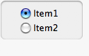
A radio box item is used to select one of number of mutually exclusive choices.
It is displayed as a vertical column or horizontal row of labelled buttons.
 Window Styles
This class supports the following styles:
wx.RA_SPECIFY_ROWS: The major dimension parameter refers to the maximum number of rows.wx.RA_SPECIFY_COLS: The major dimension parameter refers to the maximum number of columns.
 Events Emitted by this Class
Handlers bound for the following event types will receive a wx.CommandEvent parameter.
EVT_RADIOBOX: Process a
wxEVT_RADIOBOXevent, when a radiobutton is clicked.
See also
 Class Hierarchy

 Control Appearance


 Methods Summary
Default constructor. |
|
Creates the radiobox for two-step construction. |
|
Enables or disables an individual button in the radiobox. |
|
Finds a button matching the given string, returning the position if found, or |
|
Returns the number of columns in the radiobox. |
|
Returns the number of items in the control. |
|
Returns a radio box item under the point, a zero-based item index, or |
|
Returns the helptext associated with the specified item if any or |
|
GetItemLabel(self, n) . string |
|
Returns the tooltip associated with the specified item if any or nullptr. |
|
Returns the number of rows in the radiobox. |
|
Returns the index of the selected item. |
|
Returns the label of the item with the given index. |
|
Returns |
|
Returns |
|
Sets the helptext for an item. |
|
SetItemLabel(self, n, text) |
|
Sets the tooltip text for the specified item in the radio group. |
|
Sets the selection to the given item. |
|
Sets the label for the given item. |
|
Shows or hides individual buttons. |
 Properties Summary
See |
|
See |
|
See |
|
See |
 Class API
- class wx.RadioBox(Control, ItemContainerImmutable)
Possible constructors:
RadioBox() -> None

RadioBox(parent, id=ID_ANY, label='', pos=DefaultPosition,
         size=DefaultSize, choices=[], majorDimension=0, style=RA_SPECIFY_COLS,
         validator=DefaultValidator, name=RadioBoxNameStr) -> None
A radio box item is used to select one of number of mutually exclusive choices.
Methods
- __init__(self, *args, **kw)
 Overloaded Implementations:
__init__ (self)
Default constructor.
- Return type:
None
See also
__init__ (self, parent, id=ID_ANY, label=’’, pos=DefaultPosition, size=DefaultSize, choices=[], majorDimension=0, style=RA_SPECIFY_COLS, validator=DefaultValidator, name=RadioBoxNameStr)
Constructor, creating and showing a radiobox.
- Parameters:
parent (wx.Window) – Parent window. Must not be nullptr.
id (wx.WindowID) – Window identifier. The value
ID_ANYindicates a default value.label (string) – Label for the static box surrounding the radio buttons.
pos (wx.Point) – Window position. If
wx.DefaultPositionis specified then a default position is chosen.size (wx.Size) – Window size. If
wx.DefaultSizeis specified then a default size is chosen.choices (list of strings) – An array of choices with which to initialize the radiobox.
majorDimension (int) – Specifies the maximum number of rows (if style contains
RA_SPECIFY_ROWS) or columns (if style containsRA_SPECIFY_COLS) for a two-dimensional radiobox. The default value of 0 means to use the number of items, i.e. number of elements in choices.style (long) – Window style. See wx.RadioBox.
validator (wx.Validator) – Window validator.
name (string) – Window name.
- Return type:
None
- Create(self, parent, id=ID_ANY, label='', pos=DefaultPosition, size=DefaultSize, choices=[], majorDimension=0, style=RA_SPECIFY_COLS, validator=DefaultValidator, name=RadioBoxNameStr)
Creates the radiobox for two-step construction.
See wx.RadioBox for further details.
- Parameters:
parent (wx.Window)
id (wx.WindowID)
label (string)
pos (wx.Point)
size (wx.Size)
choices (list of strings)
majorDimension (int)
style (long)
validator (wx.Validator)
name (string)
- Return type:
bool
- EnableItem(self, n, enable=True)
Enables or disables an individual button in the radiobox.
- Parameters:
n (int) – The zero-based button to enable or disable.
enable (bool) –
Trueto enable,Falseto disable.
- Return type:
bool
See also
- FindString(self, string, bCase=False)
Finds a button matching the given string, returning the position if found, or
NOT_FOUNDif not found.- Parameters:
string (string) – The string to find.
bCase (bool) – Should the search be case-sensitive?
- Return type:
int
- static GetClassDefaultAttributes(variant=WINDOW_VARIANT_NORMAL)
- Parameters:
variant (WindowVariant)
- Return type:
- GetColumnCount(self)
Returns the number of columns in the radiobox.
- Return type:
int
- GetItemFromPoint(self, pt)
Returns a radio box item under the point, a zero-based item index, or
NOT_FOUNDif no item is under the point.- Parameters:
pt (wx.Point) – Point in client coordinates.
- Return type:
int
- GetItemHelpText(self, item)
Returns the helptext associated with the specified item if any or
"".- Parameters:
item (int) – The zero-based item index.
- Return type:
str
See also
- GetItemLabel(self, n)
Return the text of the n’th item in the radio box.
- GetItemToolTip(self, item)
Returns the tooltip associated with the specified item if any or nullptr.
- Parameters:
item (int)
- Return type:
See also
- GetRowCount(self)
Returns the number of rows in the radiobox.
- Return type:
int
- GetSelection(self)
Returns the index of the selected item.
As radio boxes always have a selected item, the return value is never
NOT_FOUNDfor this class.- Return type:
int
- GetString(self, n)
Returns the label of the item with the given index.
The index must be valid, i.e. less than the value returned by
GetCount, otherwise an assert is triggered. Notably, this function can’t be called if the control is empty.- Parameters:
n (int) – The zero-based index.
- Return type:
str
- Returns:
The label of the item.
- IsItemEnabled(self, n)
Returns
Trueif the item is enabled orFalseif it was disabled usingEnable.This function is currently only implemented in wxMSW, wxGTK,
QTand wxUniversal and always returnsTruein the other ports.- Parameters:
n (int) – The zero-based button position.
- Return type:
bool
- IsItemShown(self, n)
Returns
Trueif the item is currently shown orFalseif it was hidden usingShow.Note that this function returns
Truefor an item which hadn’t been hidden even if the entire radiobox is not currently shown.This function is currently only implemented in wxMSW, wxGTK,
QTand wxUniversal and always returnsTruein the other ports.- Parameters:
n (int) – The zero-based button position.
- Return type:
bool
- SetItemHelpText(self, item, helptext)
Sets the helptext for an item.
Empty string erases any existing helptext.
- Parameters:
item (int) – The zero-based item index.
helptext (string) – The help text to set for the item.
- Return type:
None
See also
- SetItemLabel(self, n, text)
SetItemLabel(self, n, text)
Set the text of the n’th item in the radio box.
- SetItemToolTip(self, item, text)
Sets the tooltip text for the specified item in the radio group.
This function is currently only implemented in wxMSW and wxGTK2 and does nothing in the other ports.
- Parameters:
item (int) – Index of the item the tooltip will be shown for.
text (string) – Tooltip text for the item, the tooltip is removed if empty.
- Return type:
None
See also
- SetSelection(self, n)
Sets the selection to the given item.
Notice that a radio box always has selection, so n must be valid here and passing
NOT_FOUNDis not allowed.- Parameters:
n (int)
- Return type:
None
- SetString(self, n, string)
Sets the label for the given item.
- Parameters:
n (int) – The zero-based item index.
string (string) – The label to set.
- Return type:
None
- ShowItem(self, item, show=True)
Shows or hides individual buttons.
- Parameters:
item (int) – The zero-based position of the button to show or hide.
show (bool) –
Trueto show,Falseto hide.
- Return type:
bool
- Returns:
Trueif the item has been shown or hidden orFalseif nothing was done because it already was in the requested state.
See also
Properties
- ColumnCount
See
GetColumnCount
- RowCount
See
GetRowCount
- Selection
See
GetSelectionandSetSelection
