
 wx.RadioButton
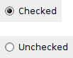
A radio button item is a button which usually denotes one of several mutually exclusive options.
It has a text label next to a (usually) round button.
Radio buttons are typically used in groups of mutually-exclusive buttons, i.e. exactly one of the buttons in the group is checked, and the other ones are unchecked automatically. Such groups are created implicitly, but can also be started explicitly by using RB_GROUP style: a button with this style starts a new group and will become the initial selection in this group. Alternatively, a radio button may be excluded from the group that it would otherwise belong to by using RB_SINGLE style.
To find the other elements of the same radio button group, you can use GetFirstInGroup, GetPreviousInGroup, GetNextInGroup and GetLastInGroup functions.
 Window Styles
This class supports the following styles:
wx.RB_GROUP: Marks the beginning of a new group of radio buttons.wx.RB_SINGLE: Creates a radio button which is not part of any radio button group. When this style is used, no other radio buttons will be turned off automatically when this button is turned on and such behaviour will need to be implemented manually, in the event handler for this button. This style is currently only supported in wxMSW and wxGTK (since version 3.3.0). In the other ports it can be specified, but single radio buttons can’t be turned off, making them not very useful.
 Events Emitted by this Class
Handlers bound for the following event types will receive a wx.CommandEvent parameter.
EVT_RADIOBUTTON: Process a
wxEVT_RADIOBUTTONevent, when the radiobutton is clicked.
See also
 Class Hierarchy

 Control Appearance


 Methods Summary
Default constructor. |
|
Creates the choice for two-step construction. |
|
Returns the first button of the radio button group this button belongs to. |
|
Returns the last button of the radio button group this button belongs to. |
|
Returns the next radio button in the same group. |
|
Returns the previous radio button in the same group. |
|
Returns |
|
Sets the radio button to checked or unchecked status. |
 Properties Summary
See |
|
See |
|
See |
|
 Class API
- class wx.RadioButton(Control)
Possible constructors:
RadioButton() -> None

RadioButton(parent, id=ID_ANY, label='', pos=DefaultPosition,
            size=DefaultSize, style=0, validator=DefaultValidator,
            name=RadioButtonNameStr) -> None
A radio button item is a button which usually denotes one of several mutually exclusive options.
Methods
- __init__(self, *args, **kw)
 Overloaded Implementations:
__init__ (self)
Default constructor.
- Return type:
None
See also
__init__ (self, parent, id=ID_ANY, label=’’, pos=DefaultPosition, size=DefaultSize, style=0, validator=DefaultValidator, name=RadioButtonNameStr)
Constructor, creating and showing a radio button.
- Parameters:
parent (wx.Window) – Parent window. Must not be nullptr.
id (wx.WindowID) – Window identifier. The value
ID_ANYindicates a default value.label (string) – Label for the radio button.
pos (wx.Point) – Window position. If
wx.DefaultPositionis specified then a default position is chosen.size (wx.Size) – Window size. If
wx.DefaultSizeis specified then a default size is chosen.style (long) – Window style. See wx.RadioButton.
validator (wx.Validator) – Window validator.
name (string) – Window name.
- Return type:
None
See also
- Create(self, parent, id=ID_ANY, label='', pos=DefaultPosition, size=DefaultSize, style=0, validator=DefaultValidator, name=RadioButtonNameStr)
Creates the choice for two-step construction.
See wx.RadioButton for further details.
- Parameters:
parent (wx.Window)
id (wx.WindowID)
label (string)
pos (wx.Point)
size (wx.Size)
style (long)
validator (wx.Validator)
name (string)
- Return type:
bool
- static GetClassDefaultAttributes(variant=WINDOW_VARIANT_NORMAL)
- Parameters:
variant (WindowVariant)
- Return type:
- GetFirstInGroup(self)
Returns the first button of the radio button group this button belongs to.
For a radio button with
RB_SINGLEstyle, this function returns this button itself, as it is the only member of its group. Otherwise, the function returns the closest previous radio button withRB_GROUPstyle (which could still be this button itself) or the first radio button in the same window.The returned value is never nullptr.
- Return type:
Added in version 4.1/wxWidgets-3.1.5.
See also
- GetLastInGroup(self)
Returns the last button of the radio button group this button belongs to.
Similarly to
GetFirstInGroup, this function returns this button itself if it hasRB_SINGLEstyle. Otherwise, the function returns the last button before the next button withRB_GROUPstyle or the last radio button in the same window.The returned value is never nullptr.
- Return type:
Added in version 4.1/wxWidgets-3.1.5.
See also
- GetNextInGroup(self)
Returns the next radio button in the same group.
The return value is nullptr if there is no successor or if this button has
RB_SINGLEstyle.- Return type:
Added in version 4.1/wxWidgets-3.1.5.
See also
- GetPreviousInGroup(self)
Returns the previous radio button in the same group.
The return value is nullptr if there is no predecessor or if this button has
RB_SINGLEstyle.- Return type:
Added in version 4.1/wxWidgets-3.1.5.
See also
- GetValue(self)
Returns
Trueif the radio button is checked,Falseotherwise.- Return type:
bool
- SetValue(self, value)
Sets the radio button to checked or unchecked status.
This does not cause a
wxEVT_RADIOBUTTONevent to get emitted.If the radio button belongs to a radio group exactly one button in the group may be checked and so this method can be only called with value set to
True. To uncheck a radio button in a group you must check another button in the same group.- Parameters:
value (bool) –
Trueto check,Falseto uncheck.- Return type:
None
Note
Under MSW, the focused radio button is always selected, i.e. its value is
True. And, conversely, callingSetValue(true)will also set focus to the radio button if the focus had previously been on another radio button in the same group –
Properties
- FirstInGroup
See
GetFirstInGroup
- LastInGroup
See
GetLastInGroup
- NextInGroup
See
GetNextInGroup
- PreviousInGroup
