
 wx.lib.agw.hypertreelist.HyperTreeList
HyperTreeList is a generic widget that combines the multicolumn
features of a wx.ListCtrl with the hierarchical features of a
wx.TreeCtrl This class does not rely on native native controls,
as it is a full owner-drawn tree-list control.
It manages two widgets internally:
TreeListHeaderWindowdisplays the column headers.TreeListMainWindowis the main tree list based offCustomTreeCtrl.
These widgets can be obtained by the GetHeaderWindow
and GetMainWindow methods respectively although this
shouldn’t be needed in normal usage.
Please note that in addition to the defined methods of HyperTreeList
many more methods are delegated to the internal TreeListMainWindow
and its subclass CustomTreeCtrl. These
methods can be called directly from the HyperTreeList class:
Adds a root item to the |
|
Appends an item as a last child of its parent. |
|
Assigns the button image list. |
|
Assigns the normal image list. |
|
Assigns the state image list. |
|
Transverses the tree and checks/unchecks the items. |
|
Traverses up the tree and checks/unchecks parent items. |
|
Transverses the tree and toggles the items. |
|
Programmatically check/uncheck item children. |
|
Actually checks/uncheks an item, sending the two related events. |
|
Used internally to avoid |
|
Uncheck radio items which are on the same level of the checked one. |
|
Collapse an item, sending the two related events. |
|
Collapse the given item and deletes its children. |
|
Deletes an item. |
|
Delete all items in the |
|
Delete all the item’s children. |
|
Deletes the window in the column associated to an item (if any). |
|
Removes the tree root item (and subsequently all the items in the tree). |
|
Starts editing an item label. |
|
Enables/disables the item children. |
|
Enables/disables an item. |
|
Globally enables/disables drawing of gradient selections. |
|
Globally enables/disables drawing of Windows Vista selections. |
|
Scrolls and/or expands items to ensure that the given item is visible. |
|
Expands an item, sending the two related events. |
|
Expands all |
|
Expands all the items children of the input item. |
|
Finds the first item starting with the given prefix after the given parent. |
|
Returns the |
|
Returns the pen used to draw the selected item border. |
|
Retrieves the rectangle bounding the item. |
|
Returns the buttons image list associated with |
|
Returns the item children count. |
|
Returns the total number of columns. |
|
Returns the pen used to draw the connecting lines between items. |
|
Returns the global number of items in the tree. |
|
Returns the current item. Simply calls |
|
Returns the colour for items in a disabled state. |
|
Returns whether built-in drag/drop will be full screen or not. |
|
Returns a reference to the edit |
|
Returns the item’s first child and an integer value ‘cookie’. |
|
Returns the first item which is in the expanded state. |
|
Returns the first gradient colour for gradient-style selections. |
|
Returns the first visible item. |
|
GetFocusedItem |
Another name for |
Returns the gradient style for gradient-style selections. |
|
Returns the colour used to highlight focused selected items. |
|
Returns the colour used to highlight unfocused selected items. |
|
Returns the font used to render hypertext items. |
|
Returns the colour used to render a non-visited hypertext item. |
|
Returns the colour used to render a visited hypertext item. |
|
Returns the normal image list associated with |
|
Returns the |
|
Returns the item indentation, in pixels. |
|
Gets the state of a 3-state checkbox item. |
|
Returns the item background colour. |
|
Returns the item font. |
|
Returns the item image. |
|
Returns the item parent (can be |
|
GetItemPyData |
Another name for |
Returns the item text label. |
|
Returns the item text colour or separator horizontal line colour. |
|
Returns the item type. |
|
Returns whether an hypertext item was visited. |
|
Returns the window associated with an item. |
|
Returns whether the window associated with an item is enabled or not. |
|
Returns the item last child. |
|
Returns the next item. Only for internal use right now. |
|
Returns the item’s next child. |
|
Returns the next expanded item after the input one. |
|
Returns the next displayed item in the tree, visible or not. |
|
Returns the next sibling of an item. |
|
Returns the next item that is visible to the user. |
|
Returns the previous item. Only for internal use right now. |
|
Returns the previous child of an item. |
|
Returns the previous expanded item before the input one. |
|
Returns the previous displayed item in the tree, visible or not. |
|
Returns the previous sibling of an item. |
|
Returns the previous item visible to the user. |
|
Returns the data associated to an item. |
|
Returns the root item, an instance of |
|
Returns the second gradient colour for gradient-style selections. |
|
Returns the current selection. |
|
Returns a list of selected items. |
|
Returns the spacing between the start and the text, in pixels. |
|
Returns the state image list associated with |
|
Returns whether an item has children or not. |
|
Hides/shows an item. |
|
Finds which (if any) item is under the given point, returning the item plus flags. |
|
Inserts an item after the given previous. |
|
Returns whether the item font is bold or not. |
|
Checks if the given item is under another one in the tree hierarchy. |
|
Returns whether the item is expanded or not. |
|
Returns whether or not the checkbox item is a 3-state checkbox. |
|
Returns whether an item is checked or not. |
|
Returns whether an item is enabled or disabled. |
|
Returns whether an item is hypertext or not. |
|
Returns whether the item is visible or not. |
|
Returns whether the item is selected or not. |
|
Returns whether the item has children or not. |
|
Prepends an item as a first child of parent. |
|
Scrolls the specified item into view. |
|
Selects all the item in the tree. |
|
Selects all the children of the given item. |
|
Selects/deselects an item. |
|
Sets the |
|
Sets the pen used to draw the selected item border. |
|
Sets the buttons image list for |
|
Sets the pen used to draw the connecting lines between items. |
|
Sets the colour for items in a disabled state. |
|
Sets whether a drag operation will be performed full screen or not. |
|
Sets the specified item as member of a current drag and drop operation. |
|
Sets the first gradient colour for gradient-style selections. |
|
Sets the gradient style for gradient-style selections. |
|
Sets the colour used to highlight focused selected items. |
|
Sets the colour used to highlight unfocused selected items. |
|
Sets the font used to render hypertext items. |
|
Sets the colour used to render a non-visited hypertext item. |
|
Sets the colour used to render a visited hypertext item. |
|
Sets the normal image list for |
|
Sets the checkbox/radiobutton image list. |
|
Currently has no effect on |
|
Sets whether the item has a 3-state value checkbox assigned to it or not. |
|
Sets the checkbox item to the given state. |
|
Sets the item background colour. |
|
Sets the item font as bold/unbold. |
|
Gives the item the visual feedback for drag and drop operations. |
|
Sets the item font. |
|
Forces the appearance/disappearance of the button next to the item. |
|
Sets whether the item is hypertext or not. |
|
Sets the item image for a particular item state. |
|
Sets the item font as italic/non-italic. |
|
SetItemPyData |
Another name for |
Sets the item text label. |
|
Sets the item text colour or separator horizontal line colour. |
|
Sets the item type. |
|
Sets whether an hypertext item was visited. |
|
Sets the window associated to an item. |
|
Sets whether the window associated with an item is enabled or not. |
|
Sets the |
|
Sets the data associated to an item. |
|
Sets the second gradient colour for gradient-style selections. |
|
Currently has no effect on |
|
Sets the state image list for |
|
Return |
|
Toggles the item state (collapsed/expanded). |
|
Toggles the item selection. |
|
Used internally to handle radio node parent correctly. |
|
Unselects the current selection. |
|
Unselect all the items. |
 Class Hierarchy

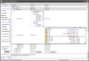
 Control Appearance

 Known Superclasses
 Methods Summary
Default class constructor. |
|
Appends a column to the |
|
Appends a column to the |
|
Calculates the best header height and stores it. |
|
Create an edit control for editing a label of an item. By default, this |
|
Gets the size which best suits the window: for a control, it would be the |
|
Layouts the header control. |
|
Freeze |
|
Returns the |
|
Returns the default font and colours which are used by the control. This is |
|
Returns an instance of |
|
Returns the column text alignment. |
|
Returns the column text colour. |
|
Returns the column text font. |
|
Returns the image assigned to the specified column. |
|
Returns the column text label. |
|
Returns the column width, in pixels. |
|
Returns the header window, an instance of |
|
Returns the main window, an instance of |
|
Return the alignment style to use for the text control that is used |
|
Return the style to use for the text control that is used to edit |
|
Returns whether a flag is present in the |
|
Inserts a column to the |
|
Inserts a column to the |
|
Returns |
|
Returns |
|
Returns the comparison of two items. Used for sorting. |
|
If the |
|
Handles the |
|
Handles the |
|
Causes this window, and all of its children recursively (except under wxGTK1 |
|
Removes a column from the |
|
Sets the window style for |
|
Changes the background colour of |
|
Sets/unsets the double buffering for the header and the main window. |
|
Sets a column using an instance of |
|
Sets the column text alignment. |
|
Sets the column text colour. |
|
Sets the column as editable or non-editable. |
|
Sets the column text font. |
|
Sets an image on the specified column. |
|
Sets the column as shown or hidden. |
|
Sets the sort icon to be displayed in the column header. |
|
Sets the column text label. |
|
Sets the column width, in pixels. |
|
This sets the window to receive keyboard input. |
|
Sets the default font for the header window and the main window. |
|
Changes the foreground colour of |
|
Associate a custom renderer with the header - all columns will use it |
|
Sets the default font for the header window.. |
|
Sorts the children of the given item using |
|
Thaw |
 Class API
- class HyperTreeList(wx.Control)
HyperTreeListis a generic widget that combines the multicolumn features of awx.ListCtrlwith the hierarchical features of awx.TreeCtrlThis class does not rely on native native controls, as it is a full owner-drawn tree-list control.It manages two widgets internally:
TreeListHeaderWindowdisplays the column headers.TreeListMainWindowis the main tree list based offCustomTreeCtrl.
These widgets can be obtained by the
GetHeaderWindowandGetMainWindowmethods respectively although this shouldn’t be needed in normal usage.Please note that in addition to the defined methods of
HyperTreeListmany more methods are delegated to the internalTreeListMainWindowand its subclassCustomTreeCtrl. These methods can be called directly from theHyperTreeListclass:Adds a root item to the
TreeListMainWindow.Appends an item as a last child of its parent.
Assigns the button image list.
Assigns the normal image list.
Assigns the state image list.
Transverses the tree and checks/unchecks the items.
Traverses up the tree and checks/unchecks parent items.
Transverses the tree and toggles the items.
Programmatically check/uncheck item children.
Actually checks/uncheks an item, sending the two related events.
Used internally to avoid
EVT_TREE_ITEM_CHECKEDevents.Uncheck radio items which are on the same level of the checked one.
Collapse an item, sending the two related events.
Collapse the given item and deletes its children.
Deletes an item.
Delete all items in the
TreeListMainWindow.Delete all the item’s children.
Deletes the window in the column associated to an item (if any).
Removes the tree root item (and subsequently all the items in the tree).
Starts editing an item label.
Enables/disables the item children.
Enables/disables an item.
Globally enables/disables drawing of gradient selections.
Globally enables/disables drawing of Windows Vista selections.
Scrolls and/or expands items to ensure that the given item is visible.
Expands an item, sending the two related events.
Expands all
TreeListMainWindowitems.Expands all the items children of the input item.
Finds the first item starting with the given prefix after the given parent.
Returns the
TreeListMainWindowbackground image (if any).Returns the pen used to draw the selected item border.
Retrieves the rectangle bounding the item.
Returns the buttons image list associated with
TreeListMainWindow.Returns the item children count.
Returns the total number of columns.
Returns the pen used to draw the connecting lines between items.
Returns the global number of items in the tree.
Returns the current item. Simply calls
GetSelection.Returns the colour for items in a disabled state.
Returns whether built-in drag/drop will be full screen or not.
Returns a reference to the edit
TreeTextCtrlif the item is being edited.Returns the item’s first child and an integer value ‘cookie’.
Returns the first item which is in the expanded state.
Returns the first gradient colour for gradient-style selections.
Returns the first visible item.
GetFocusedItem
Another name for
GetSelectionReturns the gradient style for gradient-style selections.
Returns the colour used to highlight focused selected items.
Returns the colour used to highlight unfocused selected items.
Returns the font used to render hypertext items.
Returns the colour used to render a non-visited hypertext item.
Returns the colour used to render a visited hypertext item.
Returns the normal image list associated with
TreeListMainWindow.Returns the
wx.ImageListused for the check/radio buttons inTreeListMainWindow.Returns the item indentation, in pixels.
Gets the state of a 3-state checkbox item.
Returns the item background colour.
Returns the item font.
Returns the item image.
Returns the item parent (can be
Nonefor root items).GetItemPyData
Another name for
GetPyDataReturns the item text label.
Returns the item text colour or separator horizontal line colour.
Returns the item type.
Returns whether an hypertext item was visited.
Returns the window associated with an item.
Returns whether the window associated with an item is enabled or not.
Returns the item last child.
Returns the next item. Only for internal use right now.
Returns the item’s next child.
Returns the next expanded item after the input one.
Returns the next displayed item in the tree, visible or not.
Returns the next sibling of an item.
Returns the next item that is visible to the user.
Returns the previous item. Only for internal use right now.
Returns the previous child of an item.
Returns the previous expanded item before the input one.
Returns the previous displayed item in the tree, visible or not.
Returns the previous sibling of an item.
Returns the previous item visible to the user.
Returns the data associated to an item.
Returns the root item, an instance of
GenericTreeItem.Returns the second gradient colour for gradient-style selections.
Returns the current selection.
Returns a list of selected items.
Returns the spacing between the start and the text, in pixels.
Returns the state image list associated with
TreeListMainWindow.Returns whether an item has children or not.
Hides/shows an item.
Finds which (if any) item is under the given point, returning the item plus flags.
Inserts an item after the given previous.
Returns whether the item font is bold or not.
Checks if the given item is under another one in the tree hierarchy.
Returns whether the item is expanded or not.
Returns whether or not the checkbox item is a 3-state checkbox.
Returns whether an item is checked or not.
Returns whether an item is enabled or disabled.
Returns whether an item is hypertext or not.
Returns whether the item is visible or not.
Returns whether the item is selected or not.
Returns whether the item has children or not.
Prepends an item as a first child of parent.
Scrolls the specified item into view.
Selects all the item in the tree.
Selects all the children of the given item.
Selects/deselects an item.
Sets the
TreeListMainWindowbackground image.Sets the pen used to draw the selected item border.
Sets the buttons image list for
TreeListMainWindow.Sets the pen used to draw the connecting lines between items.
Sets the colour for items in a disabled state.
Sets whether a drag operation will be performed full screen or not.
Sets the specified item as member of a current drag and drop operation.
Sets the first gradient colour for gradient-style selections.
Sets the gradient style for gradient-style selections.
Sets the colour used to highlight focused selected items.
Sets the colour used to highlight unfocused selected items.
Sets the font used to render hypertext items.
Sets the colour used to render a non-visited hypertext item.
Sets the colour used to render a visited hypertext item.
Sets the normal image list for
TreeListMainWindow.Sets the checkbox/radiobutton image list.
Currently has no effect on
HyperTreeList. The indent is auto-calculated.Sets whether the item has a 3-state value checkbox assigned to it or not.
Sets the checkbox item to the given state.
Sets the item background colour.
Sets the item font as bold/unbold.
Gives the item the visual feedback for drag and drop operations.
Sets the item font.
Forces the appearance/disappearance of the button next to the item.
Sets whether the item is hypertext or not.
Sets the item image for a particular item state.
Sets the item font as italic/non-italic.
SetItemPyData
Another name for
SetPyDataSets the item text label.
Sets the item text colour or separator horizontal line colour.
Sets the item type.
Sets whether an hypertext item was visited.
Sets the window associated to an item.
Sets whether the window associated with an item is enabled or not.
Sets the
HyperTreeListmain column (i.e. the column of the tree).Sets the data associated to an item.
Sets the second gradient colour for gradient-style selections.
Currently has no effect on
HyperTreeList.Sets the state image list for
TreeListMainWindowReturn
Trueto allow the window colours to be changed byInheritAttributes.Toggles the item state (collapsed/expanded).
Toggles the item selection.
Used internally to handle radio node parent correctly.
Unselects the current selection.
Unselect all the items.
Methods
- __init__(self, parent, id=wx.ID_ANY, pos=wx.DefaultPosition, size=wx.DefaultSize, style=0, agwStyle=wx.TR_DEFAULT_STYLE, validator=wx.DefaultValidator, name='HyperTreeList')
Default class constructor.
- Parameters:
parent – parent window. Must not be
None;id – window identifier. A value of -1 indicates a default value;
pos – the control position. A value of (-1, -1) indicates a default position, chosen by either the windowing system or wxPython, depending on platform;
size – the control size. A value of (-1, -1) indicates a default size, chosen by either the windowing system or wxPython, depending on platform;
style – the underlying
wx.Controlstyle;agwStyle – the AGW-specific
HyperTreeListwindow style. seehypertreelistfor a full list of flags.validator – window validator;
name – window name.
- AddColumn(self, text, width=_DEFAULT_COL_WIDTH, flag=wx.ALIGN_LEFT, image=-1, shown=True, colour=None, edit=False)
Appends a column to the
HyperTreeList.- Parameters:
text – the column text label;
width – the column width in pixels;
flag – the column alignment flag, one of
wx.ALIGN_LEFT,wx.ALIGN_RIGHT,wx.ALIGN_CENTER;image – an index within the normal image list assigned to
HyperTreeListspecifying the image to use for the column;shown –
Trueto show the column,Falseto hide it;colour – a valid
wx.Colour, representing the text foreground colour for the column;edit –
Trueto set the column as editable,Falseotherwise.
- AddColumnInfo(self, colInfo)
Appends a column to the
HyperTreeList.- Parameters:
colInfo – an instance of
TreeListColumnInfo.
- CalculateAndSetHeaderHeight(self)
Calculates the best header height and stores it.
- CreateEditCtrl(self, item, column)
Create an edit control for editing a label of an item. By default, this returns a text control.
Override this function in the derived class to return a different type of control.
- Parameters:
item – an instance of
TreeListItem;column – an integer specifying the column index.
- delegate(self, \*args, \*\*kwargs)
- DoGetBestSize(self)
Gets the size which best suits the window: for a control, it would be the minimal size which doesn’t truncate the control, for a panel - the same size as it would have after a call to Fit().
Note
Overridden from
wx.Control.
- DoHeaderLayout(self)
Layouts the header control.
- Freeze(self)
Freeze
HyperTreeListto allow rapid changes to the tree.Freezes the HyperTreeList main (tree) and and header windows. This prevents any re-calculation or updates from taking place allowing mass updates to the tree very quickly.
Thawmust be called to re-enable updates. Calls to these two functions may be nested.
- GetAGWWindowStyleFlag(self)
Returns the
HyperTreeListwindow style flag.See also
SetAGWWindowStyleFlagfor a list of valid window styles.
- classmethod GetClassDefaultAttributes(self)
Returns the default font and colours which are used by the control. This is useful if you want to use the same font or colour in your own control as in a standard control – which is a much better idea than hard coding specific colours or fonts which might look completely out of place on the users system, especially if it uses themes.
This static method is “overridden’’ in many derived classes and so calling, for example,
Button.GetClassDefaultAttributes() will typically return the values appropriate for a button which will be normally different from those returned by, say,ListCtrl.GetClassDefaultAttributes().Note
The
VisualAttributesstructure has at least the fields font, colFg and colBg. All of them may be invalid if it was not possible to determine the default control appearance or, especially for the background colour, if the field doesn’t make sense as is the case for colBg for the controls with themed background.
- GetColumn(self, column)
Returns an instance of
TreeListColumnInfocontaining column information.- Parameters:
column – an integer specifying the column index.
- GetColumnAlignment(self, column)
Returns the column text alignment.
- Parameters:
column – an integer specifying the column index.
- GetColumnColour(self, column)
Returns the column text colour.
- Parameters:
column – an integer specifying the column index.
- GetColumnFont(self, column)
Returns the column text font.
- Parameters:
column – an integer specifying the column index.
- GetColumnImage(self, column)
Returns the image assigned to the specified column.
- Parameters:
column – an integer specifying the column index.
- GetColumnText(self, column)
Returns the column text label.
- Parameters:
column – an integer specifying the column index.
- GetColumnWidth(self, column)
Returns the column width, in pixels.
- Parameters:
column – an integer specifying the column index.
- GetHeaderWindow(self)
Returns the header window, an instance of
TreeListHeaderWindow.
- GetMainWindow(self)
Returns the main window, an instance of
TreeListMainWindow.
- GetTextCtrlAlignmentStyle(self, column)
Return the alignment style to use for the text control that is used to edit labels of items. The alignment style is derived from the column alignment.
- Parameters:
column – an integer specifying the column index.
- GetTextCtrlStyle(self, column)
Return the style to use for the text control that is used to edit labels of items.
Override this function in the derived class to support a different style, e.g.
wx.TE_MULTILINE.- Parameters:
column – an integer specifying the column index.
- HasAGWFlag(self, flag)
Returns whether a flag is present in the
HyperTreeListstyle.- Parameters:
flag – one of the possible
HyperTreeListwindow styles.
See also
SetAGWWindowStyleFlagfor a list of possible window style flags.
- InsertColumn(self, before, text, width=_DEFAULT_COL_WIDTH, flag=wx.ALIGN_LEFT, image=-1, shown=True, colour=None, edit=False)
Inserts a column to the
HyperTreeListat the position specified by before.- Parameters:
before – the index at which we wish to insert the new column;
text – the column text label;
width – the column width in pixels;
flag – the column alignment flag, one of
wx.ALIGN_LEFT,wx.ALIGN_RIGHT,wx.ALIGN_CENTER;image – an index within the normal image list assigned to
HyperTreeListspecifying the image to use for the column;shown –
Trueto show the column,Falseto hide it;colour – a valid
wx.Colour, representing the text foreground colour for the column;edit –
Trueto set the column as editable,Falseotherwise.
- InsertColumnInfo(self, before, colInfo)
Inserts a column to the
HyperTreeListat the position specified by before.- Parameters:
before – the index at which we wish to insert the new column;
colInfo – an instance of
TreeListColumnInfo.
- IsColumnEditable(self, column)
Returns
Trueif the column is editable,Falseotherwise.- Parameters:
column – an integer specifying the column index.
- IsColumnShown(self, column)
Returns
Trueif the column is shown,Falseotherwise.- Parameters:
column – an integer specifying the column index.
- OnCompareItems(self, item1, item2)
Returns the comparison of two items. Used for sorting.
Override this function in the derived class to change the sort order of the items in the
HyperTreeList. The function should return a negative, zero or positive value if the first item is less than, equal to or greater than the second one.- Parameters:
item1 – an instance of
TreeListItem;item2 – another instance of
TreeListItem.
Note
The base class version compares items alphabetically.
- OnGetItemText(self, item, column)
If the
TR_VIRTUALstyle is set this function must be overloaded in the derived class. It should return the string containing the text of the given column for the specified item.- Parameters:
item – an instance of
TreeListItem;column – an integer specifying the column index.
- OnHTLFocus(self, event)
Handles the
wx.EVT_SET_FOCUSevent forHyperTreeList.- Parameters:
event – a
wx.SizeEventevent to be processed.
- OnSize(self, event)
Handles the
wx.EVT_SIZEevent forHyperTreeList.- Parameters:
event – a
wx.SizeEventevent to be processed.
- Refresh(self, erase=True, rect=None)
Causes this window, and all of its children recursively (except under wxGTK1 where this is not implemented), to be repainted.
- Parameters:
erase – If
True, the background will be erased;rect – If not
None, only the given rectangle will be treated as damaged.
Note
Note that repainting doesn’t happen immediately but only during the next event loop iteration, if you need to update the window immediately you should use
Updateinstead.Note
Overridden from
wx.Control.
- RemoveColumn(self, column)
Removes a column from the
HyperTreeList.- Parameters:
column – an integer specifying the column index.
- SetAGWWindowStyleFlag(self, agwStyle)
Sets the window style for
HyperTreeList.- Parameters:
agwStyle – can be a combination of various bits. See
hypertreelistfor a full list of flags.
Note
Please note that some styles cannot be changed after the window creation and that Refresh() might need to be be called after changing the others for the change to take place immediately.
- SetBackgroundColour(self, colour)
Changes the background colour of
HyperTreeList.- Parameters:
colour – the colour to be used as the background colour, pass
NullColourto reset to the default colour.
Note
The background colour is usually painted by the default
EraseEventevent handler function under Windows and automatically under GTK.Note
Setting the background colour does not cause an immediate refresh, so you may wish to call
wx.Window.ClearBackgroundorwx.Window.Refreshafter calling this function.Note
Overridden from
wx.Control.
- SetBuffered(self, buffered)
Sets/unsets the double buffering for the header and the main window.
- Parameters:
buffered –
Trueto use double-buffering,Falseotherwise.
Note
Currently we are using double-buffering only on Windows XP.
- SetColumn(self, column, colInfo)
Sets a column using an instance of
TreeListColumnInfo.- Parameters:
column – an integer specifying the column index;
info – an instance of
TreeListColumnInfo.
- SetColumnAlignment(self, column, flag)
Sets the column text alignment.
- Parameters:
column – an integer specifying the column index;
flag – the alignment flag, one of
wx.ALIGN_LEFT,wx.ALIGN_RIGHT,wx.ALIGN_CENTER.
- SetColumnColour(self, column, colour)
Sets the column text colour.
- Parameters:
column – an integer specifying the column index;
colour – a valid
wx.Colourobject.
- SetColumnEditable(self, column, edit)
Sets the column as editable or non-editable.
- Parameters:
column – an integer specifying the column index;
edit –
Trueif the column should be editable,Falseotherwise.
- SetColumnFont(self, column, font)
Sets the column text font.
- Parameters:
column – an integer specifying the column index;
font – a valid
wx.Fontobject.
- SetColumnImage(self, column, image)
Sets an image on the specified column.
- Parameters:
column – an integer specifying the column index.
image – an index within the normal image list assigned to
HyperTreeListspecifying the image to use for the column.
- SetColumnShown(self, column, shown)
Sets the column as shown or hidden.
- Parameters:
column – an integer specifying the column index;
shown –
Trueif the column should be shown,Falseif it should be hidden.
- SetColumnSortIcon(self, column, sortIcon, colour=None)
Sets the sort icon to be displayed in the column header.
The sort icon will be displayed in the specified column number and all other columns will have the sort icon cleared.
- Parameters:
column – an integer specifying the column index;
sortIcon – the sort icon to display, one of
wx.HDR_SORT_ICON_NONE,wx.HDR_SORT_ICON_UP,wx.HDR_SORT_ICON_DOWN.colour – the colour of the sort icon as a wx.Colour. Optional. Set to
Noneto restore native colour.
- SetColumnText(self, column, text)
Sets the column text label.
- Parameters:
column – an integer specifying the column index;
text – the new column label.
- SetColumnWidth(self, column, width)
Sets the column width, in pixels.
- Parameters:
column – an integer specifying the column index;
width – the new column width, in pixels.
- SetFocus(self)
This sets the window to receive keyboard input.
- SetFont(self, font)
Sets the default font for the header window and the main window.
- Parameters:
font – a valid
wx.Fontobject.
- SetForegroundColour(self, colour)
Changes the foreground colour of
HyperTreeList.- Parameters:
colour – the colour to be used as the foreground colour, pass
NullColourto reset to the default colour.
Note
Overridden from
wx.Control.
- SetHeaderCustomRenderer(self, renderer=None)
Associate a custom renderer with the header - all columns will use it
- Parameters:
renderer – a class able to correctly render header buttons
Note
the renderer class must implement the method DrawHeaderButton
- SetHeaderFont(self, font)
Sets the default font for the header window..
- Parameters:
font – a valid
wx.Fontobject.
- SortChildren(self, item)
Sorts the children of the given item using
OnCompareItemsmethod ofHyperTreeList. You should override that method to change the sort order (the default is ascending case-sensitive alphabetical order).- Parameters:
item – an instance of
TreeListItem;
- Thaw(self)
Thaw
HyperTreeList.Re-enables updates to the main (tree) and header windows after a previous call to
Freeze. To really thaw the control, it must be called exactly the same number of times asFreeze. When fully thawed the tree will re-calculate and update itself.
